I took a left, it took a left, and my right was met by a pause from the big-eyed digital waitress who left a…
Microsoft Surface review: prepare for disappointment

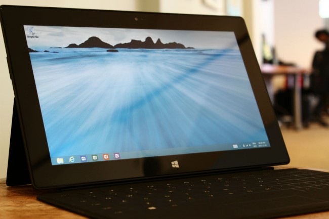
Two things instantly irk me with Microsoft’s Surface, Windows RT version, the exceedingly sexy tablet/laptop/whatever. Firstly, the viewing angle when used as a laptop is shite. It’s angled too steeply, and my eyesight suffered accordingly. Secondly, the Touch keyboard is a waste, and I instantly swapped to the traditional Type keyboard for some reprieve. I’ve written the full review directly on the Surface, so excuse me if my bitterness overflows more than usual.
Despite an initial negative reaction, Surface has some unique advantages over its competitors and these features shouldn’t be glossed over. Its design is fairly elegant, and it’s great to finally have an OS and tablet that are practically made for each other. It’s practically symbiotic. Yet still, an overwhelming set of niggling issues pushes the tablet into an uneasy situation. “Should I buy this?”, the answer is no. And here’s why.
Microsoft designed a very Rolls-Royce tablet — something that journalists, writers and students will love, but sadly, they won’t be able to afford it. And for those who can afford it, they’ll most likely only take it out on special occasions.
First party woes
It doesn’t take much to impress me. Give me a flirty look, shove a gadget in my face and say “Steven, this is the best piece of tech since, like, forever man!” and I’ll greet you with a warm smile, a handshake and a happy nod as I blankly stamp my approval on whatever tech is thrown at me (until I later tear it apart in a review). I love gadgets, almost too much. So it’s with no amount of pain that I declare the Surface to be both useless, and utterly necessary in the same breath. I’ve never been this torn with a gadget before.
Microsoft’s bravery, to actually release a first-party tablet in the same league as the iPad or Nexus 10.1, is honourable. It’s also misguided. To compete against Apple or Google, companies need to have that killer feature, a function so unique that it overshadows the iPad’s best efforts. The Nexus 10 has Jellybean at its very core, the Galaxy Note 10.1 has a pen and a massive screen, hell even the PlayBook has the upcoming BlackBerry 10 update which will leverage it out of irrelevancy. The Surface has a keyboard, good looks and not enough left to justify the US$499 price tag.
Comfort is key
Take the Surface challenge. Close your laptop, open Surface on a level table and start working. Boot up IE 10 — try not to vomit as it assaults your eyes — and load your Gmail. Feels cool, doesn’t it? With two keyboards, you’re pretty much spoilt for choice. There’s Touch, a membrane-like keyboard very much like the 30-year old ZX81, and Type, a more traditional keyboard that feels very IBM. Of the two, choose Type. Touch is a cool idea, but in practice it’s like hammering your fingers into a table. Without tactile feedback, it’s difficult to get into a typing rhythm a decent keyboard can produce.


Connect me
There’s a bevy of connection options for Surface, and this is one of the highlights of the package. On the right is something practically unheard of, a USB input and it’s utterly fantastic. Hard drives, USB mice, plug-and-play penguins, whatever. Every USB device I plugged in was detected and worked without issue. Pleasingly, plugging in a USB keyboard pretty much turns Surface into a WebBook. Add in a USB hub (there’s only one port) and rock out with a mouse and keyboard for the best possible experience. But then guess what? You might as well use a PC for a third of the price. Still, I love the USB implementation, it’s a commendable feature and something I’ve dreamed of having in a tablet for years now.

Just a note on the magnetic power clip: maybe I’ve been spoilt by my MacBook Pro’s MagSafe connector, but this is not the magnetic power clip you’re looking for. This is because the sides are inverted slightly, and as such clipping the power cable in is a hit-and-miss affair. The magnet is simply not strong enough to draw the clip in. It has to be kind of wiggled into place. Again, not what I expect from a US$499 device.
Let’s dig into the remainder of the hardware features. Both cameras are 1.2MP, and both suck. The front facing camera, which displays at 720p is excellent for Skype and whatnot. The rear camera, which shoots 1080p video is woefully underpowered. But is a camera necessary on a tablet? That’s best left to another article. For now, it’s part of this package and a forgettable one at that. Also, the camera is strangely positioned. At first glance, it looks off-centre. At second glance, you discover that the camera is actually sunk downwards into the back of Surface. This is fine and dandy if Surface is at the 22 degree tilt it was intended for, but the image darkens if it’s held at any other angle. But who cares really, it’s a crappy camera and you’ll barely use it. Shame on you Microsoft. Here’s some horrible pictures, care of Surface.
Front camera:


The HD-ready screen (1366×768) is sturdy, colorful and has multi-finger touch which I’m sure will showcase itself later in Surface’s life. For now, there’s a bevy of multi-touch options associated with Windows RT. The pixels per inch (PPI) is unfortunately low and at 148ppi, pixels are highly visible, especially in desktop mode. HD video looks great though, and the Metro interface is a treat. But this is a low resolution screen and comparatively to the other 10 inchers, it’s lacking. iPad 4: 264ppi, Nexus 10.1: 299ppi. Loser: Surface. This is an important battle, and Surface hasn’t even got a sneaky blade to stab into the back of its competitors. A wasted opportunity.


I spoke briefly about the two keyboards, Touch and Type. What I didn’t mention is how satisfying the magnetic keyboard connector is. Unlike the power cable, the keyboards snap into place with the force of a thousand magnets. Tearing the keyboard off also feels weighty and natural. It’s an excellent job by Surface’s design team and I can tell that endless hours were poured into this. It’s a Steve Jobs level of care, something Apple would have done in its heyday.
Also worth a mention is how excellent the Type keyboard is. Microsoft has gone and created a solid keyboard here, with delightfully sturdy keys that resonate tactile harmony with each hammer of the button. After a bit of practice, my fingers flew over the keyboard with a natural, sturdy tempo. Well done team Surface, well done indeed. The Touch keyboard is a bit of an afterthought though and never quite feels right. But at least there’s two options, so kudos to team Surface for supplying a decent set of input options.
Each keyboard has Windows RT/Pro specific shortcuts. Search, Share, Devices and Settings, as well as volume control keys. I would have appreciated a screen brightness option, but tech writers can’t be choosers. A final note on the Type keyboard: the miniature touchpad is horrendous, it feels rough to the touch and the mouse-click function is both cheap and unwieldy.
A visually pleasing, yet undercooked OS
Up to now, you’re thinking that I’m a dickhead who hates on “rad” devices from Microsoft. Here’s the thing though, despite the hardware being woefully undercooked, the OS it supports is a treat and produces one of the most symbiotic experiences known to tech-kind.
I’m not going to go into details, as we’ve already reviewed Windows RT in depth. I will add though, that Metro and its Live Tiles were made for a touch screen, like no other OS before it. It’s fantastically quick and deeply intuitive.

Failure is not an option
It’s a tough choice. Get a Windows 8 ultrabook for almost the same price, or stick with Surface RT and enjoy one of the prettiest, heaviest and most awkward tablets currently available. My decision though, is no. I just can’t recommend Microsoft’s Surface. It’s not based on price, or weak specs. It’s based on the fact that its unique selling point is useless. The keyboard and tablet combo is bad, and Microsoft should feel bad.
Beautiful to look at, uncomfortable to use, and without the keyboard it’s just another tablet. All be it a tablet with a full and unpleasant desktop experience built into it. Microsoft has placed its eggs into one basket, and the gamble hasn’t paid off.
Thank you to Wantitall.co.za for supplying the Microsoft Surface for review.
![]()