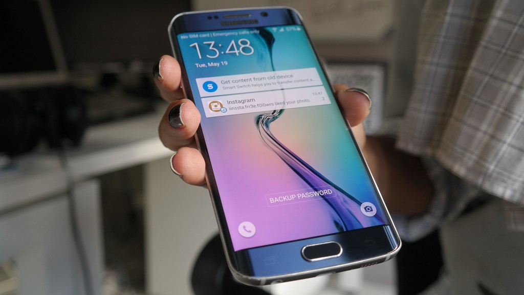
A few weeks back, we received the Samsung Galaxy S6 in all its sparkling glass and gunmetal glory. It was an instant visual hit with the office, and while it wasn’t too flash it harboured just enough flair to (dare I say it) outshine the iPhone 6.
But that’s where Samsung should’ve stopped.
No ad to show here.
The notion of curving a device’s face by shoving a slanted screen on it and releasing it to market is a bold, bold move, especially when consumers are not always ready to take such a huge leap of faith. While it was clear that the company needed to revive its ailing Galaxy name after the bore that was the Samsung Galaxy S5, we didn’t think it was the ugliest device from the Korean company either.
Read more: Samsung Galaxy S6 review: rightful leader of the Android army?
So when we got hold of the Samsung Galaxy S6 Edge after handling its flat brother we couldn’t help but ask the question: who’s the Edge really for?
Same specs, different shell
A quick gander through it’s hardware checklist and its clear to see that not much has changed internally from its normal sibling — and that, for the record, is possibly the most impressive smartphone on the planet.
It has an eight-core processor, 3GBs of RAM and 64GBs of storage (at least in terms of our review unit) and that’s not even mentioning what should largely be regarded as the best smartphone camera ever made — that 16MP marvel. There’s also a relatively stellar front camera too, which makes selfie snapping a high-quality dream. This thing’s essentially a navy blue mega yacht.
But talking about the S6 Edge’s specs is largely missing the point (especially if you’re read our Samsung Galalxy S6 review). It’s all about the superficial with this version.
Form, form, form over functionality
Physical design trends have changed massively over the past three years. Remember how large the iPhone 4 was? Or all of the unneeded bulk the Samsung Galaxy S3 carried? Incredibly, those designs were cutting edge in their day (no pun intended).
The Edge really does show the world how far tech design has progressed. Phones are no longer pieces of technology. They don’t have to be geeky or only for the nerds of the world. They’re sexy, fashionable and extremely trendy. We blame Apple for this really, but Samsung’s finally cottoned on.
The S6 Edge is a massive status symbol smartphone if there ever was one, and it’s definitely more flash than the iPhone 6 could ever hope to be. But is this a good thing? Not entirely.
Although it’s aesthetically dashing, this screen’s possibly the most impractical thing I’ve ever used. Typing characters at the edge of the keyboard for instance is impossible thanks to the lack of real sensitivity. Scrolling horizontally is also a bit difficult. We thought Samsung might’ve found some way of solving this but it hadn’t — using this screen was a horrible experience.
What else was a bit strange was video playback. Videos jumped out a bit more thanks to the raised screen, which was pretty great for movies but not so much for video recording or snapping images.
Edge or no edge?
We couldn’t find any real use for the edges either. Sure, it gave the phone a slick lick of class (it was definitely a conversation starter as well) but the only real app that used them was the “favourite contacts” pane which brought up a selection of around five oft-contacted connections. Useful? Hilariously not, especially for those who don’t exactly use traditional phone calls or messaging services.
What’s really annoying is the price tag too.
For a strange form factor, you’ll need to fork out about R1500 more. That’s practically the same specs, same camera, same Exynos 7420 chipset, same amount of storage, same device internally. The only difference is a gimmicky screen that does more harm to the Galaxy experience than good.
Okay, there are positives. It’s a double-taker. It’s difficult to put down once in the hand. It’s easily one of the best devices to watch high-definition videos on. But does that warrant its choice over the S6 flat? Nope. Not at all.
Verdict: If you’re looking for a proper Samsung Galaxy experience, rather get the more complete, less gimmicky Samsung Galaxy S6 “flat.” Unless you’re Jay-Z (and that’s likely, considering how many music videos this thing is in) and want more flash than function, the choice is obvious. But I can’t agree with that choice even if the reason is “it’s so pretty.”
Score: 6/10
