TymeBank has been earmarked to be one of South Africa’s well-performing banks according to the Forbes list of the world’s best banks for 2024….
Nine major changes in Ice Cream Sandwich

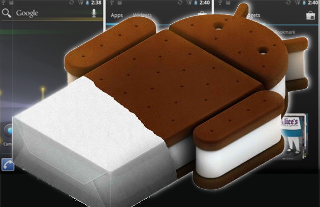

Version 4 of Google’s industry-shaking mobile operating system has hit the streets in the form of the Galaxy Nexus, just shipping now in the US. This has given us the first good looksee at Ice Cream Sandwich in its finished form. Gearburn pulls out the nine biggest user interface changes in ICS that’ll have you begging your handset manufacturer for the upgrade for your handset. Your 24 month contract up yet?
1. It unifies the look and feel of Android across phones and tablets – Gingerbread meets Honeycomb meets  a big black koki pen in dark and brooding hues set off with electric blue and white thin-lined accents. Think of it as saving the planet, one unlit pixel at a time.
2. More widget-friendly. You can now changed how icons and widgets are positioned more flexibly on the home screen – not so much on the homescreens themselves, but there is a nice, intuitive widgets tray as a sidekick to the applications tray. A great new addition is the ability to press and hold on a widget on the home screen to let you resize it (not all widgets will resize, e.g. the gallery).
3. Bye bye fascia buttons. Google is pushing to have soft buttons only, and the old search/menu/home/back buttons are now home/back/apps buttons (the last of which brings up your current and recent apps, performing the same function as the long-press on the old home button). There is no search button, and no menu button. Every home screen now has translucent search window with a big Google logotype in it. It’s all about driving web search, right Google? Menu button now appears somewhere in each app (top? bottom? not at all? this is not standardised). In some cases (like when viewing media), the buttons shrink to dots. Just don’t forget which dot is which.

4. Get rid of what you don’t want more easily – and granularly. In the running apps screen, scroll up or down, swipe sideways to close (great news for those tired of trying to get rid of the bloody Web browser); and you can do the same in the notifications window – swipe away those you don’t want, keep those you do rather than the old “clear all”.
5. Standard Android browser is much faster. That’s always a good thing.
6. Nested apps on the home screens: drag an app onto another to create folders of apps to keep stuff more organised. Hi, iOS5!
7. The onscreen keyboard has been improved with more accurate press-guessing, with standard pop up letter display a la HTC Sense.
8. A much better camera app (sorry for you, third-party Android camera app devs). It now as an image capture feature when shooting video, time lapse video, and panorama image mode, along with loads more editing features (including some silly ones for fun). And unrelated, but related, a built-in screen grab feature (sorry for you, third party screen-grab app developers). And to add an extra sorry-for-you-app-devs, it now has a built in data tracking tool (rather like the 3G Watchdog third party app).
9. Android now has an NFC phone-to-phone communication technology called Android Beam to let you move media, contacts and other files between adjacent devices.
 There’s a couple of small nice touches that aren’t major features, but we like ’em, such as when your phone rings you can drag the caller icon onto hang up, answer or send an editable message (“Busy, call you back”, “You’re dumped, don’t call me any more”, “Can’t talk, in NEC disciplinary hearing”, “Shhhh! Being breathalysed!”, etc). Facial locking feature is basically a lose as it’s hit or miss, and trivial to fool with a printout of someone’s pic).
Once we have some more inside info, Gearburn will bring you a rundown of the under-the-hood changes.

