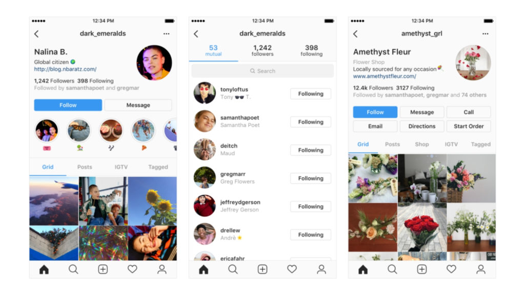
Last week Instagram announced that it has begun making design changes to users’ profiles pages on the platform.
“Your profile is where you share who you are on Instagram, so starting today we’re testing ways you can better express yourself,” the company explained in a blog post.
No ad to show here.
The company said that features would be “rearranged” and “icons, buttons and the way you navigate between tabs” will also be updated.
The upcoming changes are also meant to help you connect with follows and friends better by displaying information in a more accessible way, according to the social network.
The changes will be tested in different combinations, and the first round is already underway.
Personally, I find my revised profile untidy, outdated and boring, and the internet largely agrees. Several users expressed their distaste online, distinctly calling the update “ugly”.
did instagram break or update or did it jus become ugly
— Amanda Rose (@amandarnguyen) November 21, 2018
No offence to Instagram but the new update is ugly as hellllllllll
— Avi
(@avibeauty_) November 21, 2018
don’t rate the new Instagram update, looks ugly as fuck
— ً (@leftmeIost) November 22, 2018
instagram got this ugly ass update but they can’t fix the algorithm??? pic.twitter.com/pywlEYICH3
— lexi
(@LexiGabriellaa) November 21, 2018
The update favours the user bio, making it more dominant at the top of the profile page, with the profile picture is now next to the bio, on the right side.
This Instagram update is throwing me off so hard why are the profile pics on the right side I don’t like it I feel uncomfortable
— Hannah (@hannahjs_) November 22, 2018
I hate the new @instagram profile view update. It looks really old
—
DARBO (@darbomusic) November 21, 2018
Though users clearly don’t like the change, we can all take comfort in the fact that this is merely the first phase of testing.
“We’ll continue to experiment and update the experience as we learn from your feedback,” the company concluded.
Feature image: Instagram
