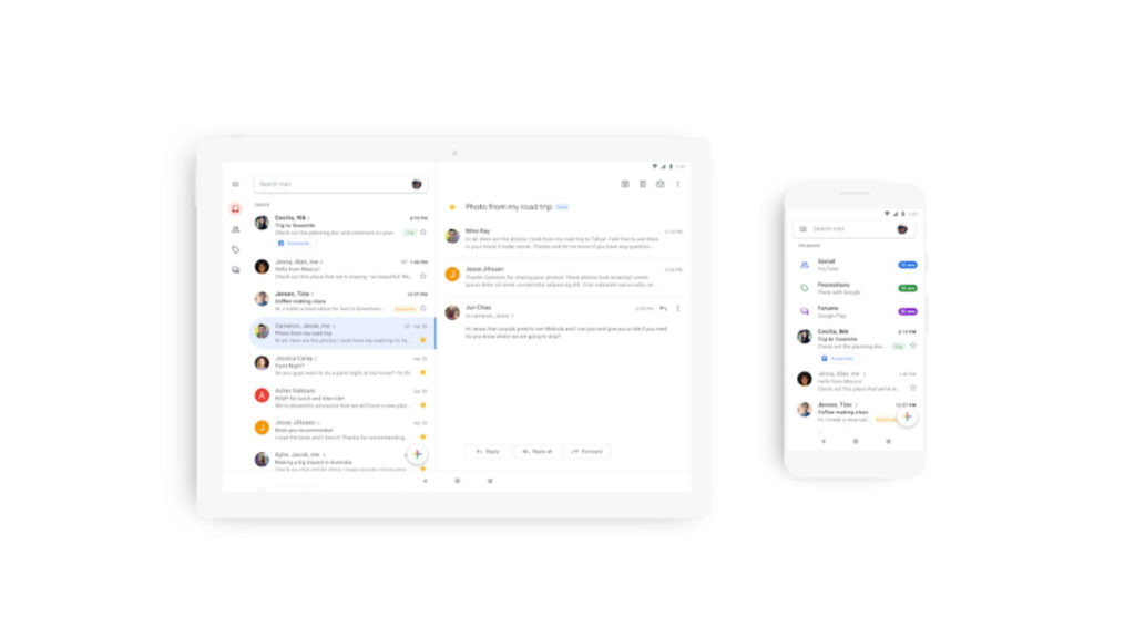
Google is finally refreshing Gmail’s dated appearance on mobile, bringing its aesthetic in line with the service’s web version, and other Material Design-themed G Suite apps.
The new look includes more rounded labels and icons, lack of solid lines between each email, and the red header at the top of the screen which makes for a cleaner appearance.
No ad to show here.
Additional tweaks under the hood are also present.
“As part of the new design, you can quickly view attachments — like photo — without opening or scrolling through the conversation, ” the company further noted.
The app will also send users alerts for suspicious looking emails.
The update to Gmail will roll out within coming weeks for Android and iOS devices.
Feature image: Google
