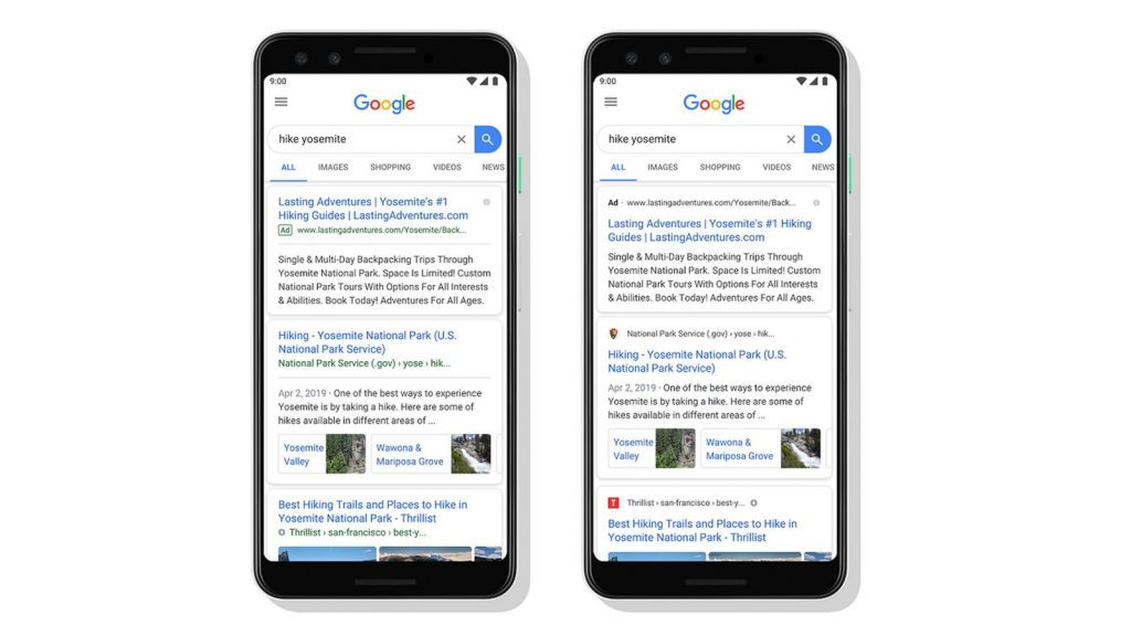
Google on Wednesday revealed a new look for Search on mobile and the way that search results appear on the platform.
The “visual refresh” is aimed at making information even easier to verify, according to the company.
No ad to show here.
“With this new design, a website’s branding can be front and center, helping you better understand where the information is coming from,” Google said on its blog.
Now, the names and icons of websites will appear at the top of each search results card so users can identify the source of information at a glance.
“When you search for a product or service and we have a useful ad to show, you’ll see a bold ad label at the top of the card alongside the web address,” the company also noted.
The new look will first roll out on Google Search for mobile in the coming days.
Feature image: Google
