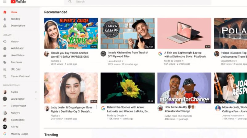
Notice anything different?” YouTube asked users in a tweet on Thursday, after it brought a number of cosmetic and functionality changes to its home page.
The first change is purely cosmetic, and barely noticeable to less perceptive visitors. “Recommended” videos now feature larger thumbnails, higher-resolution previews, longer titles and the inclusion of channel icons.
No ad to show here.
Notice anything different? We gave YT Home on web and tablet apps some remodeling. Check out this cleaner layout with:
Larger thumbnails Longer titles and channel icons Higher resolution previews pic.twitter.com/eWY9qMgSt5 — YouTube (@YouTube) November 7, 2019
YouTube also brought a quality-of-life change to the home page. Users can now tell the site to stop recommending certain channels from the three-dot menu.
“You now also have more control over the content that appears on Home for you: “Don’t recommend this channel” – select this option on a video and you’ll stop seeing suggestions from that channel on Home,” the company added in a tweet.
And finally, you can also queue a “handful” of videos without interrupting the video that’s currently playing.
“With the miniplayer, you can organize your queue without having to leave Home,” it tweeted.
Customize what you want to watch next!
𝙌𝙪𝙚𝙪𝙚 ‘𝙚𝙢 𝙪𝙥! Select a handful of videos to watch next, without interrupting the video you are currently watching.
𝙊𝙧𝙜𝙖𝙣𝙞𝙯𝙚 ‘𝙚𝙢! With the miniplayer, you can organize your queue without having to leave Home. pic.twitter.com/W7cpP2cEjr— YouTube (@YouTube) November 7, 2019
The changes were not apparent at the time of writing for us in South Africa, so it’s not clear when the changes will go live for all users in the country.
YouTube last issued a large-scale update to its UI back in 2017, when it introduced a dark mode as well as some Material Design polish inspired by Android.
Feature image: YouTube
