

Google has announced the launch of a new tool to help visualise COVID-19 data in global and regional maps — making it easier to make sense of the numbers.
While the tool is aimed at journalists, it is a useful resource that anyone can access.
No ad to show here.
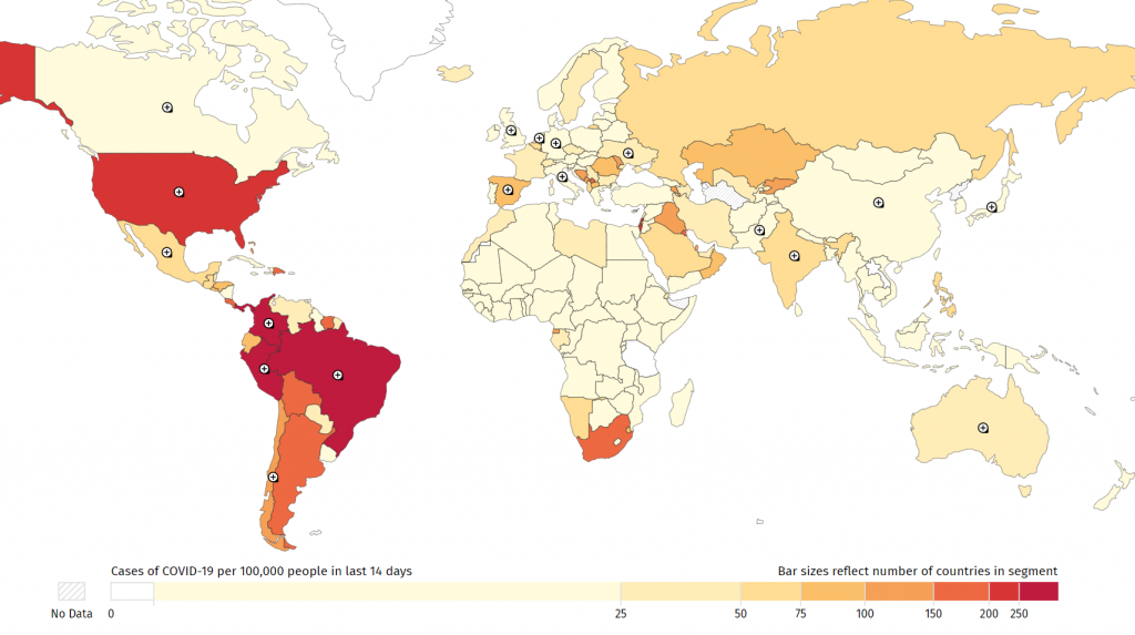
Google’s COVID-19 Global Case Mapper uses data from Johns Hopkins University. This data receives daily updates and has been a go-to resource for those tracking global cases since the start of the pandemic.
US data is also supplemented by the New York Times’ open COVID-19 county dataset, for regional US cases.
The mapping tool lets users embed maps and visualisations on their websites.
It also includes useful data such as a graph of daily new cases, fatality rates for the past two weeks, and country cases per capita.
Users can view a global map or specific countries.
For example, we’ve embedded South Africa’s COVID-19 cases below:
The map also uses a heatmap style, to reflect the worst-affected regions in the world.
For certain countries, there are also regional breakdowns of the data. For example, users can see regional heatmaps and cases for provinces/states in countries like Brazil, Spain, China, India, and the United States.
You can also switch to the fatalities per capita heatmap view.
Meanwhile, hovering over a region will show you a comparison between its rates and the global rates for the past 14 days.
Limitations of Google COVID-19 map
As with all maps, it’s important to understand the scope and limitations of the data displayed.
Google’s COVID-19 map focuses mostly on rates of cases and fatalities over the past 14 days. It also calculates rates per capita, rather than fatalities rates versus total COVID-19 cases.
This doesn’t mean the data isn’t useful. In fact, it helps you track efforts to flatten infection rate curves. It also lets you see how widespread the pandemic is within certain countries’ populations.
For a cumulative look at cases, you can use the Johns Hopkins University COVID-19 map.
Feature image: Google