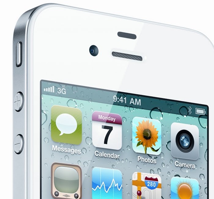
OMG! I mean, like OMFG! Is that a white iPhone 4? A real one. Oh yeah baby, Gearburn got one. And rushed to review it. Except that after two weeks the best we could come up with was “It’s an iPhone 4. That’s white. Mmm. Pretty.” No good. So we had to try harder. We are hardened professionals that easily shake of the bedazzlement of black turtleneck magic. We would find the story behind the story.
What we did, good people, is go out on the streets and ask you what you thought of it. Is it girly? Is it gay? Is it an object of unbridled lust? A bauble to scorn? Or merely meh?
No ad to show here.
It turns out there’s a bit of a story to the white iPhone. Apple started talking about it in mid 2010, announced delays in October, and it didn’t ship until April in the US, and now at the end of June it’s finally available in second tier markets. Why the long wait? After all, white is Apple’s colour de jour. It should have been easy for them, they have enough white plastic bits lying around.
Not just a change of paint-pot
The problem (apparently, Apple’s not telling) is that a bunch of engineering issues came up which were quite difficult to solve. The biggest one is that to get the lustrous depth to the colour the new generation iPhone sports, Apple under-paints a translucent glass panel. Fine if it’s black, but if it’s white, the light from the screen, the sun and the flash all bleed through into the wrong parts. Camera images wash out if the flash fires, the edge of the screen loses contrast in strong light and also suffers from bleed-through. It doesn’t look perfect. And that’s all-important to No 1 Infinity Loop.
This is no big deal at all in the real world (although arguably if you had a really, really snug-fitting hard case it may not fit). Apple does not mention the thickness issue. Anywhere. At all. These are not the millimeters you are looking for.
But is it gear-head crack?
This is all just techie detail. What you really want to know is whether to get one. What is the vox pop? Actually bugger the man in the street. We first went to the expert in the street.
Gearburn spoke to a man who knows manly. Jason Lilley (aka Captain Bread (@captainbreadza) knows style, and knows hipster. He’s not only a large man with large biceps, but has enormous tattoos and bakes. Bakes up a storm at his bakery/sandwicherie/coffeeshop, where the in crowd go for their elevenses cappuccino or to eat lunch. Some park their XKRs, some park their E300s, some their Vespas, some their authentically rusted Cortinas.
Yeah, he reckons, it’s a good looking phone. Suddenly his older Gen 3 iPhone looks cracked and shabby. And say what you will, but there are more iPhone owners with cracked glass screens than any other type of handsets – except now with Gen 4 you can crack the screen, and both the front and the back of the case. Sweet.
Jason’d have one. Slightly more feminine looking in white, but not enough to call girly, he reckons.
We then spoke to Roy Ingle (@HipTweet), who has been in high-tech for more decades than is polite to enumerate. Hardcore telecoms, brand work for trendy coffee shops, now the HipZone WiFi network that gives you free bandwidth in exchange for selling a teensy bit of your soul. Or taste in jeans, whichever you’re happier to part with.
Wendy is in corporate comms, and thinks it’s just gorgeous. The imperceptible delay in letting go of it when she gives it back says it all.
Alan is a concert pianist from Miami, and he thinks it’s really catchy. Stands out. “It’s a bit feminine,” he says, after a pause.
Less is a lot more if you are artists
Apple are the masters of combining the Scandinavian style of ultra-minimalist design – all clean lines and perfect proportions with little or no embellishment, with American engineering-flavoured function-defines form simplicity. The white iPhone is the acme of this skill.
It is so almost to the point of bad design – the obsessive reductionism in interface controls, the willingness to subject its users to the slings and arrows of kak-handed screen crackery. Even so, the iPhone does everything users want to do, and no more. It does it well, without spoiling it with doodads and flimflam.
Perhaps it’s because the design and engineering teams in Cupertino have taken to heart the one greatest line from Alice in Wonderland: “Begin at the beginning and go on till you come to the end; then stop.”
