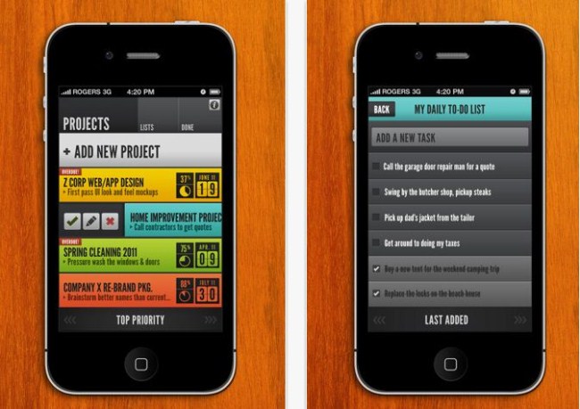
This week I take a look at HQ: To-Do, a stylishly designed and highly intuitive app that will revolutionise the way you see to-do lists and make you want to project manage the crap out of everything you do in life.
As you can see when reading my review of Listbook, I am a big fan of to-do lists. Over the last few months I have gone from scribbling them on my hands (and on busy days, up to my elbows), to scrawling them across random scraps of paper that I find lying around on my desk, from using highly complex and extremely frustrating web apps to countless, unsatisfying iPhone apps, and until recently, back to the random scraps of paper lying on my desk.
No ad to show here.
My problem with the aforementioned apps was that I got bored (and slightly annoyed) of picking up my phone whenever I had to remember to do something, sometimes I could probably have gotten the task done by the time I’d put my phone back down. In a nutshell, these apps and methods of keeping to-do lists were annoying me because they were wasting my time and were too passive. I like planning and getting things done. Like the developers of HQ say, how productive can you be if you’re constantly wasting time?
So, in my quest to find the one to-do app to rule them all (it was actually one of the items on my long-term to do list, no jokes), I stumbled upon HQ To-Do, an app that has more of a project management feel to it than a simple to-do list app. After quickly skimming through the iTunes description and noting the high number of 5-star ratings, I clicked buy. The 2MB app downloaded and installed quicker than it took me calculate how much I really paid for the app over my 3G connection, which is not a reflection on the performance of the app (or my below par maths skills) at all, but it did help to set the tone of my first experience with the app, and I’m always grateful when developers keep file sizes low (less is more in this case).
Starting off, you’re welcomed by a highly intuitive and tastefully colourful user interface that just begs you to touch it. Seriously though, the design on this app is really something to marvel at and you can’t help but open it during the day, just to be reminded of how awesome it looks, definitely a contender for best looking app of 2011…moving on.
What HQ does to revolutionize the to-do list app concept is exactly what you need it to do — throws the concept out of the window and re-invents it altogether. Step 1 is to create a project, assign a priority rating and a deadline, and then choose a colour. Step 2 is to open the project and add the individual tasks, priorities and deadlines for each of them, and step 3 is actually doing the tasks and then marking them as complete on the app. You can have as many projects running as you want at any time and even view the progress of each project and the deadline just by opening up the app. What I like about is this is that you’re proactively planning ahead, you’re building projects and adding all the steps you need to take to get to that point, so that when you’re actually in the project completion phase, all you have to do is tick your tasks off and see what’s next.
HQ doesn’t stop there either. While giving the app a quick test run last night I figured that I’d probably have to keep at least one of my older to-do apps for my day-to-day lists of tasks I need to complete, but I was pleasantly surprised to find that just next to the projects tab at the top of the screen, the app provides you with a very simple, very effective and terribly good-looking lists function. Here, just like in the projects tab, you create different lists (daily tasks, shopping list etc.) and then add tasks or items within these. Honestly, this is a feature that I’ve paid a few dollars for before and been happy with, HQ adds it to the mix as if it’s nothing. Changing the status, editing or deleting tasks and projects is also very simple and cleverly thought out, simply slide to the right on the project/task and tap the relevant icon, done, another task completed and added to your done tab (which is great to keep up with, now that you’re so damn productive).
Overall, I can safely say that while HQ is incredibly easy to use and one of the best looking apps I have ever seen, it is not a toy. It is a highly powerful project management app that will help you increase productivity at work and home. The icon is cleverly designed and deserves its place on your dock or first screen. If this app is not on your to-buy list, it should be.
Name: HQ: To Do
Publisher: Sleeping Giant Apps
Category: Productivity
Price: US$1.99
Size: 2MB
