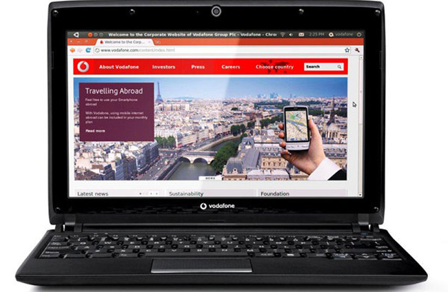
The Vodafone Webbook is cheap, incredibly cheap (around R1 500 [US$ 184]). As such, criticising it feels a little odd. It’s a bit like taking apart a soup kitchen for not having an internationally renowned wine list or the local corner café for lacking the nuances of haute cuisine in its cooking.
Here’s the thing though, the Webbook feels cheap, something designed to throw to an unwashed proletariat desperate for the democratisation of technology. I get that there’s a reason it costs so little, but surely Vodafone could have given us just a little bit more?
No ad to show here.
Allow me to return to my soup kitchen simile for a moment. There’s every chance that the volunteers at the soup kitchen make the food they do with dedication and a genuine belief in what they’re doing. What might otherwise be a bland meal is enhanced by their goodwill and a common spirit of humanity. Salt, pepper and ubuntu as condiments. Similarly, the food at the corner café might come from ancient Tamil, Greek, or Persian recipes and will leave you feeling full and satisfied, or at least intrigued by exotic flavours.
Vodafone’s product has none of that. There is absolutely zero human touch to it. It feels like it was conceptualised, designed, built and packaged by robots. Not intelligent, functional robots either. No, the machines behind this are as cheap and ill thought out as their creation. Their robot firmware is probably crawling with malware too.
The nuts and bolts
The Webbook feels cheap. It’s plasticky and badly joined together. “Ah,” you might say, “It’s built from plastic; of course it’s going to feel plasticky”. Rubbish. Look around you and you’ll see that, properly formed, plastic can look, and feel, astonishingly beautiful and tactile.
The Webbook looks okay, no worse than any other ultra-affordable netbook — but it’s just awful to handle. I managed five minutes of web browsing on it the first time I used it, and struggled to toss it aside lightly. I’d much rather have thrown it with great force.
Possibly the worst offenders in this regard were the mouse buttons, more specifically their clicks. To say they’re frustrating is an understatement. I imagine that parents defeated by a baby food jar, with a screaming infant in the background, feel similar levels of annoyance. Even if they worked properly, the sound they make is enough to set your teeth on edge.
If you want to add peripherals, don’t go looking further than anything you can stick in a USB slot or a headphone socket (you get two of the former and one of the latter).
Even when you’re pushing the Webbook to its max, the battery-life is pretty impressive. That said, it doesn’t take much to push the Webbook to its max.
The screen is, again, okay. 1024X600 resolution. Not brilliant, just okay. That is, however, something I’m willing to live for the Webbook’s price.
There’s a webcam but don’t expect to record your Magnum Opus on it. The Webbook only has 4GB of memory. No, I’m not confusing it with available RAM, four little gigs is all the non-volatile capacity it has. Oh, and only about 1.5GB is available to you to store data.
If the limited space wasn’t enough to convince you not to do anything to complex on this machine then the 512MB of RAM and 800MHz processor probably will.
It’s all about connections man
“Ah ha!” I hear you say, “What about the cloud? It’s called the Webbook for a reason right?” Well, if you choose to go the 3G route and get as much data as we did with the plan it comes with (100MB), good luck. That’s just about enough data for a couple of hours of normal web browsing, never mind uploading chunky files onto web-based servers.
If you happen to have freely available Wi-Fi, that might be a possible solution, but not if your model’s anything like the one we had. The Wi-Fi connection dropped faster than a proverbial’s undergarments.
The Spirit of Unbuntu
The Webbook runs a pretty vanilla flavour of Ubuntu 10.04, easy to use and comes standard with a large, clearly defined app pop-out bar.
All the software on it is open-source and runs as well as you’d expect it to.
Navigating between the apps is a little slow, but nothing that’ll leave you tearing you hair out. That it is so slow is a little baffling, considering the stripped down nature of the device.
What will leave you tearing your hair out, if you’ve owned any other ultra-portable device in the last couple of years, is the startup time. In actual, real world time, it’s not that long (1:15) but it’s a stripped down solid-state machine. That’s slow. After a while, a slow computer start-up can drive you as insane as a broken lift.
So what’s the verdict then? I get that this is supposed to be a dirt cheap netbook, aimed at bringing technology to the masses, but I just can’t get past all its inherent nastiness. I can’t imagine what it’s like to aspire to have any computer — not a high-performance computer — just a computer, so the next sentence may just be me talking out of my bourgeois, privileged arse. If I were in that situation, though, I can’t help but feel that I’d work a little bit longer, save a little bit more (like US$30) and get something a hell of a lot better. That little bit of extra saving gets you a machine twice as powerful for a lot less than double the price.
Who it’s for:
- Some incarnation of Vodafone’s vision of the tech-hungry masses
What we liked:
- The price
- The super long battery life
- Open source software
What we didn’t like:
- Everything else
Gear it or Burn it:
- Burn it, with lots and lots of petrol
