It’s a bit like that nice couple next door, with their two mid-sized sedans. Perfectly nice to have a conversation with, but the whole time you’ll be looking at the whiskey-drinking, Mustang-driving designer and his indie-singer girlfriend across the road.
No ad to show here.
It’s funny that we’ve got to the stage where we can say that about a product packed with features we couldn’t even have imagined just a few years ago. Thing is, I hope to convince you that’s exactly what this phone is — good but instantly forgettable.
Overall Design
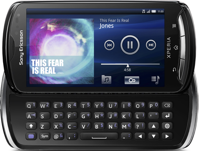
Let’s get one thing straight, the Xperia isn’t a head turner. Take off the badge and you could mistake it for any number of the other 3.7 inch smartphones out there. Things are slightly better with the keyboard out, especially when the purple alternative characters are back-lit. Sci-fi geeks will love the general other worldliness of it. Even that won’t make you want to write loving odes to it though. It’s almost as if this was Sony Ericsson’s attempt at deeply embedding camouflaged phones in shops around the world.
Feel
What’s particularly worrying is that the Xperia Pro doesn’t seem to have gained anything in return for losing its looks. Well certainly not when it comes to ergonomics. Holding the phone in portrait just doesn’t work. Put your hands in the most natural position and the HDMI port will poke into your finger while the speaker dock jabs into your thumb. Change hands and it’s the same situation, just mirrored.
This is especially disappointing. Sony Ericsson is capable of better. The Pro’s sibling, the Xperia Arc S, feels like it was crafted by superior beings just for your hands. Put it in someone else’s hands and you’ll feel an instant tinge of jealousy. Not so with the Pro.
Features
The thing is, under those mid-level-accounts clerk looks, the Xperia is packing some pretty decent features. In general, it feels likes the Xperia Pro has gone for the opposite attitude of early iPhones when it comes to design: Crammed full of features but in a package about as exciting as tea with the vicar.
Camera
The Xperia Pro rocks an 8.1MP camera and the phone comes standard with an app that allows you to take panoramic shots. The camera is capable of filming in 720p HD. There’s a front-facing camera too. As tends to be the way with front-facing cameras, it’s nowhere near as good, so don’t go thinking you’ll be able to use it for hi-res glamour shots of yourself.
Performance
The Xperia Pro runs Android 2.3, more popularly known as Gingerbread. And for once, the OS doesn’t seem overloaded with manufacturer’s additions. The 1Ghz Scorpion processor is pretty standard for a phone of this type. Thing is, even the biggest, best processor can be used badly. At the very least, I can tell you that the Xperia Pro’s processor isn’t doomed to fail from the start. Even the presence of Quicktime, the drunken fratboy of the software world, doesn’t ruin the party.
Memory
There was a time, not so long ago, when 1GB of internal memory was impressive in a phone. Nowadays I’m not so sure, especially when only 320MB of that is available to the user. Of course the standard 8GB SD card (upgradable to 32GB) goes a long way in solving the memory issues. The only trouble is you have to take the battery out to get at it. No hot-swapping here then.
Display
The 480x 854p display is great. Then again, it should be. After all, it has Sony’s Bravia Engine behind it. It’s also responsive, meaning that you only need to caress it into performing tasks rather than furiously jab and poke at it. Then again, this isn’t an entry-level phone, shouldn’t that be the least you expect?
Overall Impression
The Xperia Pro I had came in black with silver trim. If I were to pick its colour based on character, however, I would go with beige. This isn’t the kind of phone you covet. You don’t make it the background on your desktop. Your significant other will never worry that you’re spending too much time with it. You won’t… I think you get the idea.
What we Like
- The great rear-facing camera
- What the Bravia Engine does to the screen
- The fact that the keyboard lights up purple
What we don’t like
- The way it feels in your hand
- Its distinct lack of flair when it comes to design
Gear it or Burn it?
What are we talking about again?
