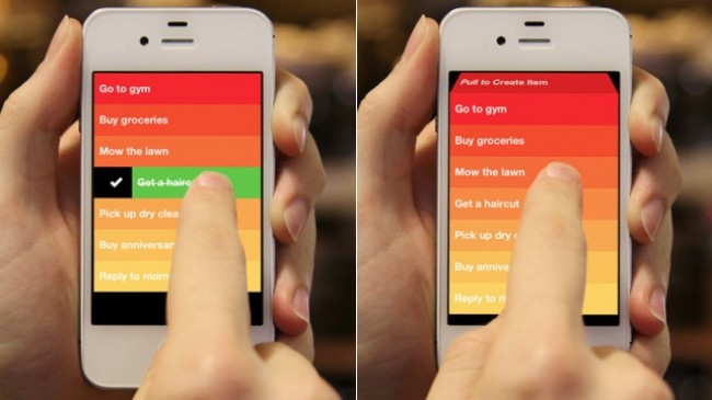
This week I take a look at Clear, an amazing app that is setting the net on fire with its simple, unique approach to creating, using and interacting with lists.
Being in the position that I am right now, writing this column every week for such an amazing site, I constantly strive to build my app of the week posts around apps that I know people will love as much as I do. I see it as a showcase for apps that have fascinated me and have added value to my daily life, whether it be a game, a news reader, or even something as simple as a calculator, I like to think that on Gearburn, apps are celebrated, rather than picked apart or compared extensively to competing apps.
No ad to show here.
To do this, I have to be completely aware of the app environment; what’s new, what’s coming out next month etc. Like any other tech-oriented writer out there, I rely on various tech blogs, Twitter feeds, rumour sites and a whole lot more for my info, and you can imagine the clutter that comes with all of this. So when I first caught a whiff of a new productivity app called Clear (on one of the more ‘reliable’ sites), I signed up to their mailing list and followed the app’s journey into the market. But why Clear? There are thousands of apps that hit the market every single day, why choose this one? What makes it special? Click here for the answer.
Amazing right? How could you not be interested? Launch day came and I quickly jumped onto the app store to make sure that the rumours were true.
The first thing that strikes me about Clear is the incredibly relaxed vibe of the entire app, it’s not trying to be the be all and end all app for tasks and to-do lists, all it wants to do is show you how simple and uncomplicated the entire operation can be. There’s no syncing with other devices or creating a free account to access your lists anywhere, it simply is what it is, a highly simplified and incredibly innovative lists app that just yearns to be touched and played with.
Obviously the main draw card and the reason that this app is receiving so much press in such a short time is because of its completely unique UI. The developers have cleverly succeeded in completely removing all buttons in the app and have taken complete advantage of the iPhone’s revolutionary multi-touch screen and gestures to create a tactile app experience that is completely unique and shows the vast possibilities of what can be done if one just thinks outside the box. Okay so let me get to the app itself now.
When launching the app for the first time, Clear gives you a quick rundown of how it works and provides a simple list to play around with and get used to. It then allows you to start creating your own lists and this is where the fun starts. Something I loved from the get go with Clear is that it really tells you to throw any kind of list at it, and see just how simple it actually is. You can build shopping lists, to do lists for tasks at work, lists of movies and music that you’d like to check out at some point in time, the possibilities are virtually endless. But the real magic happens when building and sorting these lists.
Right away, I was amazed at what Realmac had achieved. Using the touch screen and gestures that everyone is used to by now to perform new tasks that are so simple that it makes you a bit angry at yourself for not thinking of it first.
To create an item on your list, you pull down on the screen and a new block is rolled from the top of your list. To complete a task or scratch something off your list, swipe right, to delete, swipe left. After creating a number of items on the list, you simply touch and hold an item to drag it to another position on your list, and my favorite overall, to create a new item on a chosen place on your list, simply open-pinch (like zooming out on a photo) and Clear will squeeze a new block in the portion that you have chosen. It simply has to be tried to fully appreciate it.
As with all my favorite apps that I have reviewed on Gearburn, Clear’s design is simply beautiful. Realmac have managed to completely cover the entire screen so that not even your battery, signal meter and clock bar show when Clear is running, further pushing the idea that Clear wants to simplify your life. I especially love the way that they’ve implemented a heatmap approach to the priority of your tasks, and the themes that come with the app all look good, although the original is still the best. The icons is also playfully retro and really catches your eye as you look over your home screen.
So don’t now open up your ‘apps to check out’ list and start putting this one in, delete that app, get on over to the app store and get Clear.
