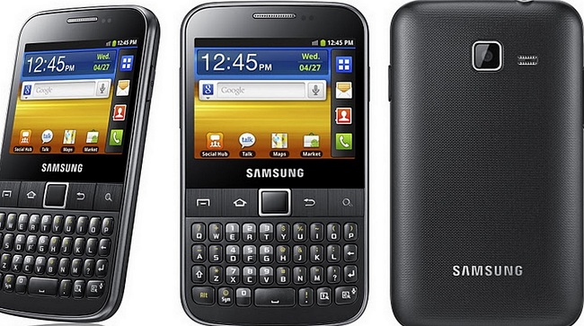
Samsung has done a pretty good job with its Galaxy range so far. Recently the Galaxy SII won best smartphone at the Mobile World Congress in Barcelona. With accolades like that, we expect a certain standard for a phone in this range. Good, I am glad you agreed with me on that point.
No ad to show here.
I think the Y Pro was given to me to review because the boys felt it was beneath them to even be seen looking at a phone like this, let alone actually daring to use it and write about it. So I took one for the team because a phone with buttons has its benefits. There are after all, those late nights that you need to call and a touch screen is less than cooperative. Buttons are often welcomed.
This is basically a B-grade smartphone. I am not sure I want to insult entry level smartphones and place this in the same category as them. It’s the smartphone version of a foreign language soap opera with English dubbing.
Design
It’s nothing fancy, really. About the size of two credit cards, sporting a QWERTY keyboard. It has a 2.6-inch TFT LCD capacitive touchscreen with a resolution of 320 x 240 pixels and wait for it… an optical trackpad. Like most phones in the Galaxy range, the headphone jack is at the top, the on/off button on one side and the volume control on the other. The four Android buttons (Home, Menu, Search and Return) are not capacitive buttons but physical buttons, which I suppose works for some.
Display
This is where things get quite annoying. In this day and age, when I pick up a phone I want crisp clear images or at least a damn good effort at a crisp clear image. I feel when Samsung put out this phone they thought, “hmm we’re doing so well, let’s just give ’em this thing we cooked up in under 30 minutes”. The screen is 2.6 inches. What is this — a BlackBerry? 320 x 240 resolution? My eyes kept trying to adjust to the screen and it just wasn’t having it. I suppose I should be happy that the touchscreen was very responsive.
The camera is moderate, with 3.15 megapixels that deliver images of 2048 x 1536 pixels, but unless you download to a computer all you have is the screen’s infantile display to work with. Some cool camera features include geo-tagging and face detection. Video is alright with QVGA recording at 24fps. There isn’t a secondary camera though.
Performance
It’s not all about the pretty stuff, so let’s have a look under the plastic and see what Samsung packed in there. It runs Android 2.3 (also known as Gingerbread), though I doubt users will be able to upgrade to Ice Cream Sandwich. Packing the power of a 1GHz CPU, there is only so much action you can expect. BlackBerry’s latest offering has more power than this. There is Adobe Flash support so yay, I guess. It has 160MB of internal memory and comes with a microSD card slot, which can take cards of up to 32GB.
Battery
It’s pretty decent, I suppose, for a mobile phone which is barely doing anything to have good battery life. The standby battery life is estimated at up to 800 hours while on 2G and up to 500 hours while on 3G. Talk time is estimated at about 17 hours while on 2G and just over 6 hours on 3G.
Some nifty features
- Stereo FM radio with RDS
- GPS with A-GPS support
- Java via Java MIDP emulator
- SNS integration
- MP4/WMV/H.264 player
- MP3/WAV/eAAC+ player
- Organiser
- Image/video editor
- Document viewer/editor
- Google Search, Maps, Gmail,
- YouTube, Calendar, Google Talk, Picasa integration
- Voice memo/dial/commands
- Predictive text input
Wrap up
I feel Samsung has really let me down with this device. There is so much potential here. Little things that Samsung has done make the user work too hard. Not being able to unlock the phone using the keyboard… I feel it’s mainly there for decorative reasons. There are other devices like this out there, like the LG Optiums Pro, Motorola Fire, HTC Status. I feel Samsung under-delivered here and that I may be better off with a BlackBerry rather than this. Android is not a keyboard OS, it’s a touch-based OS that requires a big enough screen to make the experience enjoyable.
Who is it for?
My uncle Ronny who is so eager to join the world of cool smartphones, but hasn’t got the foggiest what to do with one. Low-range BlackBerry users who feel it’s time to sever ties with RIM but aren’t sure how to transition to Android.
Gear it or burn it?
Burn it. Seriously.
