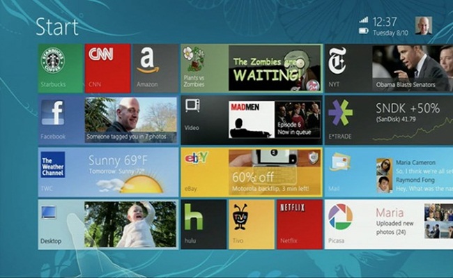
A video has surfaced showcasing mockups of an early version of Windows 8. The video comes courtesy of a presentation made by Jensen Harris, Director of Program Management for Windows User Experience Team.
No ad to show here.
Interested Windows 8 users and developers can have a look at the inspiration behind the design of the current Windows OS. The presentation, given during UX Week 2012, details the evolution and guiding principles behind the new touch-centric Windows UI.
It’s surprising how close to the mockup version, the current OS has remained. The Live Tile styled Start Menu is virtually the same, with multimedia apps showcased in smaller tiles and social media and work related apps in larger rectangular tiles. The Charms side bar is exactly the same with built-in functionality for searching and sharing app content. The snapping of apps is also very similar, with peripheral apps taking up one-third of screen space while users work with an immediate app.
From what we can see, this mockup version is a bridge between the look and feel of Windows 7 and Windows Phone 8 OS’. It seems like a more natural evolution than the current offering. Perhaps Microsoft should have rolled this version out before releasing the aggressively visual Windows 8.
