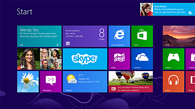
Many opinions are flying around regarding the Windows 8 UI. Some mention that Microsoft are trying to fix something that was never broken while others note that they’re tired of learning new UIs. Let’s face it, the Windows 8 UI resembles a mobile interface and it demonstrates the future of devices. This convergence of UI sees the space between mobile and desktop shrink even further.
No ad to show here.
Are we really ready for that? Windows has, until now, been a universal operating system, lowest end users have been able to easily navigate the OS and high-end users could employ it to its full potential. While Windows 8 does allow you to revert back to the traditional start Menu and taskbar design, will it be present in Windows 9?
The university I work at still has some PCs operating on Windows XP. Windows 7 hasn’t been around for a long enough time to fully penetrate the market. This scenario has become all too familiar in the tech market. Consumers purchase devices, six months later there’s a new item and the same price available. Reverting to the traditional desktop screen might be an easy way out, but is it just putting off the change?
Windows 8 might be a training nightmare, but it’s a step in the right direction. Until now, computer training has been centred around the desktop model. Students were taught how to access programs using the Start menu and desktop. Now that it’s gone, the entire learning process will be remodelled. I’m saying it’s for the better. If students can already use a mobile OS, they possibly already know how to use Windows 8.
There are some changes to Windows that will have users, like me, fumbling around the screen while others will cling onto the new-look OS.
A bold new start
Looking at this screen would be fantastic if I owned a Windows 8 tablet. However on my desktop and a 23-inch screen my mouse feels like its flailing around a cell phone. However, compare this UI to Ubuntu and there are definitely some similarities. That still doesn’t make the UI accessible as a desktop OS. Ubuntu is employed by a minority of users familiar enough with computers to have the ability to swap between two OSs in their daily life.
Everyone focuses on the fact that you can swap to the traditional desktop, but using the traditional desktop view is really just Windows 7 with new icons and no Start button. How do I access applications then? Apps are full-screen constantly and my new best friend is the Windows key on my keyboard you can use to toggle between the Start page and applications.
Where did Windows go?
I spent the first half-hour on Windows 8 trying to figure out how to close applications, which no longer look like windows. The thing is though, you can’t close applications, the new ‘Suspended mode’ runs programs in the background when they are not needed. The only way to close applications would be to open the task manager, echoing Ice Cream Sandwich.
The fact that I never saw those three so well-known icons in the top right hand corner of my screen meant that there was no space lost. Where were all the toolbars? Where was the huge border? Gone. All I was left with was an application that made the most of my screen. What a win.
The best way to approach Windows 8 would be to forget most of what you thought Windows was about. Forget the desktop, embrace the tiled interface and it will definitely make your life easier. The OS is sleek, simple and non frivolous. It’s the best change Microsoft’s ever made.
