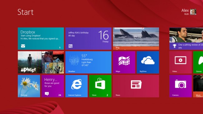
We’ve all seen what a revolutionary design overhaul Windows 8 has been for Microsoft’s famous operating system. The snazzy new Metro interface can be navigated with a touchscreen or a mouse. It’s a smart design for a computing landscape where the line between tablet and PC is steadily eroding.
Of course, longtime PC users know that multiple versions of a new of Windows OS are nothing new. However, the varied PC and mobile world has warranted flavors of Windows 8 that go beyond the typical Professional and Home designations.
No ad to show here.
Windows RT, short for Windows Runtime, is essentially the mobile version of Windows 8. Not to be confused with the Windows Phone 8 OS, RT is currently powering tablets like the Asus Vivo Tab RT and the Microsoft Surface. It’s not available as upgrade, in fact, it’s not sold separately at all. It only comes preloaded on mobile devices sporting an ARM processor.
Built specifically for the ARM processor that powers countless mobile devices, Windows RT is designed to provide everything mobile users expect and a little bit more. However, its schizophrenic reliance on the Desktop, choosey Flash support and limited compatibility make it feel like Windows 8 lite.
So does Windows RT offer a good value for mobile customers? Or are there to many software limitations? Let’s find out.
Design
Just like the standard Windows 8, Windows RT is based around the new tiled interface. It looks great, but since it took the place of the stalwart Windows taskbar, there was no shortage of fan outcry.
The Metro UI can be decked out with numerous aesthetic options. There are over two-dozen colour schemes to choose from, and 20 “tattoos,” designs that take the place of background wallpaper.
The tattoos and color choices mesh nicely. The results range from surprisingly artsy and eclectic, to something that looks like whimsical wallpaper in a child’s bedroom.
While the tattoos and colour schemes give Metro a charming look, users are limited to images provided by Microsoft. This is likely due to the unusual dimensions of theses backgrounds, which are wide enough to fit Metro’s scrollable design. However, the lock screen, which you’ll see whenever you boot or wake your Windows RT or Windows 8 device, can be customized. You’re allowed to use any picture on the hard drive, and those included are rather stylish as well.
If you’ve already been using Windows 8, your transition to a Windows RT device will be especially easy. Simply log in with your Microsoft account and your settings and Internet Explorer 10 bookmarks will follow you onto your new RT device. Any apps you own can be downloaded individually or en masse, and Skydrive, Microsoft’s cloud solution, will make sure your (compatible) files are at your fingertips.
Desktop
The good old fashioned Windows Desktop makes an appearance in Windows RT, as well as Windows 8. That means customizable wallpaper, folders, the Recycle Bin and the Control Panel are here as well.
The Start button has been replaced with an Internet Explorer icon, which provides quick access to a familiar tabbed browsing experience. There’s also icons for Word, PowerPoint, Excel and OneNote, the four Microsoft Office 2013 programs generously included with Windows RT.
These are the only applications you’ll run from the desktop, as Windows RT, unlike the full Windows 8, does not allow third-party applications to be installed there.
However, there’s still a lot of the classic Windows functionality that can be accessed from here. Drag and drop file management is still there, and this includes importing and organizing media from USB thumb sticks and hard drives.
There’s even the old fashioned file registry and DOS prompt. These functions are strictly power user territory, making their inclusion a bit of anomaly, since the desktop is so limited on Windows RT. We’re not sure what can be done with them besides damaging the Windows file structure.
Overall, Windows RT’s tiled Metro Start Screen has the exact same strengths and weaknesses as it does on Windows 8. It’s very attractive, works extremely well on a touchscreen, and does an excellent job of displaying your primary apps. It takes some repetition to grow accustom to the layout, but once you learn it, your fingers will fly.
When it comes to the more under-the-hood functions, such as adjusting settings or managing apps tiles, there’s an additional learning curve. It’s none too steep, but whether you’re on old-school Windows fan or a first-time user, you’ll find yourself climbing it.
Review originally on Techradar.com and is published with permission. Read the full review here.
