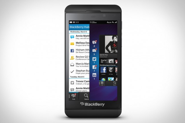
The BB Z10, RIM’s, excuse me, BlackBerry’s new flagship phone, the other being the touch and type Q10, is exactly what BlackBerry needs to pull itself out of the deep, dark hole it’s currently positioned in. Not in sales of course, as BlackBerrys still sell by the millions. But the geek-elite and those “in the know” have all but abandoned this stale and wholly outdated platform. The Z10 is going to change this of course, for better or for worse. I’ll detail the worse later.
For better
No ad to show here.
The Z10 is one hell of a beautiful device. It’s got a 4.2-inch screen, a 356PPI display, a 1.5GHz dual core Snapdragon S4 processor with 2GB of RAM, 16GB internal memory plus support for further memory with an expandable MicroSD slot and one of the most responsive touch screens ever produced. Camera wise, and outside of the incredibly responsive touchscreen picture snapping mechanism, we get an 8MP in rear and a 2MP for VoIP chats. Also, and most importantly it lacks any physical buttons, save for the PlayBook-like media keys and power button located on the sides of the device. A no-button interface is the future, and the Z10 embraces this with glee.
From the chiseled PlayBook-like back, to the gorgeous top and bottom designs, the Z10 is a sight to behold. This really is a new phone, something different and eye-catching that friends and colleagues alike will want to play around with. It’s hard not to gush after the endless “me-too” copycat phone designs of the past few years.
“So how the hell do I navigate this sexy slab?” you’re most likely to muse. Easily, with built-in swipe controls that have been finely honed beyond standard levels of intuitiveness. Want to unlock the screen? Swipe up from the bottom of the Z10. Want to Peek (yes, this is an official buzzword from BB) at any emails, texts or instant messages? Just swipe left, down and the famous unified inbox is displayed. It’s a cool method of checking your mail without interrupting your browsing experience. And with NFC and LTE, there’s speed and effortless connection options.
And what an experience it is. This is true multi-tasking, unlike Apple, Microsoft and Android’s best efforts. With a pinch, apps are shrunk into an app folder, paused and instantly resumed upon activation. It’s a master-class of OS design.
The screen itself is the star of the show. The enormous 4.2-inch display is a touch of genius, displaying HD content with the best of them. Just boot up Angry Birds Star Wars and marvel at the crispness in comparison to the Galaxy S III.
For worse
A phone lives or dies by its apps. And the Z10 has a steady pulse, with a slight flutter now and then. Apps that I’ve come to rely on such as Google Maps, Google Mail, Instagram, FlipBook and more simply aren’t present. When I interviewed Rui Brites, Director of Product Management for Africa at BlackBerry, he assured me that the BB 10 QNX platform (BB’s app creation tool) is still in its infancy and these apps are planned for a “future release”. Happily enough, and unbeknownst to me, any Android app can be sideloaded onto the Z10. So with a bit of software trickery, you can use non-native Android apps on your new BlackBerry, and in a future article, I’ll explain how.
But new customers, the “select few” that BlackBerry is aiming its new devices at, are going to be pissed off. Migrating from Android, iPhone or Windows Phone will present its own set of unique issues. Apps we’ve come to rely on simply aren’t there and the 70 000 strong BlackBerry app store is strangely lacking in anything truly useful.
So it’s just the apps that present a problem then? Incorrect. A lack of a home button will alienate most users, as the swiping functions take some time to get used to. And oddly enough, when the phone is in landscape mode, pinch-to-multitask turns the phone back into portrait. A BB10 limitation? Possibly.
Next up is price. This is a premium device, and it’s aimed at the pockets of iPhone 5 users looking for a phone that combines equal parts of business and pleasure. It costs a reported US$630 so start saving those pennies, you’re gonna need them. One of the saddest aspects, and this deeply saddens me, is the 1800mAh battery. That frankly is pathetic and with a screen this pixel-dense, the Z10 may only last 7-8 hours at a push.
Finally, there’s the question of BIS, one of the reasons BlackBerry manages to shift so many units. It’s reportedly going the way of the dinosaur and this is going to put many punters off a purchase. Never underestimate the pull of free data.
The best of a new breed
Despite some minor flaws, the Z10 is the phone to get. It’s strikingly designed, swipe happy and it offers something genuinely new to the smartphone race. Namely a button-free design and one of the slickest OSs ever made. It’s available right now in the UK, and Canada gets the Z10 on 5 February and the UAE five days later. There is of course, plenty more to speak about with regard to the Z10 but we’re reserving that for the full review, coming in roughly two weeks.
