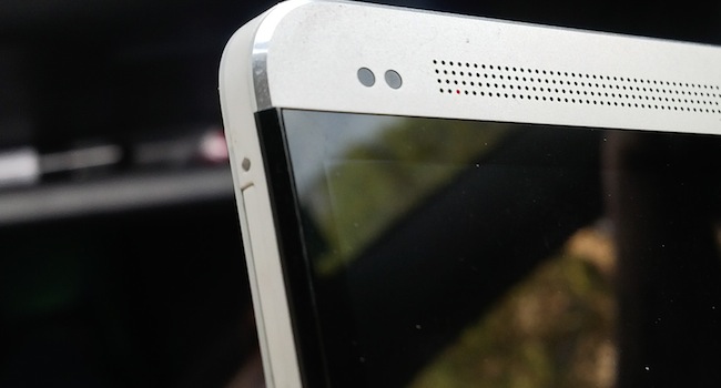
I go gadget crazy, often due to my love for the new and shiny. I even left the shelter of my apartment and flew to another city, just to be one of the first to handle the HTC One. Undoubtedly, it’s one of the most well designed phones I’ve ever seen and consequently, the iPhone 5 finally has a phone which has instantly dated it. Aesthetically, at least. Here’s what I mean:
No ad to show here.
40 Minutes
That’s how long it takes to factory-produce the ultra slick unibody aluminum shell. The 4.7-inch screen is sandwiched on top of the HTC One and becomes the prettier child of an iPhone 5 and the Z10. I can’t stress enough how fetching the HTC One is. HTC has put genuine effort into the One and it’s hard not to notice. The HTC One is featherweight in your hand, but is weighty enough at 143g to feel compellingly mature.
iPhone 5 developed my love for chamfered edges, I’m glad to feel it again on the One. The One looks and feels like a 60s Sci-Fi spaceship. The iPhone 5 feels like a marble tile, the Z10 an executive’s wallet. It’s all down to taste, but I like the One more.
HTC throws around words like “Zero gap construction” and “Infinity Glass”. Running my fingers over the HTC One seemed to prove the Zero gap construction theory, and the Infinity Glass is just a nice way of saying that the phone is nigh-on scratch-proof and glare resistant. It’s partly true, but it was still hard to read in very bright light. It’s a well-designed phone and beats the hell out of any current smartphone, looks-wise.
Dull but soulful interface
HTC’s Sense UI (version five) has been reworked until it’s barely there. The first thing you’ll notice is that the lock screen now has four app shortcuts from the home screen, as well as the unlock toggle. Opening the phone reveals Blinkfeed, a Flipboard-like interface that combines social updates, app notifications and whatever else the internet can throw at you. In theory, this is going to be a great way of truly digesting our daily lives. I’m not sure of the practical advantage of this though, as it’s really only useful when you’re showing it off to your friends. I love the look of Blinkfeed, but I’m almost positive that I’ll ignore it for standard notifications after a day or so of use. Blinkfeed is on by default, but can be disabled if need be.
Swipe to the right of Blinkfeed and the traditional Android homescreen appears. Thanks to the bumped-up resolution, the app icons look amazingly crisp. It’s all Android Jellybean goodness from here. But it seems that HTC has distanced itself from the usual app display. Tapping the app button reveals a single vertically scrolling window filled with all current apps.
The Home button has also been revitalised, with a single tap now revealing all open apps displayed in a grid format. It’s a touch easier than the old method of scrolling vertically through the apps in older versions of Jellybean. It’s very much in line with how the BlackBerry Z10 multitasks. Finally, Google Now seems to spring up instantly when the Home button is long-pressed. My point is, that it seems more integrated into the device than previous efforts.
A bit about the internals
I’m currently loath to discuss phones specifications. Everything seems to be heading towards a zero-point, a fine line where every phone is as fast as the one before it. The only thing that seems to differentiate the identikit internals of 2013’s phones are the looks and UI. Phones are the opposite of humans — it’s whats on the outside that counts. Highlights of the HTC one include:
- 1.7Ghz quad-core CPU
- 4.7-inch display with an insane 468PPI
- 2GB internal memory
- A featherweight of a phone at 143-grams
- A choice of 32 or 64GB external memory
- LTE or HSPA (region dependent)
- NFC
- HTC BoomSound. These are dual stereo speakers, and it sounds fantastic for a phone.
- 13MP “Ultrapixel” camera. Pictures looked to be the same as the ones I took on my iPhone 5 and BB Z10. Further testing is required.
- A 2300mAh battery
A beefy phone, but it’ll be the apps, user choice and UI that win the day. Thankfully, the slimmed down, practically retro look of the HTC One’s UI is an eye-pleasing winner. For the full review, we’ll go into full detail regarding the internals. For now, just know that the HTC One competes nicely with every other high-end phone on the market. And here’s the specs to prove it.
Everyone will look at the HTC One and wonder where the hell they can buy one, if they can find one. The HTC planning to launch the One in South Africa end of April. And when it does, it’ll be competing against the Samsung Galaxy S IV while rumours of the iPhone 5S swirl around, casting buyers remorse. I hope therefore that the One comes out sooner than later.
When it does arrive, some sites have priced it upwards of US$700.
