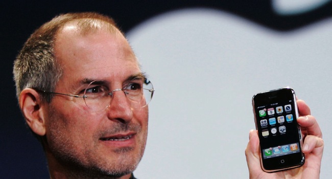
According to the San Francisco Examiner, the next two iPhones may have been approved by the late Steve Jobs. During a talk on mobile phone thefts, San Francisco district attorney George Gascón said that he was told by Apple that the next two iPhones “preceded Tim Cook.” Gascón was in discussions with Apple’s government liaison. So if Jobs had his hand in upcoming iPhones, there’s a lot we can expect, and eliminate. This means that at least two decent phones were introduced before October 2011, the month of Jobs death. All of the below is purely speculative, but is in line with Jobs’ design ethos (and appears in Walter Isaacson’s Steve Jobs biography).
No ad to show here.
A finely designed phone
Jobs was known for saying “craft above all”. So at the very least, we can expect a well-designed phone that perhaps even pushes us past the chamfered edge seen in the newly designed iDevices. Maybe we could see a wraparound iPhone screen, as seen in this Apple patent. The uncovered design would have a “flexible display that returns to the original shape.” Would jobs have accepted this? If the design was sound, and the technology capable then yes, he would have rigorously tested it reached the production line. Jobs wanted clean and orderly. So the next iPhones may not even change in shape at all. Stick with a winning formula and all that.
Making a connection
Jobs understood what a customer needed. He practically predicted what customers wanted with the iPad, therefore the next iPhones would be exactly what we need, in terms of technology and practicality. So add-ons like the fingerprint reader, laser keyboard and a “self-awareness” feature would fall by the wayside. Like it or not, iDevices are simplicity. It takes a few minutes for any user to jump into an iDevice. Android, BB OS 10, these mobile operating systems are powerful, but come with a steeper learning curve. Understanding what a consumer needs, before they need it is an Apple design hallmark.
User-friendly and button-free
Apple, and mostly every other hardware maker, is going to have to start removing physical buttons from its devices. The Z10 did it, and it’s all the better without a home button. When Jobs made the first Macintosh, he designed it to look like a human face. Jobs spent a lot of time in department stores studying home appliances and applied that “home friendly” design ethos to most facets of his work. This is why the button, in the next iPhone, would have to go. We’re evolving towards a solid slate of glass, think of a smaller Slate minus the touch-sensitive Windows button.
Simplicity above all
This is another good case for a fingerprint reader free iPhone. Jobs said “People know how to deal with a desktop intuitively. If you walk into an office, there are papers on the desk. The one on top is the most important. People know how to switch priority. Part of the reason we model our computers on metaphors like the desktop is that we can leverage this experience that we already have.”
Less is more, to coin a horrible cliche. These design extras are not part of the Apple design document. The product we have now, is something that may not change in this decade still. The iPhone is all about straight lines, excellent design, a very clean and simple OS. Design had to be skeuomorphic of our daily lives, like in the desktop example. Above all else, expect the next two iPhones to look very much like the iPhone 5. Whatever Jobs left in his design vault, it won’t stray too far from the flock.
Image via Macworld.com
