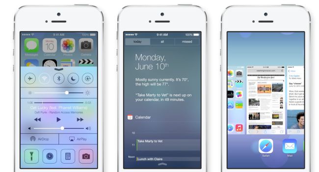
The recent release of Apple’s freshly overhauled iOS 7 has been a breath of fresh air to most users who felt like the company had lost what made it special. To me, it feels like I’m using a completely new phone and my faith has been restored in the rigid ecosystem that is Apple. But aside from the big update to the OS, Apple fans everywhere were frothing for compulsory updates from our favourite developers who, in an effort to stay on top of their respective fields had to, for lack of a better phrase, adapt or die. Here are ten of my favourite Apps that have the iOS 7 gloss on top of them.
No ad to show here.
Evernote
The popular cross-platform productivity-enhancing, note-taking juggernaut with the elephant icon capitalised on the launch of the updated operating system to introduce its seventh version and damn, it is beautiful. Taking its design cues from the overhauled operating system, the new Evernote features smart layouts, a new audio recorder and fast access to the app’s most used features, all packaged in a breathtaking new green interface that looks and feels like it was designed by Apple.
Facebook
The social media giant was obviously one of the first apps to be redesigned for iOS 7 and in terms of redesign, they’ve gone a lot further than most. Naturally, they’ve flattened everything to help it look natural and understated. They’ve also gone ahead and redesigned the user interface to allow for easier navigation of the app and its various sections.
Nike+
Always ahead of the game in terms of design and usability – Nike+ does not disappoint with its new look and feel. The familiar reds and whites have been flattened, but still appear spruced up and ready to help you achieve your fitness goals. Maps have been updated and made to look flashier while the addition of Nike+ challenges add a new form of gamification to an app that has always been ahead of the pack in terms of special features.
RunKeeper
Besides the radically simplified icon, RunKeeper’s redesign makes the app feel lighter and cleaner than ever before. While keeping the existing functionality stable and fresh, the team at RK have also addressed a number of known issues that users have experienced with the previous versions like bringing the map to the run screen, making the activity tracker easier to set and making the log button a lot easier to find.
SnapGuide
SnapGuide has always been the type of app that needed to look good in order to work, and with their latest redesign, they’re basically making sure of that. Images look sharper, text is easier to read and the guides are so much easier to browse through. Add to that the fact that the amount of content is constantly growing and you’ve got one killer app for iOS.
Foodspotting
Of course, a visual guide to food and where you can find it has to look good. So naturally, being the biggest app in that category, Foodspotting released a belter of an app update that will make you lick your screen with hunger. Other than the tasty new visuals, they’ve also added filters and places, locations and maps, and more info about each dish and place. Delicious.
Pocket
One of my favorite apps of all time, in terms of functionality and design, has brought out version 4.6 specifically for iOS 7 and it is mind-blowing! Aside from fresh new changes to every single screen and a new app icon, it comes with instant background sync, faster list loading and an updated reading experience. If you have not yet checked Pocket out, please do yourself a favour and do so. Thank me later.
New York Times
Enhanced imagery combined with clean design and streamlined navigation – this is what the new app descriptions tells us about the NYT. But what do we think? Redesign brilliance – that’s what! From cross-platform article saving to AirDrop article sharing, the newly designed NYT app is definitely worth checking out if you’re a fan of the publication.
Shazam
Everyone’s favorite song dictionary has been released with a fresh looking update and a handful of useful new features to keep you on your path of discovery: shazam sharing (you can now mention friends), shazam from last night (reminders of your latest discovery when opening the app again) and improved recognition technology that speeds up your music discovery immensely.
TED
The app that you should definitely have on every single device, no questions asked, has emerged with a freshly redesigned UI that looks amazing on iOS 7. They’ve also improved the audio bar with a time seeker and a 30-second rewind function. Beautiful to look at and way easier to navigate through.