Call me a Neanderthal, but I miss typing on a phone with a physical Qwerty keyboard. Nothing quite beats the tangible feedback a springing key with defined edges provides. BlackBerry’s now largely extinct Bold range had the best example but now, although touchscreen smartphones are more powerful than we could ever have anticipated then, typing anything of length on one is an unwanted chore.
No ad to show here.
Enter the third party keyboard app that hopes to kill Qwerty for good — ETAOI Systems’s 5-TILES keyboard, available for Android and likely iOS too in the coming months.
Novel and attractive design
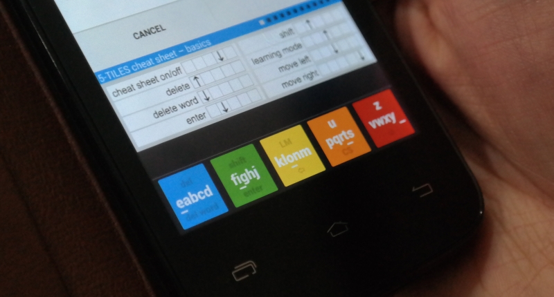
The self-proclaimed “keyboard designed for the future” features a slim five key-layout in a bar as opposed to the usual barrage of Qwerty tiles, saving around 70% of screen real-estate. Those used to Qwerty (or even Dvorak) will be puzzled by the layout’s non-normative design, but it is a very attractive app. The standard skin comes in the pastel rainbow colours, which isn’t as garish as it sounds. It looks much better than what has emerged from Microsoft’s current tile-obsessive UI design studio although in landscape mode the bar failed to span across the entire width of the screen.
The introductory page is also easy to navigate. Controls for sound, haptic feedback and Auto Complete are all adjustable. A host of European-based languages are also natively supported, but sadly that’s about all for now which will win no favours with international users. Skins can be applied on the paid version too, which’ll set you back around US$4. The free version however, is more than adequate for test purposes and is the more widely used variant judging by Google Play’s metrics.
A never-ending typing lesson
Apart from the different appearance, using 5-TILES is unlike any keyboard I’ve tried before.
According to the layout’s creator, Michal Kubacki, the 5-TILES’s one-finger swiping method can be fully mastered in under 30 minutes, which I retort is an over-idealised statement. It took me well over a week to learn its ins and outs, commands and all, and to this day, I still find myself staring at my phone, aimlessly trying to navigate the tiles to type something as simple as my name. It makes messaging, or typing a lengthy password, even more of a chore than with Qwerty.
Perhaps it’s the positioning of the keys that threw me off. As noted previously, each of the five keys house multiple letters. Said letters are typed using a tap and swipe method that corresponds with the position of the intended letter and the position of the letter. For example, to type a “C” — which is the fourth letter in the first key — the user taps the first key and swipes towards the fourth key. It sounds simple, but it feels ungainly and unnatural.
Essential commands like DEL, SHIFT, ENTER and directional keys are accessed through a downward or upward swipe of their respective keys. A cheat sheet is available for reference, but it’s incredibly foreign not having those commands staring you in the face, but after about a day, their locations become relatively familiar — more so than the keys themselves.
Accessing punctuation and special characters requires some specialised gesture-based voodoo, which induces much head scratching. Coming from months of learning SwiftKey’s ins and outs, it was troubling more often than not to find the period and commas not positioned in a predictable place. More often than not, I abstained from punctuation altogether and reverted to an abbreviated, IM-tainted version of English. It was the only way I could come close to my current typing speed but not ideal for mashing out work-related emails.
Potential for wearables, not smartphones
For its host of drawbacks, 5-TILES does come with its fair share of glinting positives. Although it’s a horror to learn, more screen for important content means you won’t need to close the keyboard to read an IM, for instance. It’s also much easier to type on it with one hand than a Qwerty, as a simple finger swipe in opposing directions is all that’s needed.
For these reasons, ETAOI Systems hopes to infiltrate the wearables market with this keyboard. Michal Kubacki also has desires on being Google Glass’s keyboard of choice, noting that the linear swipe-motion is perfect for the Glass’s touch pad.
I have my doubts about its mainstream smartphone implementation though. It’s novel sure, but it doesn’t give consumers enough reason to ditch Qwerty to learn a completely new and rare keyboard layout. The paid version also has some nice additions, but it’s not enough to justify buying it either. I can see this keyboard being a big hit on smartwatches and the like, but not smartphones.
Like I said before, 5-TILES is not intrinsically terrible, there’s just equally nothing wrong with the Qwerty system.
Verdict: ETOAI’s 5-TILES keyboard is new and an interesting concept for small screens, but it takes too long to learn for no real end reward. There are only advantages that come with the compact layout for wearables but as a smartphone keyboard, it leaves a lot to be desired in the face of Qwerty’s dominance. Don’t give up that Qwerty keyboard, or the US$4, just yet.
Score: 4/10
