Update: As if this couldn’t get any better. The same site that leaked the pile of purported screenshots has just leaked a video of the OS in action.
No ad to show here.
We wondered how the start tiles would operate alongside the returning start menu, and it seems “Pin to Start” functionality will overlap quite a bit. Additionally, the new animations are crisp and swift, which should benefit underpowered machines. But we have vastly polarised opinions in the office about the fledgeling OS, but what do you think? Let us know in the comments.
The world may be one step closer to knowing what’s going on at Microsoft’s OS testing table this month. A new batch of screenshots have allegedly leaked from Redmond, depicting Microsoft’s Windows 9 or “Threshold” Technical Preview. It’s highly likely that these are authentic, but Microsoft has not yet responded to the images.
Thanks to German Windows-centric blog WinFuture, there’s an album of 21 glistening snaps of Microsoft’s latest attempt at crafting the perfect desktop computing operating system. So what can we make of it thus far?
What to get excited about
Well, judging by the album, there are a slew of UI improvements over Windows 8.
Credit given where its due, there are some tasty new features, including the new shadow effects and font anti-aliasing in the menus and desktop. The new virtual desktop bar at the bottom of the desktop, just above the task bar, also looks sleek and extremely useful, and will probably be used almost as often as the CTRL+ALT feature.
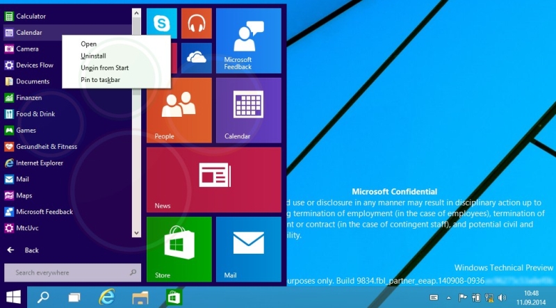
The start menu has returned, and sports the return of the customary Windows 7-like search strip under the menu items, also reminiscent of Microsoft’s last good OS. So, changes for the good then?
Sadly, that’s about it.
What looks absolutely horrid
What is apparent is plague of Windows 8 rearing its ugly head through the new flat and cartoon-like design language, but with even more vapidity (as if this was remotely possible before).
Included in the batch of leaked screenshots is the new, even more unintuitive start menu, which features a right-wing of large, Windows 8 tiles which will likely tick through relevant information. Previous leaks suggested that this would be a glowing feature, but it seems Microsoft has tweaked it substantially since then.
The task bar (lo and behold!) hasn’t been scrapped but instead adorned with new icons, including a search icon, a virtual desktops icon (well done Microsoft for finally catching up to Ubuntu) and a new explorer icon, that looks rather tacky.
Unfortunately, and perhaps the most awful design decision yet, the Control Panel the world has come to know and love in Windows 7 is completely dead, and in its place lies Windows 8’s “PC Settings” dialog. It was, and probably still is about as intuitive as driving a car backwards down the freeway whilst blindfolded.
But with less than two weeks before Microsoft allegedly previews the new OS on 30 September, the design team will likely have a slew of UI bugs to iron out. So far, even though there’s plenty to criticize, it looks promising compared to Windows 8. Frankly, anything would be better than 8.
It’s not quite Windows 7, but we’ll likely never see a Windows OS as good as 7 again.
Images: WinFuture
