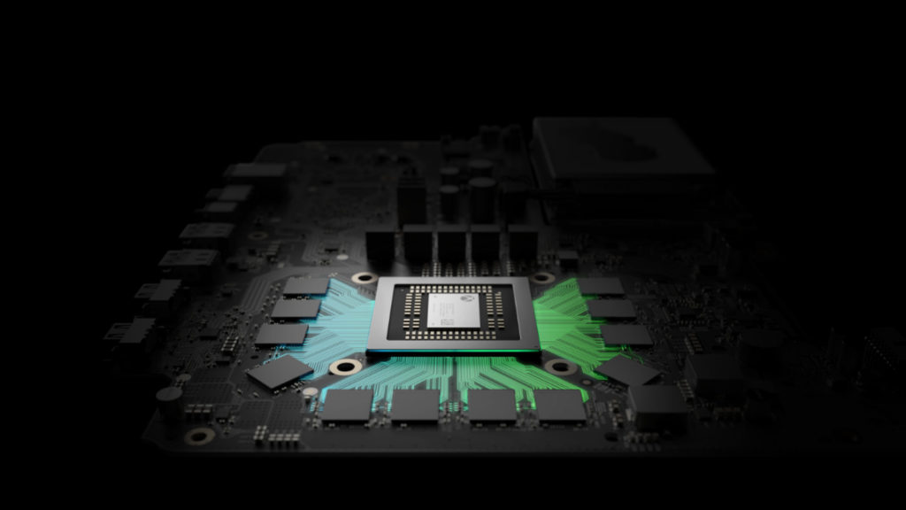
We still don’t know what Microsoft‘s Project Scorpio will look like, and it’s expected that we’ll only know at E3 in June. But Microsoft has revealed what its development kits (devkits) look like — and it’s a pretty interesting design.
The Redmond company showed off the design and other details to Gamasutra, revealing a console that has a few stylings in common with the Xbox One S, such as the white colour and Xbox logo. But otherwise, it brings to mind a set-top box, with five or six buttons along the front of it.
No ad to show here.
However, the coolest feature might just be the bottom half of the devkit, which features an OLED screen for readouts, such as frames per second and other development-related information. The bottom half of the kit also sports three additional USB ports.
Microsoft also made a few more changes to the devkit compared to previous consoles, such as cooling vents on the sides of the kit (in addition to the top). Apparently, developers love to stack them.
“I kid you not, I go to first-party studios, I go to third-party studios, and they have dev kits stacked. But they basically built blocks, or used Legos, as a gap so they could vent,” a Microsoft representative told Gamasutra.
Microsoft has detailed the Xbox Scorpio devkit, showing off an image as well
Another interesting note is that, while the retail Scorpio will have 40 compute units in its graphics chip, the devkit has 44 compute units. The RAM has also been doubled from the retail version’s 12GB to 24GB, while the devkit also gets a 1TB SSD in addition to the retail version’s 1TB hard drive (2TB of space in total).
“At a high level, it’s much easier for a game developer to come in higher and tune down, than come in lower and tune up. Or nail it. That just rarely happens,” the representative explained. “Our overarching design principle was to make it easy for devs to hit our goals: 4K, 4K textures, rocksteady framerates, HDR, wide colour gamut, and spatial audio.”
