As the saying goes, size matters. But in the case of smartphone users, it’s not always the largest devices that get the most love.
In fact, as phones get bigger and bigger and bigger, the compact flagship market resembles something of a ghost town.
No ad to show here.
The sector that Sony and Apple once commanded so defiantly, is now all but gone, and compact, powerful devices are gone with it.
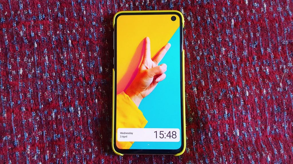
But, this year, there seems to be a renewed focus on devices that humans can actually use with one hand. The Samsung Galaxy S10e is one such example.
As I’ve had the bright Canary Yellow version in my hand for the past 48 hours now, here’s my early point-by-point impressions of Samsung’s smallest S10 device.
Samsung Galaxy S10e: the brilliant, beautiful moments
- Even though it has a 5.8 inch screen, it feels compact and comfortable in the hand.
- You’ll need to “learn” how to use the phone with one hand, but it’s definitely more doable than the S10e’s larger siblings.
- The colour. If you needed a single reason to buy this phone, it’s the Canary Yellow variant that’s as bright and colourful as a field of tulips.
- Samsung bundles a hard plastic case in the S10e’s box, which mimics the colour of your device. No dreary clear plastic option here.
- The case also sits flush to the body, hiding the camera protrusion yet has enough clearance to ensure the lenses won’t be scratched by placement on a table.
- Although the S10e’s screen isn’t using Samsung’s sAMOLED technology, the blacks are deep and the colours pop. It’s bright enough to use outside.
- OneUI’s notification management is good on the larger S10 variants, but on the S10e popups are smaller and more compact, suiting the size of the screen. It’s incredibly smart, but easily ignored.
- USB-C. Headphone jack. Yes, and yes.
- The side-mounted fingerprint scanner makes using authentication apps, like LastPass, your banking app or Authy, much easier than an underscreen fingerprint reader.
Samsung Galaxy S10e: the questionable decisions
- The side-mounted fingerprint sensor is not in the centre of the phone like Sony’s compact line, but much higher up the frame. Again, some adjustments need to be made when picking up and unlocking the device, but it’s not a deal breaker.
- The S10e’s selfie camera, mounted in the top-right of the screen is an acquired taste. It cuts out a considerable amount of taskbar and top-screen real estate, and for a smaller phone, that’s an issue.
- You’re getting a single-channel speaker at the bottom of the phone. If you’re coming from a Galaxy Note 9 or LG V40 ThinQ, this is going to disappoint.
Samsung Galaxy S10e: the aspects that make it hard to love
- Samsung’s bundle of bloatware makes an appearance on the S10e too, including Facebook and Facebook Services. LinkedIn is now too installed by default.
- The volume rocker and power buttons are not as sturdy as those on the S10+. There’s a bit of vertical play. Not a fan.
- Samsung’s included screen protector has a sharp edge which makes swipe gestures unpleasant. This is true for the bottom of the S10e as well as the sides.
- Samsung Pay is set to open through a bottom home button swipe on the home screen by default, making swipe gestures awkward to use. It’s a UI element that I shouldn’t have to switch off. It should not be enabled by default.
- You will have to increase the animation speed in developer options if you don’t want the S10e to feel sluggish when traversing menus, or tapping UI elements. This even with the “reduce animation” option checked.
- It’s 2019, and selfie cameras still think that everyone should look like rubberized humanoid robots from our soon-to-be dystopian future.
The above notes are initial impressions, and nothing more. Take these with a grain of salt, especially since I have two more weeks with the device.
As for whether my opinions change, and whether the S10e can win my heart within this time period, only time will tell.
Still, it’s difficult to not love a bright yellow smartphone whoever the manufacturer.
Feature image: Andy Walker/Gearburn
