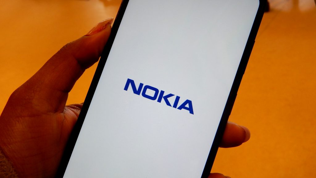
My first thought when unboxing the Nokia 3.2 was “Damn, this phone looks smart”. Unfortunately, like a really bad relationship, I found the device more and more annoying the more time I spent getting to know it.
Don’t get me wrong though, there are a fair few things to enjoy about Nokia 3.2, so I narrowed my week-long experience into a few choice talking points.
No ad to show here.
The exterior
On the outside, the Nokia 3.2 is an attractive 6.2-inch device with HD+ display. Its black exterior, teardrop notch and smooth finish give it an overall slim, modern look that makes you feel like you’re handling something of flagship quality.
The smartphone’s power button stands out in white just below the more lowkey volume button. Unfortunately, the phone’s dedicated Google Assistant button, on the other hand, is placed exactly where you can accidentally push it multiple times while trying to do anything but talk to the AI.
Otherwise, the phone is clean, simple and fresh to look at.
The interior
Though the Nokia 3.2 looks and feels good to handle, the internal workings of the device, which run on Android 9 Pie, are not as smooth.
By the time you’ve installed your essentials, you’ve taken up most of the 3.2’s 16GB of storage. And, by the time you start snapping pictures or downloading your favourite memes, Google is already asking you to clear up some space.
Granted, this can probably be solved by adding a microSD card or opting to buy the 32GB version, but it’s still quite disheartening to see a “clear storage” notification every time you pick up your phone.
Although apps like Instagram, WhatsApp and Twitter work seamlessly on the Nokia 3.2, you might find that the device isn’t fond (or capable) of deleting a large batch of photos. In fact, I had to manually select shots in Google Photos and delete them one by one, because the phone simply refused to process the “select all” option.
By the time you’ve installed your essentials, you’ve taken up most of the 3.2’s 16GB of storage
Weirdly enough, however, if not for a few minor freezes and slow loading times, I can barely fault the Nokia 3.2’s handling of apps like Adobe Lightroom and Adobe Illustrator Draw.
This isn’t cause for celebration though, because the phone also features a face-unlock option that is completely useless unless you’re standing in the same light, with the same expression, at the same distance from the camera you were when you set up the security feature.
Battery life
One of Nokia’s key marketing points for the 3.2 is its two-day battery life. I used the phone and its 4000mAh battery for at least 12 hours a day and only needed to charge the phone up again by the next afternoon.
Roughly, this means that I was able to use the phone for one and a half days before needing a recharge. Needless to say, the Nokia 3.2 does indeed have excellent battery life.
Google apps
The Nokia 3.2 is heavily reliant on Google apps. In fact, the phone quickly becomes suffocating because there is a Google app in every direction.
Want to look at your pictures in a simple gallery? Sorry, you’ve got Google Photos begging you to back-up the three photos you just took.
Want to take notes? Sure, just sign into Google’s Keep Notes so your shopping list from two weeks ago can be saved on the cloud for when you need it again.
Personally, I just don’t like the idea of Google being so integrated into my smartphone, but that is what you’re getting with an Android One smartphone: a device built entirely around the Google ecosystem.
The cameras
To be fair, the Nokia 3.2’s rear 13MP camera did impress me. I was able to take some sharp shots during the day, which I could further enhance without losing a great amount of detail.
There’s not much freedom with the camera, however, and it doesn’t expose or adjust to light very well.
On the other hand, the rear camera is a dream in comparison to the Nokia 3.2’s selfie camera.
The front-facing 5MP camera on this device is so terrible, I’m almost sure it was added as an afterthought compared to the rest of the phone.
The selfie cam seems to have a sepia filter with extra noise pre-set, so your selfies look grainy, warped and far too warm.
Final thoughts
The Nokia 3.2 is good enough if you’re looking for a Google-powered phone with a few trendy gimmicks — it’s got a teardrop notch, rather attractive display and face unlock.
The device can also handle a fair number of essential apps, such as WhatsApp, Instagram, and Twitter, so staying online and up to date won’t be a hassle either.
Beyond its smart appearance, the phone is a bit slow and fidgety.
The biggest flaw comes in the form of its cameras. While the rear is pretty decent, with much detail recoverable on a mobile editing platform like Adobe Lightroom, I wouldn’t advise anyone to snap a selfie with the Nokia 3.2.
In the end, the Nokia 3.2 is not a bad phone for R2399, it’s just not the phone for me. I want something with more photographic power, less Google and, perhaps, a fingerprint sensor (you’ll have to opt for the 32GB variant for this luxury).
In fact, I will happily go back to my Huawei P8 Lite 2017 while I decide on my end-of-year upgrade.
Feature image: Shereesa Moodley/Gearburn
