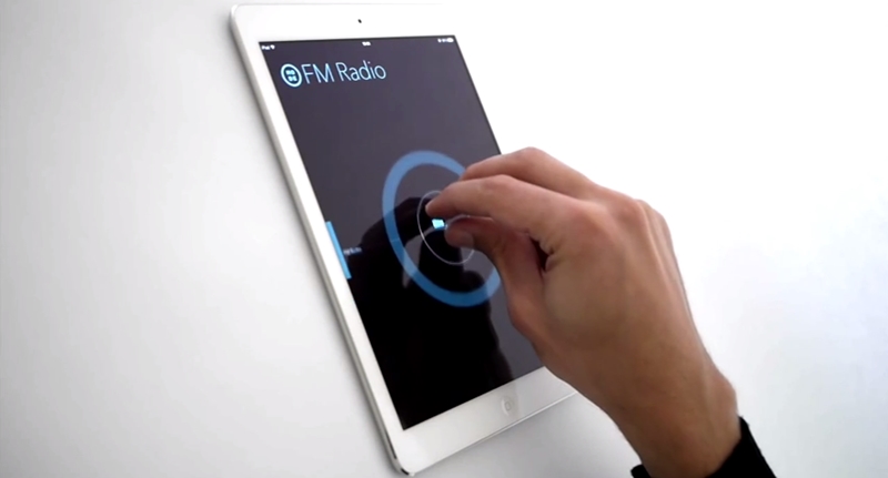
If we’re brutally honest, the touch-screen interfaces in most cars aren’t great. As Motorburn contributor Ryan Bubear notes manufacturers have a habit of burying important functions, forcing you to take your eyes off the road for dangerously long periods of time.
Part of the problem is that, in many cases, car makers have just tried to cram traditional button controls onto a tablet screen. As anyone who’s had to deal with that kind of setup will tell you the experience just doesn’t translate. Something that once required just a pinch of muscle memory now means potentially having to concentrate on a screen for long enough to veer wildly into an on-coming truck.
No ad to show here.
But what if there was another way? Well product designer Matthaeus Krenn, reckons there might be.
Krenn’s concept, which is currently available for testing on the iPad, uses a single gesture performed in different ways to control up to eight different functions. Moving two fingers up and down, for instance, would allow you to change the volume of your car’s stereo, while using three fingers would allow you to choose which audio input you want to use and so forth.
Holding your fingers further apart meanwhile would set off a whole different series of functions.
Of course, the system’s not perfect. It requires some level of learning (although probably not much more than we all faced the first time we used a tablet) and there’s no way that this kind of system would be able to control all the functions in a contemporary car without the addition of a few more gestures. Still, it probably wouldn’t be the worst thing if a car maker were to poach Krenn.
