It was tough, but we did it. We overcame.
Yes, dear reader, weâ€
No ad to show here.
But while the third-generation model is overall an utterly convincing package, thereâ€
Yes, weâ€
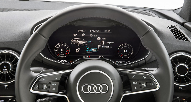
Gone are the traditional instrument cluster dials (and any trace of analogue), replaced by a nifty 12.3-inch TFT display that also incorporates all the usual suspects from Audiâ€
The setup serves to declutter the dashboard (yes, that means the centre-mounted, retractable screen familiar to many Audi drivers has been given the boot) in the most extreme of ways, with just a handful of conventional buttons making the cut.
Cleverly, the Ingolstadt-based automaker has also relocated the climate control switches (and mini-displays) to the air-vents themselves, thankfully choosing not to follow the in-vogue example of many other manufacturers and bury these functions dangerously deep within the interface. Itâ€
But back to that smart digital screen. The driver has the option of toggling between two distinct display styles with the simple press of a dedicated button on the multifunctional steering wheel. In “Classic†mode, the speedometer and tachometer dominate the display, while the remaining area between the two clocks is filled with information relating to things such as navigation, phone, infotainment or trip computer (one can scroll through these various tabs).
In “Infotainment†mode, however, the two dials shrink dramatically and scurry to opposite ends of the screen, freeing up oodles of space for whatever other info the driver wishes to display (we found this view particularly effective when using the maps function of the navigation system).
The screen serves up crisp images and silky smooth animations, with the latter thanks to the use of a lightning-fast graphics processor (Nvidiaâ€
The interface can still be controlled via a conventional rotary pushbutton (or indeed using voice control) – which furthermore incorporates a main menu button, a back button and two toggle switches – sited between the gear-lever and the electronic parking brake.
In addition, the top of the rotary control doubles as a touchpad, which both recognises handwriting and mimics a smartphone with pinch and scroll functions (again, very useful when dealing with maps). But the system can also be fully operated using various buttons on the multifunctional steering wheel, which allows the driver to keep his or her eyeballs far closer to the road.
So, does it work in the real world? Ultimately, yes – itâ€
That said, we were far more comfortable operating the interface using the steering wheel buttons than the rotary control, which – despite its relative familiarity – felt a little less natural by comparison. And the virtual cockpitâ€
But itâ€
The futureâ€
