Everest is Ford’s most premium vehicle in the South African market. Fans of the American brand might counter that statement with Mustang, but Ford’s Pony car sales and supply are limited. Mustang is a niche offering for South African buyers instead of Everest, which is truly Ford’s luxury family vehicle.
Ford product planners know that for all the mechanical engineering excellence present with Everest, from its sophisticated all-terrain suspension to the 3-litre V6 turbodiesel engine and ten-speed automatic drivetrain, it’s the digital screens that matter. A lot.
No ad to show here.
Getting the screen architecture right
Ford’s been a legacy investor regarding infotainment technology. Its SYNC system has long established a standard for other bakkie and rugged SUV infotainment systems to aspire to. And with each upgrade, Ford’s digital specialists have shown an appreciation for the balance between form and function regarding SYNC.
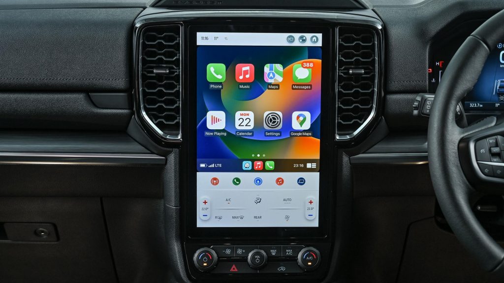
The entire approach of Ford’s Everest infotainment is driven by UX best practices. The infotainment screen is portrait mounted instead of landscape. Why? Because we are conditioned to interact with a touchscreen device in a vertical orientation instead of horizontally.
It is obvious that user behaviour is conditioned to interact with a vertical screen. Despite this, much of the automotive industry’s cabin design regarding infotainment, still use horizontally orientated touchscreens.
SYNC and Smartphone logic
Ford realised more than a decade ago, that the Smartphone industry sets the rules for infotainment and screen interaction. And instead of challenging it, Ford’s follows the form and function of established leaders in the mobile device space. And it shows.
At the 12.4-inch size, on Ford’s most luxurious Everest trim levels, the SYNC infotainment screen benefits from abundant space. And as any UX designer will admit, you can shape a much better menu and function navigation, but having more available selections on screen instead of in sub-menus.
But a large screen is superfluous if software architecture and navigation are illogical. And here, Ford continues to benefit from a very inspired investment from 2017. Those old enough to remember the dominant BlackBerry device era will know that the Canadian technology device brand has excellent UX principles.
Buying the best BlackBerry people
BlackBerry would eventually cede its dominance to rivals, partly because it didn’t anticipate the value of full touchscreen user interfaces, but the core engineering was never at fault. When the company started declining during the 2010s, Ford, recognised an opportunity.
With its headquarters in Michigan, across the lake from BlackBerry’s head office in Ontario, Ford went scouting. And in 2017, it hired 400 Blackberry engineers and developers. The quality of their work, relating to SYNC, has been evident. It’s why the graphics look so relatable, and the haptics are so intuitive.
Works perfectly out in the bush
One of SUV infotainment UX’s most challenging aspects is creating a screen that retains great touch fidelity even when caked with dust. If you are going to explore the treasures of rural South Africa with your Everest, there will be dust ingress.
When you stop for selfies or sample that quaint local coffee or snack stop, dust will get in the cabin. That’s a given. What matters is how good the foundational touchscreen contrast and resolution are.
In the case of Everest, it remains terrific, even with a thin film of dust covering the screen. The touch functions still operate without delay, and even in direct sunlight, Everest’s SYNC infotainment screen displays excellent contrast with terrifically legible graphics.
SYNC is a the differentiator
At a time when the automotive industry is desperately struggling to execute software solutions, Ford’s infotainment is an outlier. Something a legacy automotive brand is getting right.
Bakkie-based SUVs have become the default luxury family cars for South African middle- and upper-middle-class buyers.
Whereas A4, C-Class and 3 Series were once the markers of middle-class success, that market share has ceded to Toyota and Ford, with Fortuner and Everest.
And if you value device synching and infotainment touchscreen quality and UX above all else, there’s nothing in the class to rival Ford’s Everest and its SYNC system.
