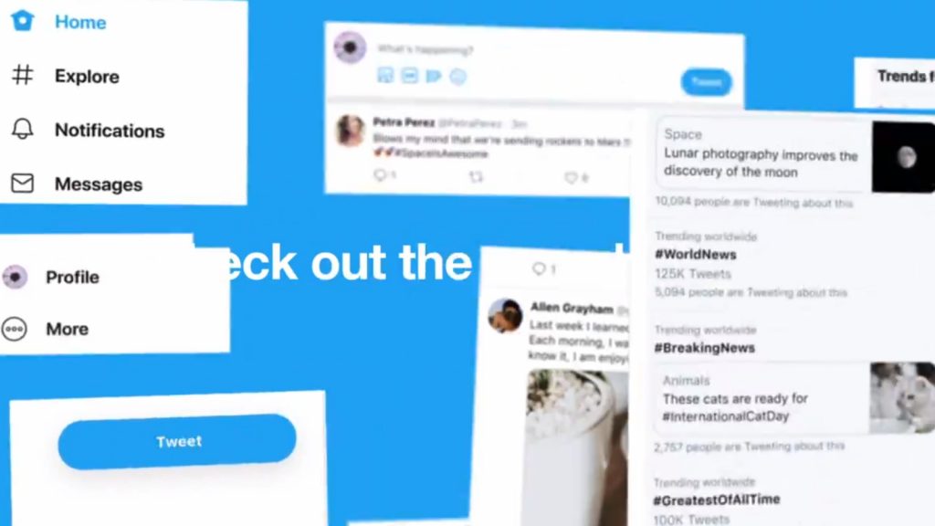
Twitter on Monday announced that it is rolling out a web redesign aimed at making the desktop platform faster, “more fun” and “easier to navigate”.
“Woah, what’s this? A shiny new https://Twitter.com for desktop?” the company tweeted.
No ad to show here.
Woah, what’s this? A shiny new https://t.co/q4wnE46fGs for desktop? Yup. IT’S HERE. pic.twitter.com/8y4TMzqBGa
— Twitter (@Twitter) July 15, 2019
The new desktop Twitter includes an Explore page where users can discover local content and trends, as well as a more colours and two dark mode options.
“Bookmarks, Lists, and your Profile are right up front and have their own spot on the side navigation, making it easier and faster to jump between different tabs,” the company explained.
Direct Messages now lets users view conversations and send messages from one place.
Users can also switch between accounts directly from the side menu.
“This update also gives us a much stronger foundation to build on so we can continue to bring you updated features faster than before,” Twitter noted.
The new look is rolling out at the time of writing.
Feature image: screenshot, @Twitter via Twitter
