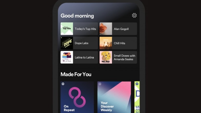
Spotify has tweaked its home screen on phone and tablet apps to help users find their favourite content faster.
“Starting today, when audio lovers open up their Spotify mobiles or tablet apps, they’ll be greeted with a refreshed user interface that allows them to quickly jump back into familiar content,” the company said in a press release.
No ad to show here.
The tweak is a big one for routine lovers.
There are now six dedicated blocks at the top of the home screen that’ll list, and change, content based on time of the day and your personal preferences.
If you tend to listen to podcasts in the morning, that particular cast will feature on the home page. Tune into a radio station, listen to a specific artist or playlist? That’ll be displayed there too.
Everything else you’d usually find on Spotify’s home page now lies below this banner, including the Made For You section that houses playlists like On Repeat and Discover Weekly.
It’s a welcome quality of life change to the interface and should cut down the time it takes users to search for their morning or evening jams.
The update is rolling out to users across the world.
Feature image: Spotify
