Anthropic says its AI will not be used to spy on customers, even in government contracts. Here is what that means for AI governance, enterprise trust and defence partnerships.
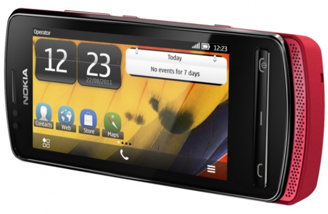
Light, sexy and daring, it’s the Nokia 700

 The Nokia 700 is a beautiful phone, with a dreadful OS, and some redeeming features. I tear it apart like a rare fillet in a New York diner.
Overall design
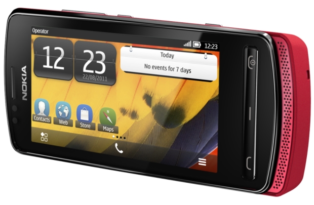
In a word, solid. In a longer word, rock-solid. The 700 smacks of passion. Its diminutive proportions may be too tiny for my meaty paws, but in a normal sized hand it rests comfortably, like a shivering metal kitten.
The 0.096kg weight combined with a length of 11cm is a masterstroke of design. While I hated the shape of the N9, I feel as if Nokia has struck gold with the 700. At roughly US$280, it’s priced in the same league as the HTC Wildfire, but infinitely sexier.
Frankly, I’m amazed that Nokia managed to squeeze so much functionality into this shrunken beauty. A bar of function keys line the bottom of the 700, with the underpowered speakers below that. The Answer, Menu and Hang-up/Power keys dim when inactive.
Along the right of the phone are the volume up/down keys, as well as the lock and camera buttons. Slim, sexy, but far too small for my liking.
The 700 is not carved from the near indestructible polycarbonate of the N9, but it makes up for it with “eco-friendly” materials such as aluminium. It feels good, looks great and, in my personal “let’s-mess-shit-up” test, can be thrown well over 30 meters. Overall, excellent design.
Performance
A 1Ghz CPU, combined with a native GPU accelerator, equates to satisfactory speeds. Apps load quickly, but some of the more graphic hungry apps, such as the built-in 3D maps application, tend to chug rather than race.
I had nothing to compare the 700 to in pure speed tests. My iPhone 3GS is dreadfully slow, and the Blackberry 9810 sitting on my desk is “just fine” according to my gadget-loving partner in crime. So for a more than fair benchmark, I booted up Angry Birds on the 700, and on a Samsung Galaxy S II, a dual-core monster of a smartphone. Angry Birds on the 700 took 12 seconds to load. The Galaxy S II, 3 seconds. Nokia loses! Game over!
But it’s not a graphics whore, and it doesn’t pretend to be one. That’s why the lack of power (or is it just the right amount?) isn’t an overall failure. For what the 700 offers, the performance is more than adequate. Check emails, Facebook, Twitter, take photos and enjoy. Just don’t expect fireworks.
Display
The display is a beauty to behold, but way too dark on the default setting. Cranking the brightness to “11” displays the crisp, vibrant colours of the 640×360, AMOLED screen. Seriously, Nokia you’ve impressed me again.
Symbian Belle, the OS which runs the 700 delivers a competent, if unspectacular interface. Scrolling is smooth on the menu screen, the graphical flourishes are “nice” and the (exceptionally) Samsung-like homescreen fits in well with the overall aesthetics. But, and this is a hippo-sized but, it’s way too small. I feel like a giant, stabbing into a crystal display for information.
The 3.2-inch screen is begging to be upsized and, regardless of your mobile needs, your eyes will be straining to read the 700’s text. In other news, holding the phone in landscape mode does nothing to improve the look of the display. If anything, it makes the experience that much more unintuitive.
Keyboard
The virtual keyboard is dreadful. The keys are too small, it’s hard to type quickly and you’ll be relying on the autocorrect function more than you should. The landscape keyboard fares better, if only by a tiny margin.
Memory
With 2GB internal memory, your complete collection of Britney Spears will have to be pared down to size. It’s far too little, but thankfully a (not-included) MicroSD card of up to 32GB can be installed underneath the battery.
Camera
Nokia’s golden goose is its camera. Does the 700 succeed where others have failed? No, it belly-flops into the pool of shame and disgrace. Older models such as the N8 have a spectacular camera. Granted, the N8 is 12MP with autofocus. But it’s older! That’s got to count for something right?
This fixed-focus, 5MP, LED-flash rocking, geo-tagging disaster is primarily for social images. What do I mean? In other words, it will look great on Facebook, but awful when projected or printed out. The level of grain present in even the brightest of settings is simply abhorrent. At the very least, the camera hardware switch on the bottom right of the device allows quick access for happy-snappers. But at this price, 8MP with auto-focus would have been desirable.
Data and Phone
Full HSDPA 2100 speeds are supported with the 700. If you can get a clear signal, the phone breezily loads social feeds, YouTube videos, websites and so on. Wireless is more suitable though, but drains the battery like a hungry energy vampire.
As for the quality of the phone calls, it’s excellent. There is very little audio hiss as is present in lower-end smartphones.
Battery
Standby time is an estimated 450 hours on 3G, which roughly translate to 18 days. In tests, I left the phone alone, cold and naked for a week until deciding to test it out. Incredibly, the battery was on 95%. The device can go a solid 2-3 days without needing a charge and quickly reaches full power after 4-5 hours of being connected to the mains.
Other internals
Accelerometer, proximity sensor and compass round off the internal features of the 700. The most useful though is the proximity sensor, which turns off the display when it detects a sweaty ear pressed up against it. Handy!
Wrap-up
The Nokia 700 leaves me with a feeling of dread. How can Nokia continue to create such beautiful looking phones, but with such an awful OS? Symbian Belle is an abortion of an interface. Some will love the primary school-like look of the icons, others will want to dip their eyes into a bucket of weasels. Some will enjoy the clean and frankly snappy interface of the homescreen, others will detest it for its lack of innovation.
BUT and I capitalise every letter because I want you understand how deeply I care about gadgets, the Nokia 700 doesn’t give a toss what I think about it. The Nokia 700 is not for an iPhone-loving geek like myself. It’s for an undemanding user, who requires nothing else from a phone but to keep their social life in order, to take a few pictures every now and then, to play Angry Birds, to watch streaming videos and to navigate with the middling Nokia maps app. It’s the everyman smartphone, not too hot and not too cold. So it’s just right then. Right in the bin for me!
Who it’s for
- Nokia fans
- Nokia lovers
- People who want a NOKIA PHONE
What we like
- The sexy-as-hell design
- The bright and chirpy screen
- The breezy interface
What we don’t like
- Symbian Belle, the OS from hell
- The feedback every damn time you touch the phone. Seriously, you scroll, it vibrates, you stare at it, it vibrates. No.
Gear it or burn it
- A light gearing, followed by a berry reduction

