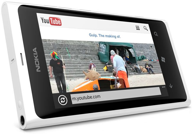
With powerful hardware working together with an industry-leading camera system and intuitive AI experiences, everyday tasks have never been easier and faster
Review: Nokia Lumia 800 – Achingly beautiful

Writing this review was emotional. I became deeply pensive, and at one stage called my mom to tell her that I love her and that I’ve found the perfect phone for her. It’s what the Nokia Lumia 800 does. It evokes emotive responses. It makes you, for the lack of a better word, gaga.
I work with a panoply of personality types, and the Lumia 800 drew superlative praise from everyone. No hyperbole here, just plain, honest truth. Expletives were thrown around, crooning was done, and shrieks of delight were commonplace.
I tried to figure out why people were having these visceral reactions. Windows Phone has been around for a while now, the N9 based design is nothing new, and it was a Nokia, a brand that for the majority who bought into the melodrama, was dead.
As I zoomed out, it dawned on me. The majority of people were oblivious to the N9’s existence. The lack of promotion for the N9 was intentional as Nokia deemed the MeeGo operating system not ready for primetime (it had a grand total of 500 apps). In an effort to fast track its dwindling smartphone foothold, Nokia decided to keep the N9 design, arguably one of the most beautiful designs to ever come out Espoo — perhaps, the world — and combine it with the equally beautiful and simple Windows Phone operating system.
For many, the Lumia 800 will be their first brush with the beautiful hardware design, and Windows Phone. It would take a venerable company with a flair for design, such as Nokia, to push Windows Phone into the mainstream and in front of people’s eyes.
The Lumia 800 is a masterfully designed device and it comes close to producing the same magnetic pull the original iPhone managed to produce. But, for all the praise the Lumia 800 deserves, it’s not without fault. Far from it. Most of its shortcomings can be attributed to Windows Phone Mango. The OS is breathtakingly beautiful and simple, but it’s incomplete and the fledgling platform specification hampered the Lumia 800 from featuring NFC, dual-core processing and removable storage.
So, it’s not the phone for everyone, but it will be for a lot of people. The promise of a future OS juggernaut is there, and thanks to Nokia’s prominence, many will experience the wow factor Windows Phone tends to produce for the first time.
Overall design
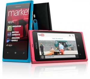 The Lumia 800 is Nokia design at its finest. Nokia fans would hardly be surprised, the Finnish company is a master at design. With its unibody polycarbonate design, the construction feels rock solid.
Inspired by the CMYK colour chart, the phone comes in four colours: cyan, magenta, black and white. The colour is mixed into the polycarbonate, so you don’t have to worry about paint peeling or scratches showing what’s beneath the veneer.
The Lumia 800 has a beautifully curved 3.7-inch Gorilla Glass display, which blends seamlessly into the body of the phone. The display also has a polarising filter that reduces reflections and improves the image quality.
Below the display you’ll see three backlit, haptic touch Windows Phone keys: Back, Home and Search. I had some odd problems with the backlighting as they seemed unwilling to illuminate once I manually selected high brightness. It works fine on automatic brightness though.
Above the display you can see an earpiece and hidden just below that are the ambient light and proximity sensors.
On right is a two-stage camera button — half press for focus, full press to take a picture –, lock/power key and volume rockers. There’s nothing on the left hand side.
On the bottom of the phone you can see the speaker/microphone grill. On the top there is a 3.5mm headphone jack, microUSB port and microSIM compartment. The microUSB port is hidden under a little plastic lid — which gets in the way of L-shaped USB cables –, and needs to be opened in order to slide he microSIM compartment to the left and out. Like many iPhone users, Lumia 800 owners will have to swap our their standard size SIM out for a microSIM, if they don’t already have one.
Moving to the back, there’s a 8MP, f/2.2 aperture Carl Zeiss camera with dual-LED flash, positioned centrally so you won’t ever have to worry about accidentally covering the lens with your fingers. The Lumia 800 can be held comfortably just like a point-and-shoot camera.
Inside there’s a non-removable 1450mAh battery which Nokia says will give you 13 hours and 9.5 hours talk time on 2G and 3G respectively. You can expect 265 hours standby on GSM and 335 hours on 3G as well as 55 hours music and 6.5 hours video playback. During my own use I’ve experienced about 12 hours with full brightness and almost a full day on the automatic setting.
The handset measures 116.5 x 61.2 x 12.1 mm and weighs 142g. It’s not thinnest phone ever, but it feels very comfortable in hand nonetheless while calling, taking pictures or carrying it in your pocket.
Due to the Windows Phone Mango spec, there’s no SD card slot or NFC. There’s also no front-facing camera.
Performance
The Lumia 800 runs on the Qualcomm MSM8255 chipset which means you get a 1.4GHz Scorpion CPU, Adreno 205 GPU and 512MB of RAM. As you probably gathered from the lack of SD card slot, internal memory is set to 16GB and there’s no USB mass storage mode. Everything works through the Zune app (PC), or Windows Phone 7 Connector app (Mac). The Windows Phone Mango spec also doesn’t make provision for dual-core which is a pity, but you won’t miss it for the most part. The overall UI experience on the Lumia 800 is blazingly fast and smooth. Some apps can take a good few seconds to open though. It’s even more noticeable with games. iOS feels faster.
You might be interested to know that Windows Phone Mango can now deliver games at 60 frames per second. We compared Angry Birds on the Lumia 800 to the iPhone 4 version and although relatively evenly matched in terms of hardware, animation on the iPhone 4 was significantly smoother. That’s because the Windows Phone version is still set at 30 frames per second. Need For Speed Hot Pursuit seemed to be on par though.
Display
The 3.7-inch AMOLED WVGA (480 x 800) resolution display delivers good, but not great image quality. As with most AMOLED screens you get amazing contrast, deep blacks, and rich colours that can seem almost over saturated at times.
What would have made it great? Higher brightness, higher pixel density — 251ppi of the Lumia 800 — and perhaps standard RGB instead of Pentile matrix. Pentile matrix means that each pixel has two subpixels instead of three. For colour presentation, this means you’ll get a slight green tinge overall. All of this ads up so when you look close, you’ll see a multicolored mesh or grid of pixels sitting on top of an otherwise beautiful display.
Most people won’t notice this, but if you’ve seen the iPhone 4S or Samsung Galaxy Nexus display, you probably will.
The display fares well in direct sunlight, with colours remaining visible even through smudges. Finally, the Lumia 800 has one of most responsive touchscreens I’ve ever used.
Sound
The external loudspeaker delivers clear sounding audio with adequate loudness, which is especially useful when using the built-in turn-by-turn Nokia Drive GPS system. When plugging in a pair of headphones however, I wished the Lumia 800 would produce a slightly more powerful output. That extra bit is useful when there is a lot of external noise, and the cheap headphones included with purchase certainly isn’t going to help with shutting out noise.
Camera
The Lumia 800 has an excellent 8MP camera with dual-LED flash and a Carl Zeiss Tessar lens that opens to a f/2.2 aperture. This means relatively good low-light photography. Coupled with a fast, stock camera app thanks to Windows Phone Mango, the camera easily stands shoulder-to-shoulder with the best camera phones on the market. At its highest settings, it can produce 8MP photos with 4:3 aspect ratio or 7.1MP photos with 16:9 aspect ratio.
You can launch the camera app quickly by holding down the physical camera button. Taking pictures happens through using the physical two-stage camera button, or by tapping the subject you’re taking a picture of on the touchscreen. When using the physical button, press down slightly to focus, and then depress fully to take the picture. When taking a picture by tapping the touchscreen, focusing occurs automatically.
Tapping on the ‘cog’ button provides access to flash control and a dreamy array of manual options including white balance, exposure, ISO, metering mode, contrast, saturation, focus mode, resolution and flicker reduction.
Video recording happens at 720p and you have the option of enabling or disabling continuous autofocus. If you disable autofocus, your focal length will be fixed at whatever you focus on, before disabling autofocus. I found the autofocus for video recording to be somewhat inconsistent though, sometimes taking too long to adjust and at other times adjusting when there is no need to. That said, it’s still a really good video camera, definitely one of the best I’ve used on a phone.
Data and phone
The Lumia 800 is not HSPA+ capable, but it supports fairly high theoretical speeds of HSDPA at 14.4Mbps and HSUPA at 5.7Mbps. You get Wi-Fi 802.11 b/g/n with hotspot capability and fairly limited Bluetooth 2.1 as it doesn’t support file transfer.
Thanks to two microphones to boost noise reduction, the phone call quality was excellent (for both the receiver and sender), although the speakerphone was a bit on the soft side.
Other internals
Mandated by the Windows Phone Mango specification, all Windows Phone devices must have an FM receiver and the Lumia 800 is no exception. Apart from the aforementioned proximity and ambient light sensors, the handset also has a GPS receiver with A-GPS, an accelerometer and a digital compass (magnetometer).
Accessories
Included in the box is a pair of headphones with built in microphone and audio controls, a USB cable, a cleverly designed two prong power adapter, and a really nice protective rubber case which is the same colour as your phone. It doesn’t compromise the good looks of the phone all that much, except for adding a bit of thickness.
Windows Phone
I could write a completely separate article just on Windows Phone Mango, but as the OS is almost completely stock, I’d rather give you a quick summary and then tell you what’s unique to the Lumia 800.
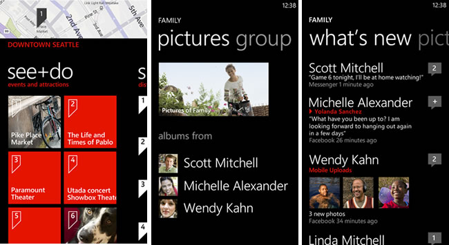
Windows Phone Mango is a distinctly different experience and a refreshing departure from the Android, BlackBerry and iOS app grid interfaces. Instead of icons, the home screen has what Microsoft calls “live tiles”. Think of them as active icons. The People live tile, for example, is constantly updating with pictures of your friends.
Tapping on a live tile, gives you access to a particular hub. There are hubs centred around People, Messaging, Pictures and Music. Taking People as an example, you’ll find a person’s social media accounts, phone number, email address and instant messaging accounts all in one place. Not only do you find basic account information, but tapping on a person will bring up their latest Facebook albums, or Twitter updates. The apps take a backseat and instead, content and functionality from various services are pooled to paint a detailed picture of a person.
Overall the OS is bold, fast, simple and beautiful. Frankly, after you’ve used it for a while, iOS and Android feel positively antediluvian. It has the essentials down pat. Great browser, fantastic keyboard, developed voice control, a fast growing app store and a killer app suite in Microsoft Office.
Beneath the beautiful veneer however, Windows Phone is still a fledgling and incomplete OS. It has made massive strides to become a real threat to Android and iOS, but it’s not quite there yet. For example, with Mango, Windows Phone now has multitasking, but not all developers have updated their apps to use multitasking which makes for an inconsistent user experience.
In its current state, it will appeal to the casual to moderately tech savvy person, but when you get into things like the lack of universal search, multiple calendars, VPN support, USSD input handling, Bluetooth file transfer and proxy settings — things which competitors already have — it’s clear that it has some ways to go before being the OS for everyone. Also with its limited Mac support, Windows Phone has a Windows PC bias. iTunes is fully supported on both OS X and Windows.
I can see it getting there though. It reminds me a lot of iOS in its early days. It has the world’s most successful operating system manufacturer backing it and growing developer support means that Marketplace is the fastest growing app store on the planet. It stands at over 40 000 apps today.
Nokia software
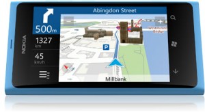 Nokia stands out ever so slightly in the Windows Phone landscape thanks to its three proprietary apps. The brilliant Nokia Drive gives you free for life voice guided turn-by-turn GPS, and in my experience took less than a minute to get a location lock. You can use online maps, or download offline maps for true intrepid exploring.
Nokia Music gives you access to Mix Radio. It’s a lot like the music discovery app, Pandora, except that it’s strangely in tune with local culture. You can stream pre-selected music from multiple categories. I cringed at the Afrikaans selection, but the attention to detail here is commendable. Keep an eye on your data plan with this one.
Lastly, there’s App Highlights which suggests essential apps from Windows Marketplace to get started with. It has a silly feature that lets you shake the phone for a random app, but fun nonetheless.
Wrap-up
Nokia’s Lumia 800 is beautiful, but incomplete. That’s not to say that it won’t sell well. With bold aesthetic appeal in spades, Nokia is clearly going after the hearts of mainstream consumers first, geeks second. Despite what it lacks due to limitations in Windows Phone, to me, it feels like Nokia made the right move siding with Microsoft. In a market saturated with Android devices, a Windows Phone device is still distinctly different and certainly more consumer ready than MeeGo. In the long term however, it will be interesting to see how Nokia will outrun the rest of the growing Windows Phone pack. The relationship with Microsoft is key. Nokia Drive is great, but proprietary apps cannot be Nokia’s only strategy, can it?
In the end it’s not the phone for everyone, but it will be for a lot of people. The promise of a future OS juggernaut is there, and thanks to Nokia’s prominence, many will be introduced to the wow factor Windows Phone tends to produce for the first time. A push from Nokia is exactly what Windows Phone needs to get the mainstream attention it deserves.
If you’re chasing bleeding edge specs, go Android. Windows Phone is not for you. Microsoft’s Windows Phone mandate for hardware manufacturers is slow to evolve, but it does ensure quality, something that Android cannot promise. iPhone still has the most apps and the Lumia 800 doesn’t play well with Mac. If you do decide the Windows Phone experience is for you, apart from the HTC Titan, the Lumia 800 is the only Windows Phone to consider.
Could I switch? I’ll consider it when Windows Phone gets Instagram.
Gear it or burn it?
Gear it, with my whole heart.
Who it’s for
Anyone who appreciates beautiful design.
What we liked
- Drop dead gorgeous unibody polycarbonate hardware design.
- Anti-glare polarised display.
- Nokia Drive.
- Fast GPS location lock.
- Excellent 8MP f/2.2 camera.
- Two-stage camera button.
- Blazingly fast UI.
- FM radio.
- Deep social networking integration.
What we didn’t like
- Windows Phone OS feels restrictive/incomplete at times.
- 720p video recording with twitchy continuous autofocus.
- Poor Mac support.
- No USB mass storage.
- No front-facing camera.
- No SD card support.
- No NFC support.
- Micro SIM.
- No 32GB/64GB model.
