South Africa’s retail forex industry is entering a decisive phase as regulation tightens and consolidation accelerates. What does it mean for brokers and traders?
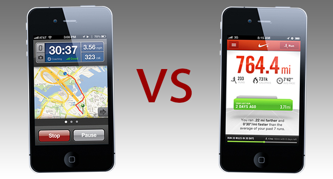
App Deathmatch: Nike+ vs Runkeeper

In a completely new weekly feature, resident app guru Danny Greeff pits two competing apps against one another in a bid to find out which one deserves a place on your home screen, and which one gets deleted, never to be spoken of again. Five rounds of brutal, bloody, binary bit-spilling glory, where only one can reign supreme. This is a quest for perfection, fuelled by a burning desire to use only the best in category, and rid your device of inferiority for good. Is this madness? Is this unnecessary? No, it’s App Deathmatch!
In our inaugural app death match event, we see a monumental battle between two long-standing foes in the app environment. Constantly one-upping the other over the years with clever updates, competitive price drops and refined coding, these two giants need no introduction; but to continue with the epicness that is app deathmatch, let’s do it anyway!
In the red corner, tipping the scales at a hefty 36.1 megabytes and currently on version 4.0.1: Nike+ Running! A firm favorite amongst tech-savvy runners, both casual and serious, Nike+ is regarded as the app that made running cool again. Currently going for free in the app store after its latest update, the app has seen many new downloads and sits at position 57 on Apple’s free apps charts.
In the blue corner, weighing in at a slim 12.8 megabytes, and sitting on version 2.5.4, the running app favored by those who choose performance and simplicity over aesthetics and branding: Runkeeper! Also going for free on the app store and used by over 10-million runners worldwide, Runkeeper focuses more on the serious runner out there and makes use of in-app purchases and elite accounts to generate revenue.
So as you can see folks, this looks to be a classic battle of the best; a no-holds barred fight for supremacy and glory. There can be only one!
ROUND 1: Aesthetics, design and user experience
Right off the bat, Nike+ just looks and feels so much better than Runkeeper. The designers know that iPhone users are sensitive to what an app looks like and full marks go to them for coming up with, what I think is one of the most beautiful apps on the market. On the other hand, Runkeeper looks like it was designed by Microsoft (circa Windows ME) and no matter what it does, just cannot compete in this regard.
When looking at user experience, Nike+ is the clear winner again due to the level of intuitiveness and ease of use built into the app. I will however state that the app has enjoyed a longer time in the market and can thus draw on the feedback of its users to improve each version, but Runkeeper still lacks a lot of the innovation and out-of-the-box thinking that could make it better and easier to use. Ding ding! Nike+ takes round one!
ROUND 2: Functionality
Round two is most definitely going to be a lot tighter than the first as both contenders make superb usage of the device’s GPS capability, striking a blow (outside the ring) to the highly competitive sports watch market. When run simultaneously during a recent trip around the lower slopes of Lion’s Head, both apps recorded similar distances (give or take a few meters) and the routes on map were pretty much identical.
The only deciding factor that I can use to compete with in this round is power usage. Launched on a full battery with music playing and all audio cues enabled, Runkeeper uses significantly less power to operate than Nike+ when launched in an identical fashion. Not sure why, but as the bell goes, Runkeeper takes this round with a well-placed last-second right hook to the chin of its opponent.
ROUND 3: Added extras
Before we delve into the bloodshed, let me just state that by added extras, I mean all features other than the core offering of the app (in this case, measurement and reporting of running statisitcs in real-time). This is where Runkeeper is caught off-guard again, focusing on in-app purchases to access the added extras they offer: RK Elite, where users can follow your run in real-time online, and classes, a set of training schedules put together for certain goals.
These features, although great, focus again, more on the professional runner. Nike+ makes running fun. It records your personal bests, alerts you once you’ve broken one of your records and congratulates you when you do.
After every run you’re given a little pep talk by a famous sport personality or celebrity and your total mileage is updated, with a summary of your performance. It also integrates well with your music selection, allowing you to change music from within the app (a great time-saver) and giving you the option to set ‘powersongs’ (a little ‘Eye Of The Tiger’ always helps when you’re feeling tired) that can be played from the main screen. So here, it’s really what kind of runner you are that will determine the outcome of this round, I’m ruling in favour of Nike+.
ROUND 4: Desktop environment
Both apps have really great desktop environment support. After your run, your activity is synced with your online profile and you can then view it later and see exactly how you’ve done. Your running friends can then comment and compare, creating a more social environment overall.
Nike+ leads the way in design once again, and I really like the way your run route is displayed as a heat measure: red for your faster, braver and probably downhill moments, green for those slow points where you hate yourself. Runkeeper is again, more analytical overall but I like the fact that is used by more of the people I know. Nike+, although well designed, is quite resource hungry and therefore takes a while to load. It is also a lot more international than local, which I don’t really like. This one goes to Runkeeper!
ROUND 5: Longevity & Stability
So as we enter the fifth and final round, both contenders are weary but ready to fight one more round to decide this battle. When it comes to the question of longevity, which will outlast the other? In this instance, it’s what you’re using the app for: serious training or just to keep fit and have fun. For me, those two ideas overlap, so I move onto what comes next, how stable is the app, and how often does it get updated? A while back, and every now and again it still happens, Runkeeper has the habit of adding distance to your run at the very beginning of your run. You’d only realize this after about five and a half minutes of running when the audio cue tells you you’ve just completed your fifth kilometer.
It’s annoying, frustrating and downright disappointing, as you have to cancel your current run and start a new one, one kilometer in. This issue was addressed in one of the updates, but still occurs every now and then. Nike+, in all the time I’ve used it, has never once crashed, reported bogus results, or disappointed me in any way. The updates are plentiful and if users complain, they usually address issues hours afterwards. Nike+ takes this one hands down.
FINAL RULING
After five grueling rounds, Nike+ is the only app left standing while Runkeeper is flat on the canvas, breathing heavily, but not moving too much.

