With powerful hardware working together with an industry-leading camera system and intuitive AI experiences, everyday tasks have never been easier and faster
Samsung Galaxy S4 hands on review: all hail the king

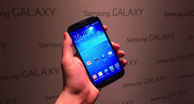
The Samsung Galaxy S4 brings a huge Full HD screen, an improved camera and faster innards, and fits in all in a chassis the same size as theGalaxy S3.
However, many will struggle to tell the difference between the S4 and its predecessor, as the polycarbonate chassis is still in use, although the metallic banding around the side, while still plastic, is much sturdier and feels more premium.
We’ve already seen a lot of the Samsung Galaxy S4, as it’s been snapped multiple times in leaks – some more accurate than others, it has to be said – and the specs mooted have turned out to be pretty bang on.

Design
The Samsung Galaxy S4 is built on four foundations: an improved camera, better connections with others, health and wellbeing improvements and simply making life easier.
While this is all a little hyperbolic, the S4 at least brings an integrated feel to things while improving nearly every spec on offer. The outside is still plastic, but harks back to the mesh design, if not feel of the Galaxy S2.

That means it will have a larger screen, but smaller chassis than the Galaxy S3, which is a superbly impressive feat of engineering, especially when you consider the specs.

However, it’s exactly the same sensation as we found on the Galaxy S3, and given the record numbers of sales that had Samsung is sticking with a winning formula, plus there’s more than a market for a phone that you’ll barely notice in your pocket most of the time.

The home button is roughly the same size and the same menu and back buttons remain from the prequel.

The Samsung Galaxy S4 feels like much more of an iterative update than new design, and while it will probably sell well there’s very little to wow you when it comes to the overall shape. Specs are important, but if there was such as thing as a Samsung Galaxy S3S, this would be it.

Display
We almost feel sad that this isn’t the first Full HD screen we’ve seen on a mobile phone, as it’s kind of lost its lustre since the likes of the HTC One and Sony Xperia Z have all managed the same trick – but it improves the sharpness a lot, even though you’re not getting that much different from the S3.

The 441ppi pixel density doesn’t match the HTC One, but is more than good enough for the average user.

Aside from the initial impression of the design, in the hand the Samsung Galaxy S3 feels just dandy. The design contours well against the palm, and while the screen size may be a little big for some (you’ll need a bit of shuffling to reach the upper section of the screen) it’s definitely useable in the hand.

Interface
Samsung hasn’t really re-tooled the Touchwiz overlay for the Galaxy S4, but has added some clever upgrades that will have some users talking about innovation.

For instance, the lock screen doesn’t have the water rippling any more, but does register your finger from up to two centimetres away, so a little beam of light will follow your digit as you unlock. It’s something you’ll definitely play with for ages.
It’s clear with the Galaxy S4 that Samsung has worked out there’s only so much it can do on the hardware side these days – not to say that we’re pretty impressed with the spec list – and as such has tried to bring the unique flavour through the interface instead.
As before with Touchwiz, there’s a definite sense the whole process has been simplified, as the phone has got a much easier feel to it when swiping around. That’s not to say there aren’t loads of widgets to be played with, but there is less clutter on the larger screen.
The dock at the bottom of the display pervades, and there are more widgets to play with. Thanks to the Galaxy S4 running Android Jelly Bean4.2.2 you’ve now got an addition in the notifications bar of a toggle in the top-right hand corner where you can turn on and off pretty much anything, from NFC to Group Cast to eye-tracking.

Swiping around the display was easy as pie – it’s not exactly taxing on the processor, but we did note that there was a slight pause as we swiped through the menu screen on this pre-production model.
However, there is a worry that the octo-core (yes, you read that right) 1.6 GHz Exynos 5 CPU, with 2GB of RAM as well, could suck power a little too dramatically – but we’ve yet to hear the full details of how the CPU will work before we can pass any judgement on that.
Smart Stay, which tracks your eyes to tell if you’re looking at the screen, has stablemates now. Smart Pause will note if your gaze leaves the screen and will pause the video, and Smart Scroll will check when you’re reading a web page and scroll up and down as you tilt the device.
It’s a novel idea for replacing things you do already but in practice we didn’t find either that useful. Smart Pause takes a second to register your gaze has gone, which means you’ll still miss part of the video, and Smart Scroll (again, pre-production model) was far from accurate when we tilted the phone.

Smart Voice hasn’t been upgraded beyond improving the accuracy of the voice recognition and Driving Mode, which will give you more voice-related feedback when you’re in your motor.
Smart Alert has been upgraded: now it’s joined by Air Gestures, which allow you to swipe the phone without touching the screen. So this means you can flip through pictures or music tracks (“good if you have messy fingers” says Samsung) flick to the top of a list by wiping upwards on the screen and Air Call Accept starts the camera… no, we’re joking. It accepts a call without touching the screen.
On top of that there’s Hover mode, which is the same as Air View on the Note 2 which used the S Pen and tracked when it was near the screen to give previews of emails, video scrolling without disturbing the action, and seeing who is on speed dial.
A quick test with this saw the preview being activated a little too easily, but it’s definitely a neat feature and something we could get used to.
But overall the good news is the large screen looks great, the improved CPU might not be needed but is welcomed and the little touches like the shining lock screen do actually feel like a real step forward.
Media
The Samsung Galaxy S4 follows in the footsteps of its predecessors in that it’s designed for media – which is what you’d expect from a phone that’s the sequel to the phone we dubbed the best out there for media on the go.

The video player is obviously taking centre stage here on the Galaxy S4, and combined with the improved Full HD Super AMOLED screen is just magnificent for watching movies.
The video hub now contains both personal and downloaded content in one place, and it looks really, really nice when viewing it on the 5-inch screen.
It’s an understandably excellent experience, with the screen veritably shining with quality contrast ratios and decent colour reproduction.
The navigation experience is easy as well, and slipping up and down the timeline to move through a video seems very intuitive.
AllShare Cast is included as well, powering up the ability to stream to and from other devices. In addition to being able to send content from the phone to a TV and receive from a PC in your home network, you can also do this remotely now, as long as the device is turned on obviously.

Another feature is mirroring, where you can send whatever is on the screen of your Galaxy S4 and have it show on a larger display. We’ve seen this on a number of devices, and while it’s not going to allow big screen gaming on the go, as we’ve often noted that there’s a lag between input and its realisation on the screen, it could be good for movies if it’s less jumpy than found on the S3.
Samsung has managed to stay ahead of the pack when it comes to internal storage too – it will be available in 16GB, 32GB and 64GB flavours plus up to 64GB through a microSD card as well. That’s more storage than most will ever need on its own, right?
This will be a killer feature for a lot of smartphone users, as while the internal storage is generally good enough for most things, many love the idea of having the choice to expand if they so wish – so combining this with an expandable battery is a great idea from Samsung once again.
Camera
The Samsung Galaxy S4 camera is a step up from its predecessor, with a 13MP sensor on the back, which now has to bulge slightly from the chassis.
Samsung promises excellent low-light snaps from the S4 as well, but we doubt it can take on the might of the HTC One when it comes to low light conditions, as the Galaxy S3 was decimated by the might of HTC’sUltrapixels – and that’s before we even get onto the Nokia Lumia 920.

The UI has changed a bit to mimic that found on the Samsung Galaxy Camera, with a special mode wheel to move between items like the Macro, Beauty shot and smile setting, and while it’s a little slow it’s definitely an easier to use interface.

Eraser mode and Cinema mode also come straight from the Nokia Lumia phones we’ve seen recently – the former works extremely well though, noting an unwanted object moving in the background and erasing it by drawing a pink outline around the thing and letting you delete.
However, you must have the mode enabled, which takes multiple pics, rather than the standard shot, so you probably won’t be able to make good use of it most of the time.

You also get a 2MP camera on the front of the phone for some decent personal snaps – plus you can also get HD video recording too.

Battery
Samsung has managed to lower the thickness of the Galaxy S4 compared to the S3 but upgraded the battery from 2,100mAh to 2,600mAh, promising a much larger capacity and therefore longer life.

It was excellent on the S3 for the most part, so here’s hoping that Octo-core will inspire even better battery life.
This article by Gareth Beavis originally appeared on Techradar, a Burn Media publishing partner.

