South Africa’s retail forex industry is entering a decisive phase as regulation tightens and consolidation accelerates. What does it mean for brokers and traders?
Nokia Lumia 925: thinner, but not all the way better
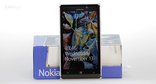

Ladies and gentlemen, Nokia listens when its users talk. I recently got my hands on a Lumia 925 and it’s a big step up from the 920 I reviewed earlier this year. Although I thought that the 920 had some very fetching qualities, I just could not look past the weight.
As an iPhone user, I obviously think I am really clever because I have been brainwashed by the cult of Apple. But ever since I used the 920 I have slowly started waking up from the iComa. But can the 925 restore me fully?
Design: Oh my, baby you lost weight
It must be mentioned that compared to the 920 this device is practically anorexic. The not-so full metal phone has a beautiful finish that is becoming synonymous with Nokia. It measures in at 139g, a significant 46g less than its 185g older sibling. The Finish mobile maker decided to go for a combination of metal framing and polycarbonate, with a glass front panel — good choice.
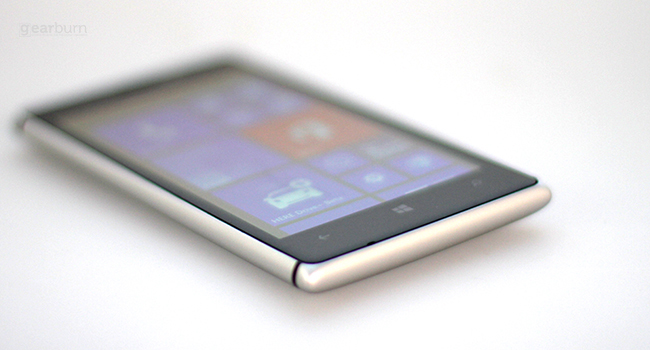
Holding the phone and using it is a much more pleasant experience and it looks quite beautiful (and perhaps even more expensive) than the 920. The device shimmies in with a standard micro SIM card slot at the top left, the micro USB port and 3.5mm headphone port sit in the centre and the microphone hangs about to the right.
It’s pretty gorgeous but that’s to be expected: Nokia would have done itself a great disservice if it made an ugly phone.
OS: Notes on a Windows experience
Microsoft, we talked about this — you’re meant to start showing them who is boss. As much as Windows Phone 8 floored me in the 920 iteration, I feel that aside from a few minor tweaks (such as getting Instagram) not much has happened — that’s not necessarily a bad thing though.
Nokia’s Amber update has done a fair bit to make the Lumia experience more interesting. It gives the user some very useful apps like Data Sense and my personal favourite, Glance — a stealthy clock app that pops up when you wave your hand over the screen, so you don’t have push any buttons to check the time.
One of the first things I noticed (aside from the slimmer look) when using the phone is the lock screen. It displays a wallpaper in the background, which is overlaid with the time, day and date in large white writing.
The Windows Phone 8 tile style still works quite beautifully and is possibly the more stylish of all the mobile OSes. Beyond just being pleasing to the eyes, the tiles are quite useful when it comes to managing your life via your mobile, much better than shortcut format Android or iOS use.
My biggest issue with Windows Phone 8 is its lack of intuition — it takes a while to wrap your head around how to navigate the OS. It’s a bit of work for the user to get into how things work and where things are, and Microsoft needs to fix this.

Lumia Test 7
Lumia Test 1
Lumia Test 2
Lumia Test 3
Lumia Test 4

Lumia Test 5
Lumia Test 6
Display and performance: Vibrantly delicious
Nokia is trying to dominate the market of vibrantly delicious visuals with a 4.5-inch, 1280×768 pxiel PureMotion HD+ AMOLED display. Coupled with its super intensified colours and deep blacks the 925 is a pleasure to browse.
Multimedia on this device is great and here is a win for Windows Phone 8 as it offers plenty of possibilities for syncing or streaming media. That visual intensity make videos come to live on the AMOLED screen, and the little extra screen real estate makes movie watching quite pleasant.
There is a lot of power behind all that visual intensity, with a 1.5GHz dual-core processor and only 1GB of RAM the Nokia Lumia 925 matches the Lumia 920 but loses behind other super smartphones such as Samsung Galaxy S4 or Sony Xperia Z with their 2GB RAM and quad-core processors.
Verdict
The 925 is a winning improvement on the 920 but only just. As much as size does matter, it can’t all boil down to the dimensions of the phone. I had a wonderful time with the device but it has not convinced me to escape the Apple cult and seek a much better experience. At the end of the day it is just the 920 in a thinner casing down to the less than perfect battery.
Fans of the 920 will love this device and will make the change in the a heart beat, but Windows Phone needs to get more intuitive and the memory needs to come to the party of the super devices already out there. Perhaps the 1020 is the device to bring the change?
Score: 7.5/10


