Anthropic says its AI will not be used to spy on customers, even in government contracts. Here is what that means for AI governance, enterprise trust and defence partnerships.
Samsung Galaxy S5 review: no five star rating


Samsung’s fifth Galaxy, the S5 doesn’t even approach the design and interface of the HTC One (M8) and iPhone 5s, so what’s it got going for itself? The 16MP camera is outstanding, possibly the best mobile phone snapper I’ve ever used, also the S5 is light and responsive, making it an excellent phone for handbags and boardroom tables. Yet for US$700 I want more from a smartphone than a dimpled rear and cool camera. Those who own a Galaxy S4 can safely skip this gimmick-heavy phone. The remainder (those who can afford it) should carefully weigh up their options before plonking down those hard-earned coins. So why am I so underwhelmed by the Galaxy S5? I’m not a fan of novelty and the S5 is packed to the rafters with extra features and software tricks that can’t bare the strain of repeated use.
What I liked
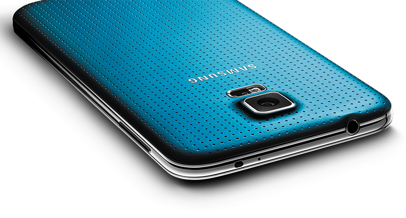
My favourite feature of the phone is its camera, because after weeks of dealing with Sony’s Xperia cameras, the S5’s is a breath of fresh, digital air. Sure, we’ve all wrestled with camera software in the past but the S5’s is close to perfect. Samsung’s not only created an all-in-one interface (the photo and video capture buttons are on the same screen, there’s no need to switch between the two), but a great environment for editing photos as well.
Editing a picture is now as friendly and intuitive as Instagram, with Samsung even going the extra mile by providing floating tool tips when the app is first used. And as I said, image quality is uniformly excellent throughout. The S5 also manages to capture images in mere milliseconds, making it much faster than the iPhone 5s and other quality camera-phones. I also found the new HDR mode cool whereby two pictures are taken simultaneously, one light and one dark, then fused together to created an image with defined subjects. I like it because it’s just as fast as the regular mode. Video quality is captured in full HD and is superb.
The S5 also feels like nothing in-hand and at 157g, weight isn’t an issue. I mention this because one of the key reasons of phone fatigue is a heavy, cumbersome build. The Xperia Ultra is a great example of a phone that looks great on paper, but is too big and heavy in real life. It’s because the S5 is one giant swath of plastic, with nary a thin strip of metal accentuating the sides.
Those looking for a phone with a long-lasting battery, the S5 is it. A 2800mAh battery kept my S5 powered for a full day, incredibly. Most Android (and all iPhone) users can only dream of such thrills. Happily, there’s Ultra Power Saving Mode which turns the display black and white and turns off “non-essential” features like the WiFi, allowing the S5 to only text and take phones calls on a mere 10% charge, which can last a full 24-hours. Unbelievable? Believe it.
This is also one of Samsung’s first water and dust-proof phones and it works as well, if not better than Sony’s implementation with its Xperia line of smartphones. I submerged the S5 in water and it worked fine, and I used it as an actual spade during my Sunday gardening routine. No issues, except for when I answered the phone and flung sand into my face.
Rounding off the positives is the 5.1″ Super AMOLED screen, a display clear as still lake on a sunny day. I own a Samsung TV and the S5’s display, while tiny in comparison is brighter and smoother than my full HD set. Watching content is a pleasure and the loud, single mono speaker easily handles dialogue and music without any tinny distortions.
For multimedia, social media apps, taking pictures and having a kawaii time in general, it’s the S5 all the way. As a serious smartphone that nails down it’s features perfectly, the S5 falls miserably short.
What I disliked
Samsung’s destroying Android, one UI makeover at a time. At the S5 launch event, Samsung’s bosses described the S5’s interface to me as “highly functional”, “intuitive” and “time-saving”. It’s none of those, it’s just Android 4.4 (KitKat) with loads of perfunctory extras. Gestures, FlipBoard, the awful new settings menu with its giant Nokia N9-like icons… it’s a poor showing from Samsung. Stock KitKat, as seen in the Nexus 5 and OnePlus One is always welcomed by Android owners. While the UI is slick, it’s not intuitive and icons quickly begin to clutter the screen. When this happens, the bright display of the S5 is overwhelmed with colour and the phone begins to look messy, with many apps suddenly lost in the background.
One of the S5’s selling points is the heavily-publicised Fingerprint Scanner which practically never worked. After recording my fingerprint, the swiping mechanism almost never worked again. I either swiped too fast, too slow, or swiped with only half my finger, apparently. I eventually gave up and changed to pattern lock. The iPhone 5s’ TouchID is one of the best, most flawless fingerprint scanners yet and the S5 barely takes anything away from it.
Samsung also promised that I could boost my downloads with the cleverly named Download Booster. It works by combining WiFi and mobile data for double download speeds. Sadly, it’s network dependant and my telecom (Vodacom) doesn’t support it. It looks like a clever app, pity I’ll never get to use it.
The design of the S5 irks me, because it’s essentially an upgraded S4 which I found to be an exceptionally plain device. Looking at the rear of the phone, the dimples add nothing to the S5, save for making it look like a band-aid. Samsung’s design team needs to step up its game for the S6. There’s more problems though, namely that nothing is flush on the back. The speakers, camera, needless and often inaccurate heart-beat sensor, headphone and charging port all stick out of the rear. How can practically every other smartphone accommodate a flush rear, but not the S5? Again, this seems like a lazy effort by the design team. Friends and random strangers thought the overall look was sleek and attractive, but the dimpled rears mimics the look, not the feel of leather and that’s not good enough for me. So overall, if the S5 is going to cost and look expensive, it should also feel and be, a genuinely expensive device.
Design issues extend to the volume and power button, which are both quite slim and often accidentally pressed. Holding the phone is a pain because the buttons are rather sensitive, accidentally locking the phone and raising the volume often at once. The other physical button, namely Home, looks great and performs well. Best Home button yet, actually. To the side of the Home button is the Back key on the right, and the switch-app button on the left, again these buttons are often pressed without user intervention. The buttons are just overly sensitive.
Nutshell: A lot of cool tricks and neat looks produce a shiny follow-up to the S4 which ultimately impresses everyone else save for the owner. It will sell in the millions because it’s the best-looking, most advertised Android phone — but the clunky interface and average experience I had with it holds it back from real greatness.