South Africa’s retail forex industry is entering a decisive phase as regulation tightens and consolidation accelerates. What does it mean for brokers and traders?
Samsung Gear S2 review: intuitive but imperfect
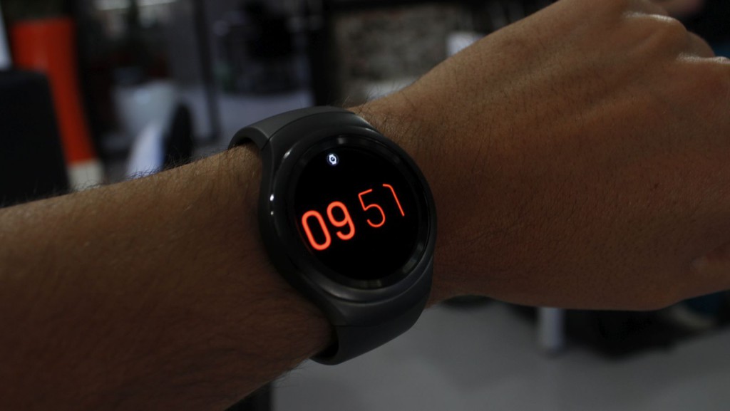
Android Wear currently rules the smartwatch roost, running on more devices than we could possibly list off the top of our heads. While that’s a great thing for Google, it’s not for consumers.
Although Google recently updated its OS, it remains immature in a relative young market segment, and as a result, smartwatches haven’t seen the rise and rise that we’ve expected from them in their early days. This isn’t to say that some smartwatches are completely hopeless though. What I will say however is that few Android Wear smartwatches really impress enough to leave a lasting impression.
But what if the user was looking for something devoid of Google and its merry troop of cookie-cutter wares?
Well, you currently have two alternatives: Samsung and Apple. And it’s the former that we’ll be looking at today — the Samsung Gear S2 to be precise.
Unboxing
This was less an unboxing and more a handover of the device. Still, the Gear S2 arrives in a rounded box clearly made for a hare’s top hat. Inside there’s some scattered, intuitive plastic holders about but the watch does sit snugly and safely inside.
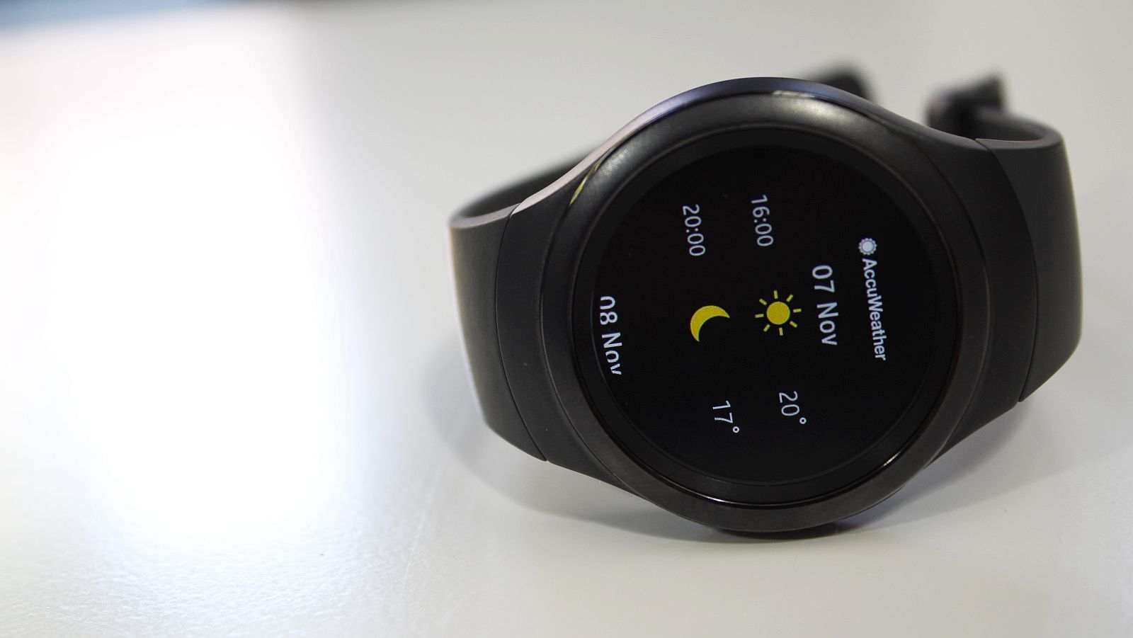
Digging deeper, there’s a wireless charger dock on which the Gear S2 sits, and a fixed-cabled 0.7A charge lurking beneath the plastic, which takes ages to charge anything other than the watch itself and felt decidedly cheap in comparison to the watch.
Overall, the Gear S2 feels a lot safer in its cocoon compared to the Sony Smartwatch 3 in its clear plastic cube, and thankfully, Samsung didn’t blow its entire budget on a swanky, over-engineered enclosure.
Design and aesthetic
Where it did though is the aesthetic.
There are three distinct styles of the Samsung Gear S2. There’s a Classic variant, which oozes class and sophistication thanks to its array of interchangeable watch straps; and for those who hate smartphones, there’s a Gear S2 3G version with, you guessed it, support for 3G networks. The standard Gear S2 (our review unit), is the blandest of the three, and doesn’t boast interchangeable straps.
While the Samsung Gear S2 is a bit of a Jane Eyre, it’s by no means ugly, but won’t make your heart jump either.
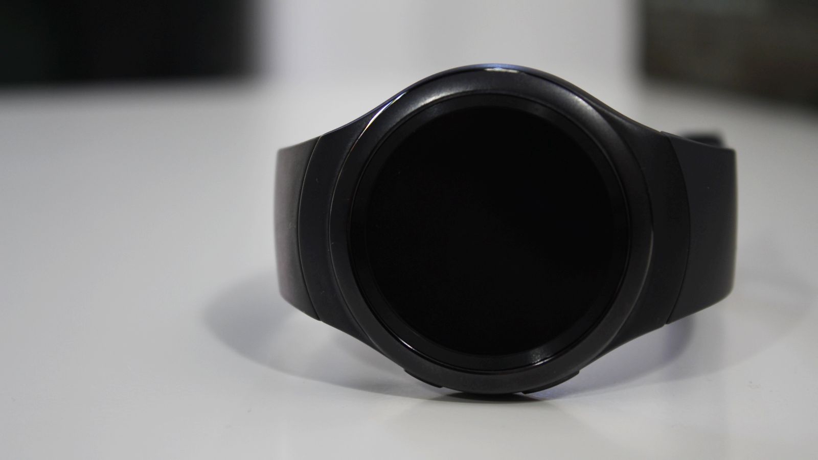
There’s a large face up front bordered by an ingenious rotating bezel that probably deserves a dedicated chapter. There are two buttons on the one side, which sandwich the microphone hole for S Voice and the like. These are for the Home and Back functions, but are as easy to confuse as a pineapple and a porcupine in a kitchen drawer.
In terms of the watch’s overall look, the straps integrate nicely with the watch’s face, but I quite enjoyed the Gear S2 Classic’s more formal, timeless aesthetic. The generic Gear S2 is perfect for the gym though, especially if you’re one who actually uses the gym to, well, gym, and not the free WiFi.
While the Samsung Gear S2 is a bit of a Jane Eyre, it’s by no means ugly
Speaking of creature comforts, the Gear S2 straps aren’t the most comfortable on the arm and tend to swash around while walking or checking the time. This will depend on your arm size and how tightly you enjoy your watch to your body, but it’s also thanks to their more hard plastic than rubbery design. This does mean that random lint won’t cling to them though — a major annoyance I had with the Sony SmartWatch 3.
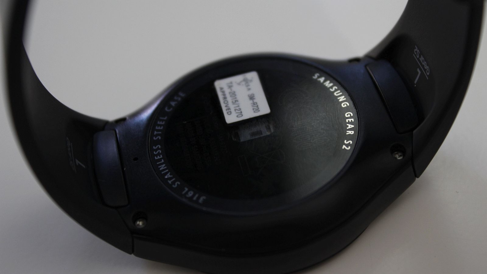
At the watch’s back, there’s a heart rate monitor among other sensors, hidden behind a pane of glass for protection and hygiene.
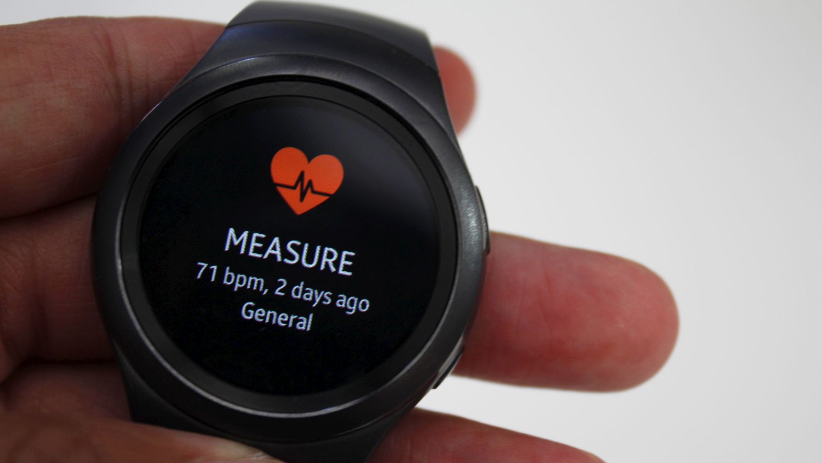
Ultimately, Samsung didn’t reinvent the smartwatch here, but it has updated it slightly.
It’s classic charm is enough to appease some more discerning buyers, without alienating the tech savvy 2016 crowd. It’s a bit bulkier than your average smartwatch, but it’s stately and plain enough to wear alongside a suit to a business meeting, or to the grocery store in sweatpants while walking your labrador.
Internal and specifications
Non-geeks, look away now.
Let’s play the numbers game. Are specifications really that important for smartwatch users? It’s a valid question, and really shouldn’t actually be something that’s asked for those more interested in the fashion aspects of devices. Nevertheless, if you are worried, take a deep breath: the Samsung Gear S2 is cheetah-on-caffeine fast.
Samsung’s using its own frisky dual-core Exynos 3250 chipset developed specially for the watch, which arrives with 512MB of RAM and 4GB of internal storage. Capable specs for a smartphone, mind. And speaking of size, the screen measures up at 1.2-inches with a resolution of 360×360. It’s definitely a lot denser than other smartwatch screens that we’ve seen.
The Samsung Gear S2 boasts a range of sensors too, including an accelerometer, a heart-rate monitor, a barometer, ambient light sensor and a gyrometer. The 3G variant also packs a GPS, but its omission from the cheaper watch doesn’t quite make sense.
And while we’re on this topic, the 3G watch does feature a larger battery at 300mAh though, with the standard device packing a 250mAh reserve.
All Gear S2 variants feature WiFi, NFC and Bluetooth as well, and the 3G version features an eSIM which lets the watch receive and make calls James Bond-style. A speaker is also included for this purpose.
The Samsung Gear S2 is cheetah-on-caffeine fast
You should be happy to know that the Gear S2 also features an IP68 water- and dustproof rating, which means that a quick shower should be no problem while wearing the watch on your wrist.
Performance and general usability
The best feature of this watch is this: it works with Android, Samsung and iOS devices. Yes, even Apple’s partizan ecosystem. You can tether an iPhone 6S, LG G4, Samsung Galaxy S6, or practically any other Android device you can think of. This is less a great feature for the user than a brilliant design decision by Samsung. Still, it’s worth a mention.
Thanks to the Samsung Gear S2’s brains, there was virtually no lag compared to its Android Wear siblings, and navigating through menus was performed with verve and brevity. Many Android Wear watches in comparison feel laboured in this regard, but the Gear S2 never quite gave this impression.
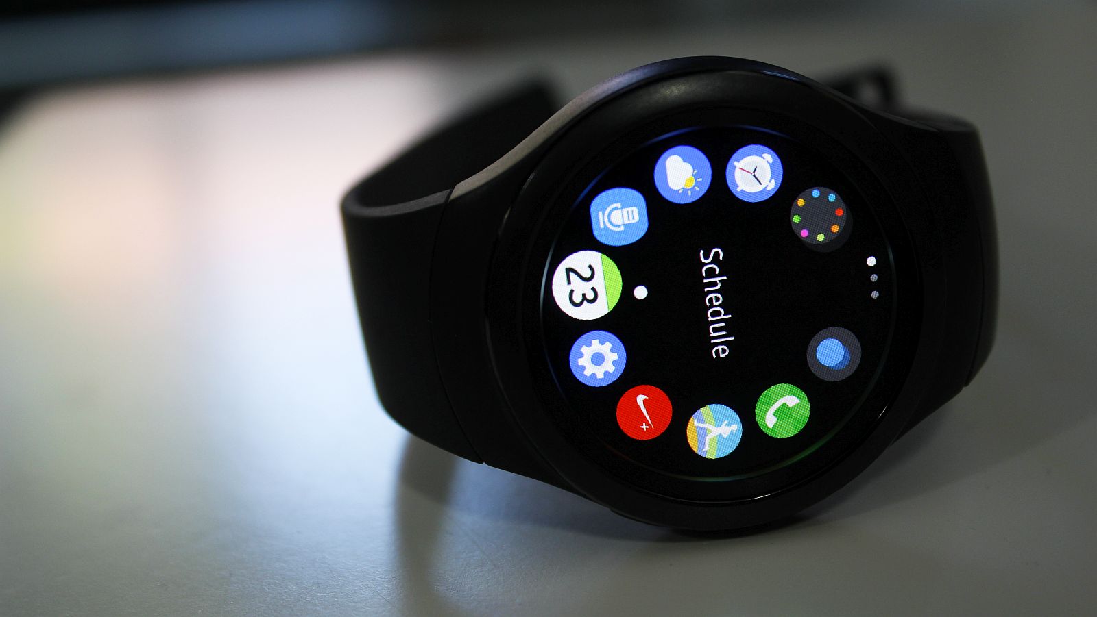
It’s also thanks to the rotating bezel that commands the watch’s menu layout as well. Bordered by circular icons, jogging the bezel scrolls through these icons and a simple tap of the touchscreen selects them. This will be hellish for those with larger hands, but I managed pretty fine with my dainty salad fingers. It feels a lot like those old Samsung hi-fi system jog wheels.
Jogging through these menus also reveals apps neatly sin ections by distinct pages that flick across when you’ve rotated the bezel too far. It’s a great system on first use, but I don’t quite know if I love it. Innovative, definitely, but is it easier than Android Wear or Apple Watch’s watchOS? It’s debatable.
Regardless, apps open with a hop and a skip and don’t ever show signs of lagging or waiting for the world to change. And they engulf the entire screen, something that many Android Wear smartwatches of a circular persuasion still struggle with.
Health tracking performance was accurate as well, when comparing it to my loyal Fitbit Charge HR. The watch didn’t sense random spikes in my heart rate like some other watches in the past, and in terms of steps taken, it was largely congruous with the Charge HR as well. And unlike the Fitbit, I don’t have to tell the watch that I was in the middle of a run. It just started tracking all the parameters. That’s not to say I used this feature often, because I’ve grown to like the ass-shaped indent in my living room couch.
It’s a great system on first use, but I don’t quite know if I love it
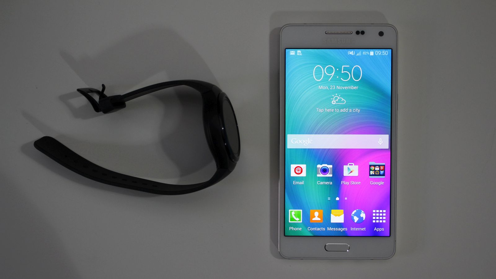
Where this does come across as an issue is this: I was forced to use S-Health, and not to mention Samsung’s other range of apps. S-Voice I despise, and if you’re not using the Samsung Gear S2 with a Galaxy device, you’ll be tasked with installing a trio of additional apps to get Android phones to talk to the Tizen watch. I wasn’t about to give up my daily driver, so I installed the apps onto the LG G4. And they aren’t great.
Unlike the watch, these apps dragged their feet like a spoiled child in a supermarket. Response times were long enough for me to accidentally double tap options thinking that the app froze. But it didn’t.
This is rather all unfortunate because the app’s selection of options are great. You can download more Tizen apps from it, change the watch face, download more watch faces and ban apps from sending notifications to the watch, and that’s just a sample. It just took too damn long to do any of these things though. I barely ever used this app as a result.
And speaking of apps, there really aren’t too many available on the Tizen platform. With two smartphones, a few smart TVs and a bunch of other devices sporting Tizen, I can’t imagine that developers are chomping at the bit to code for Tizen. It’s a grave pity, because it sips RAM and CPU cycles. It’s such a brilliantly optimised OS for small screens, and there’s always spare power in spades.
The apps supported through (not explicitly based on Tizen) were broad enough for my general usage, and included WhatsApp, Twitter, Instagram and Google Mail. If you’re looking for some deeper integration though, I’m not sure if you should be looking at smartwatches at all.
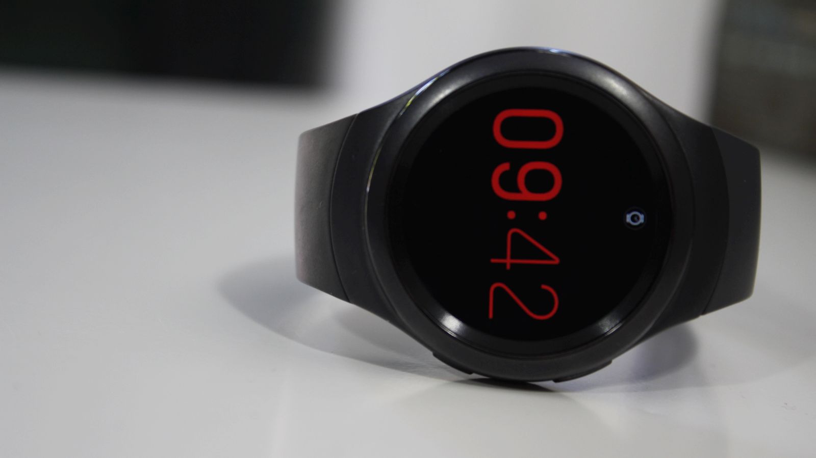
Customisations worked a treat. Holding a firm tap on the watch’s screen brings up a menu allowing you to change aspects, from font used, to information displayed on screen. It’s trivial, but great for those who see these devices as they rightfully are: fashion statements. It’s more satisfyingly granular than Android Wear and watchOS too.
Value for money
But is this the chief reason people will purchase the Samsung Gear S2? Probably, but I’d bat for the Classic version rather if you’re thinking about fashion rather than function. At R4800, it’s a lot of money to drop on a device that won’t likely age well. And in terms of the Classic, hell, if you can afford one (it’s more than R4000, mind), you can probably buy one every year with the gold coins lost between your couch pillows.
But is the general Gear S2 worth it? It’s a great smartwatch, and for one, it is actually a watch. Checking the time was never an issue — something that smartwatch makers seem to forget to include.
But as far as the Tizen OS goes, I don’t think it’s all that mature either. There’s no unique selling point here strewn across the sky, written on my forehead or well, detailed on the Samsung Gear S2’s face. There’s a lot to improve, and that will likely come of age.
It’s a good device, but it doesn’t overcome the flaws inherent in every contemporary smartwatch: it’s just doesn’t add value to my life.
Positives:
- Plays nice with Android and iOS
- Ingenious design enhanced by slick OS
- Fitness tracking is a great positive
Negatives
- Aesthetically bland in some guises
- Pricey for the average consumer
- App support (on watch and phone) is dismal
Verdict: As a piece of engineering, I appreciate what Samsung was trying to do with the Gear S2 range. The S2 Classic is undoubtedly the prettiest smartwatch around, while all models boast incredibly clever design features. But the Tizen app store is lacking, the apps to support the watch on Android are god-awful and, the most important issue: I felt no desire to wear it constantly. But at least smartwatches are improving little by little, round and round.
Score: 7.5/10

