We tested Vox Telecom’s 100Mbps Kiwi Home Wireless in South Africa. Installation, real speed tests, pricing and how it compares to fibre for everyday use
Apple Watch Sport review: the definitive timepiece for Apple fans
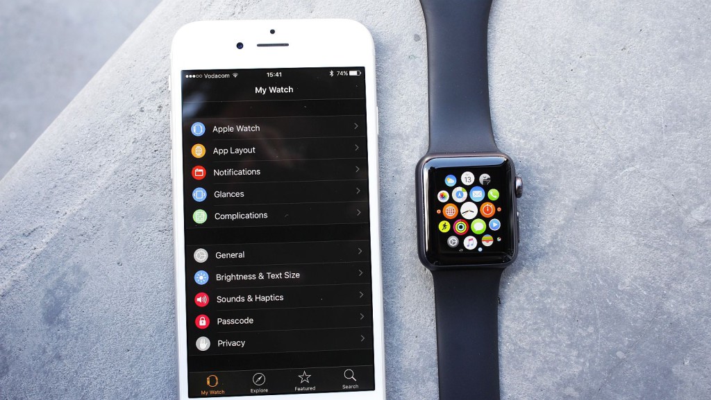
Let’s get this out of the way: smartwatches are still fairly stupid. They’re supposed to stop users constantly checking the nagging smartphones in their pockets, but I find I check my phone more often with a smartwatch on my arm. That’s not to say I absolutely hate all smartwatches.
Sure (and rather incredibly, in fact), I’ve used some that I’ve liked before: the Sony SmartWatch 3, the LG G Watch R and the more recent Samsung Gear S2 spring to mind, but they aren’t desirable, or beckon me on bended knee to buy them. If anything, I’m better off with an analog lounge clock hanging around my neck. But what about the Apple Watch, you ask?
It was a rumour that just didn’t go away in 2015, and was a device long in the making. It’s undoubtedly Apple’s biggest gamble since the iPad, and while tablets did experience something of a sales explosion, smartwatches haven’t quite yet enjoyed that same popularity, until the Apple Watch was launched.
But with that said, if anyone can take a burgeoning idea and milk it, it’s Apple.
Unboxing
Exciting is a word you can ascribe to any Apple unboxing, and that also rings true for the Apple Watch. It’s presented in a long cardboard box, and within it, a submarine-like plastic box. The Watch nestles safely in the latter, while the wireless charger, additional strap and literature is another level below deck.
Thankfully, the strap ensures that thicker armed individuals can wear the watch as well, while the charger can be plugged into practically any USB port, which is a welcome adoption of standard technology by Apple.
Design and aesthetic
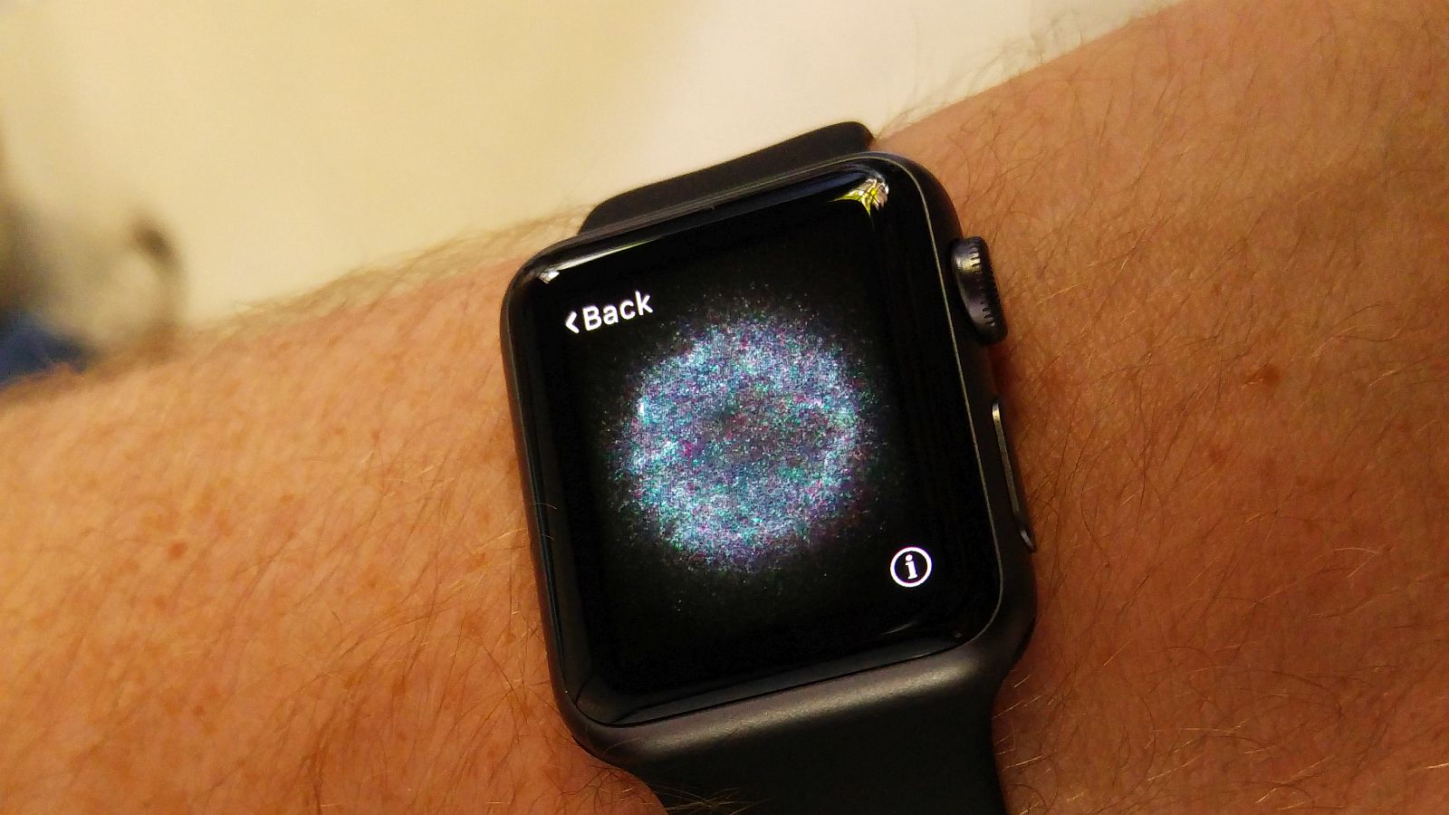
If there’s one (other) thing Apple does extremely well, it’s designing attractive devices. The Apple Watch is another example. Watch’s first generation features only square faces with rounded edges, but at least they’re good looking. It’s definitely a device you want to touch, and others want to grab off your arm. It’s that mystic Apple allure.
It’s also thanks to Apple nailing the finer details too, including the tapered screen which is slathered in scratch-scoffing Sapphire Glass, the dense aluminium shell and the vivid OLED screen.
The Watch is available in two sizes too (as well as three versions, of which the reviewed Sport is the cheapest). We received the 38mm option, which is better suited to those with smaller, thinner wrists. There’s a 42mm version as well, which also features more pixels, a larger battery and suited to gruffer types.
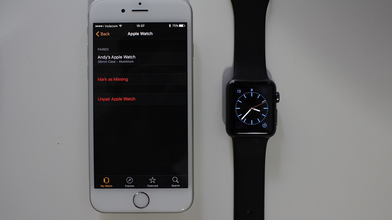
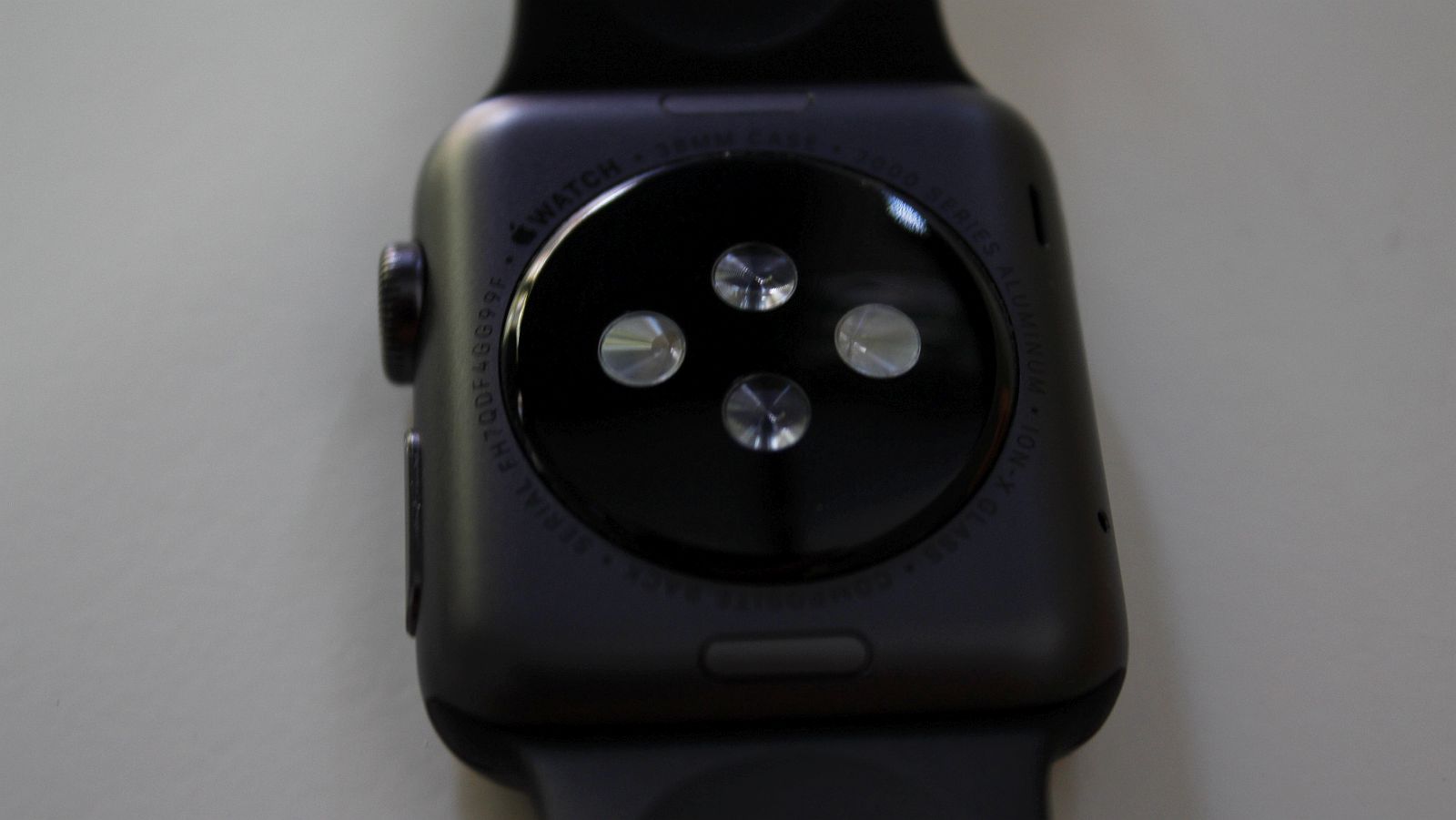
Turning the Watch upside down though, there aren’t any differences between the two. You’ll find the bevy of sensors, with four notable circles within a shroud of glass, and on its side, two buttons. The first — which I’ll call the Friend button (I’ll explain this later) — is almost flush to the Watch’s body, while the second is the famed Digital Crown. The latter feels like a little cog in function and touch, and is satisfyingly sturdy in construction.
It’s that mystic Apple allure
Overall, it’s a stately device adopting new technology and a classy aesthetic which is marred only by its silicone strap. Understated is perhaps the best way to describe it, much like a long, flowing piece of evening wear spoiled by a five dollar pair of pumps.
Internals and specifications
Watches aren’t filled with gears or imps with clipboards anymore, so we have to mention some hard numbers here.
Apple uses a bespoke SoC dubbed the Apple S1, manufactured by Samsung. Its CPU runs at 520MHz, with 512MB of RAM alongside, and 8GB of internal storage for music, pictures and apps. Only a finite amount of storage is dedicated to the former two though.
In terms of connectivity, it features NFC for Apple Pay, Bluetooth 4.0 LE for connecting with iOS devices, and WiFi 802.11b/g/n for additional internet connectivity.
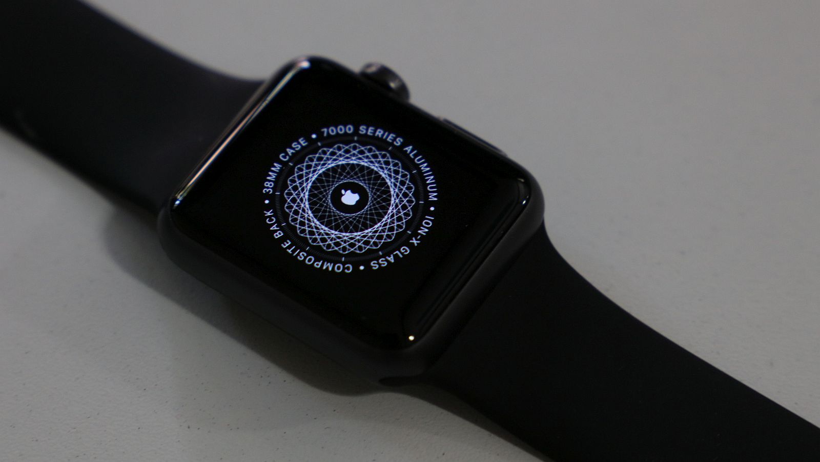
The screen’s size and resolution depends on which model you get. The 38mm version features a 340×272 screen, while the larger 42mm version features a few more pixels, at 390×312.
It’s effectively a powerful pocket sized computer that straps to your wrist, but smartwatches are so much more than the number of pixels they can push around a screen. They’re largely about general usability, and perhaps the most important question is this: “How does the Apple Watch make the consumer’s life better?”
Performance and general usage
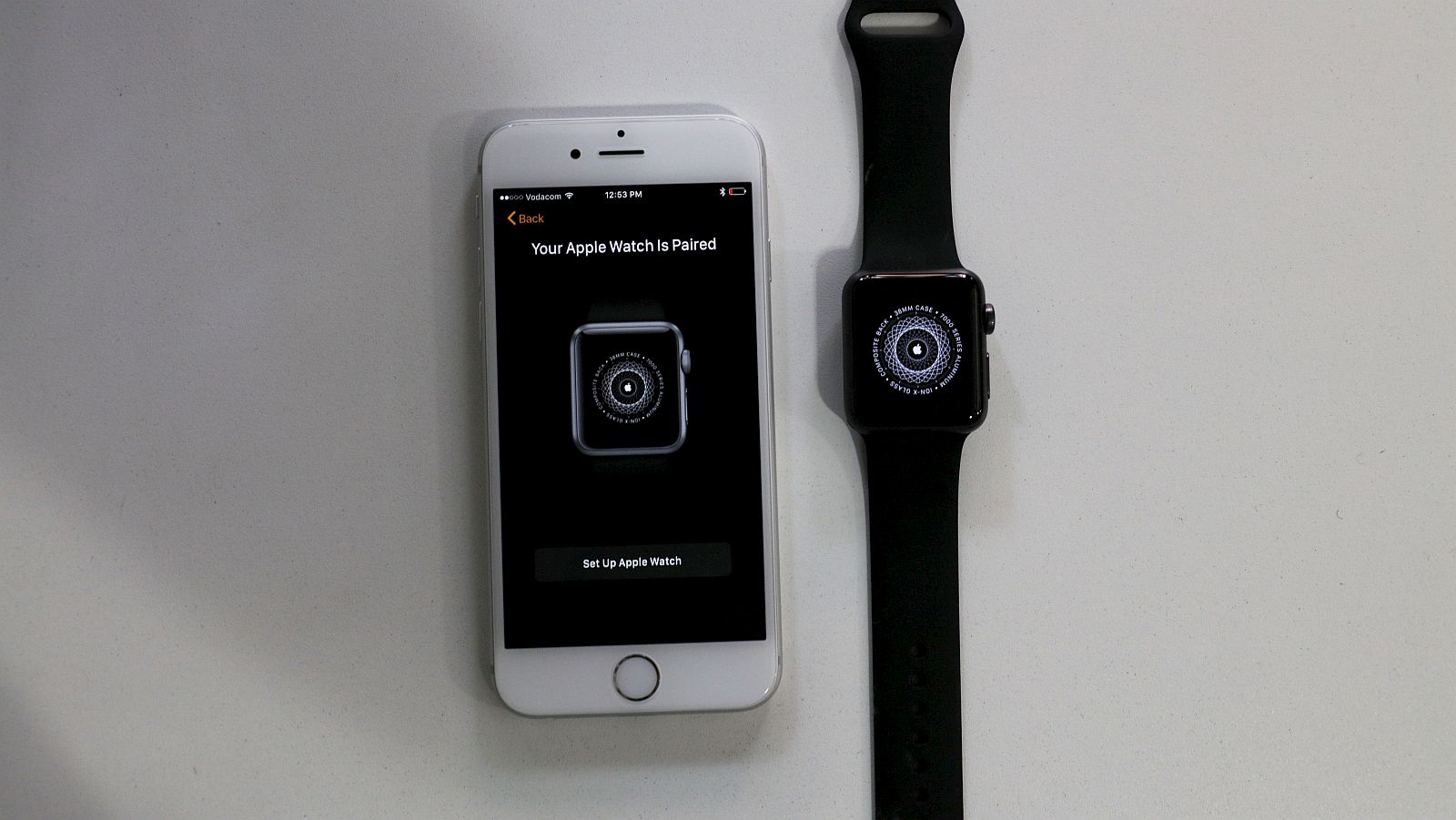
Initial setup of the Watch is simple but more granular than others, but the usual swathe of legal documentation greets the user even before the time features.
Much like a long, flowing piece of evening wear spoiled by a five dollar pair of pumps
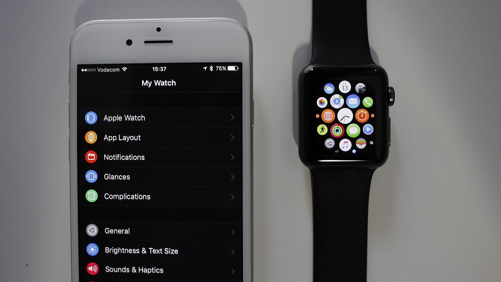
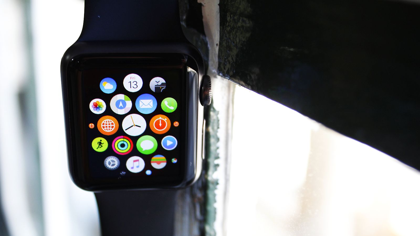
Once the setup is over though, the watch face fills with wheels of circular icons that each represent an app. And there can be a lot of apps. That’s mainly thanks to watchOS’s framework, based on a striped down version of iOS, and perhaps the allure of developers crafting apps for Apple’s wearable. Either way, there’s a much larger array of apps here than on other smartwatches, notably the Samsung Gear S2.
WatchOS is an aesthetic pleasure and lot easier to navigate than some other watch UIs, but you have to know the app’s icon you’re looking for and have fairly small fingers to use it. I often mis-tapped icons alongside my intended target, which wasn’t really conducive to a good experience.
I didn’t find that I needed many of the apps though, and those that I used often didn’t work well. Google Hangouts was one, and other Google services as well were lacking. Yes, you’re probably wondering why I’m banging on about Google. It’s a problem when the majority of your work life is pegged on Mountain View’s systems.
Using certain apps, like WhatsApp, and replying directly from the Watch itself was a productivity boon though. Often the voice recognition system misunderstood my perfectly normal Capetonian accent, which meant that messages were almost always incorrect, but the more often you use it, the faster the Watch understands you. Replying from your watch also means no need to find your phone and pick it up with, say, dirty hands, in order to reply. It’s marvelous but only if you can grasp this lifestyle change.
Apple Watch’s OS is quick to react to touches, but the Watch often required more than one tap or prod to react to my touch. I don’t think this is an issue with the hardware, but more the screen’s sensitivity or the size of my fingers. The 38mm face seemed a little too small for me.
Getting back to the OS, the circular icons can be scrolled through using the Crown or a finger. The Crown was, conversely, almost always too sensitive to use regularly. The OS does feature a nifty set of options to ensure the Crown’s always in the most comfortable place regardless of how or where you wear your watch, but still, it feels a little too cumbersome.
It’s a problem when the majority of your work life is pegged on Mountain View’s systems
If you’re not interested in fiddly bits though, and more interested in the “Sport” portion of its name, the Apple Watch is one of the better health tracking smartwatches out there.
This is mainly thanks to the numerous biometric sensors crammed into its shell. It monitors steps taken, distance travelled and calories burned and said figures are all recorded without any user input. This also plays nicely with the Apple Health app on iOS, where the user can peruse a more detailed representation of activities. And that’s probably what this watch will be used for as the “Sport” variation.
While this is a bonus, getting an Apple Watch to track health is like buying a gold-plated bulldozer to fell a house. It’s expensive overkill. Granted, Apple fans vested in the company’s health tracking systems will undoubtedly disagree, but there are better sport-centric trackers out there from the likes of Fitbit and TomTom, to name but two (and they also happen to display the time, if that’s your thing).
The Apple Watch is a first generation device finding its footing in a burgeoning market segment, so I’ll give it that. It was the first real smartwatch marketing breakthrough, and has sold around seven million units since launch. So Apple’s doing something right, right?
Value for money
At just around R5000, the Apple Watch Sport is one of the more expensive (entry level) smartwatches available in South Africa. It’s explicitly for Apple users too, and thrives if your entire ecosystem centres around Cupertino’s technology. But did it make me want to buy it? Not really.
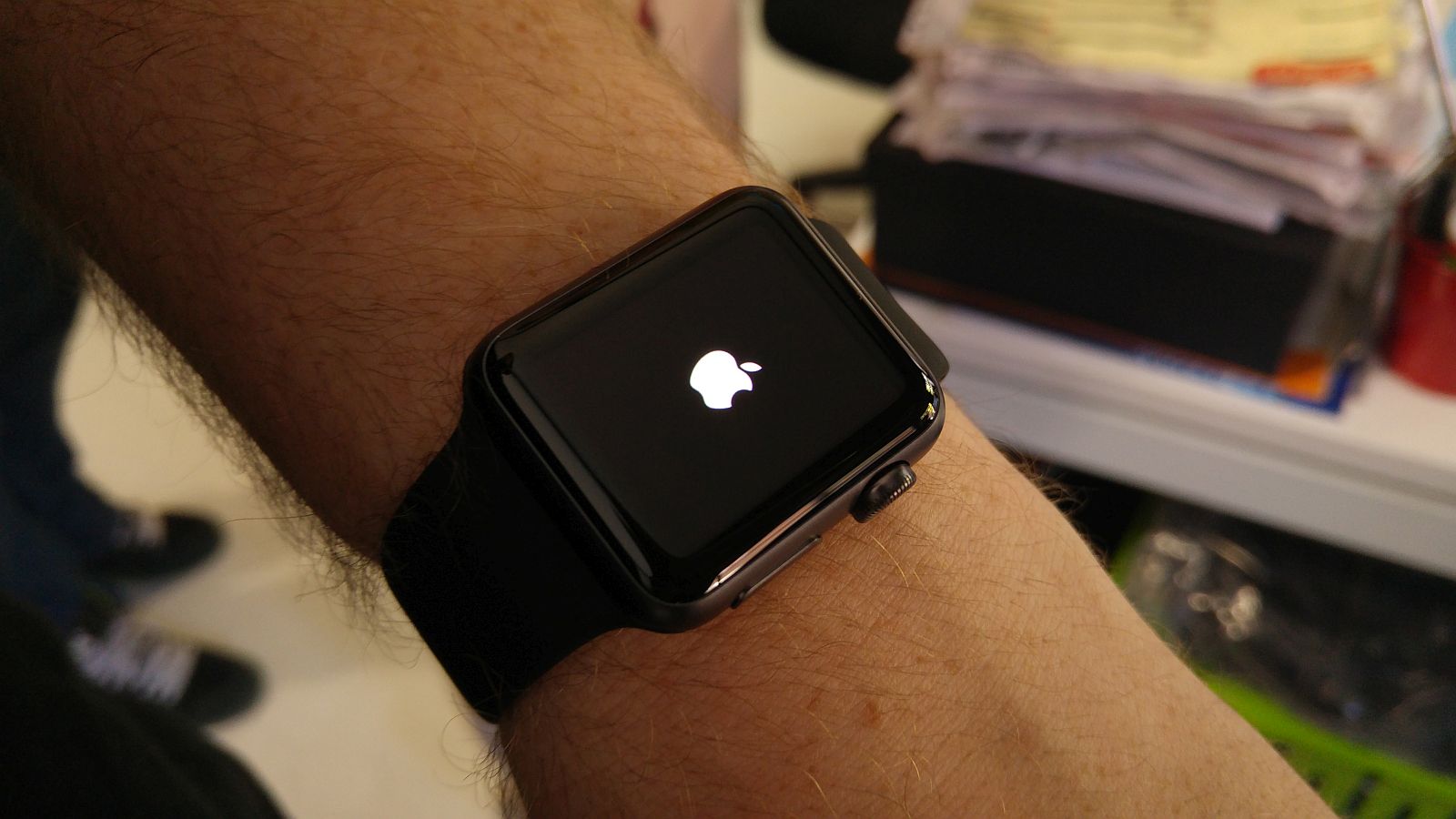
I could often do without the Watch on my arm, and didn’t feel I missed a large part of my digital life when I left it at home. It’s not as magnetic as the iPhone 6S — the phone I used to test it. I can appreciate what Apple has done, shoving a host of impressive technology into a tiny 38mm watch, but that doesn’t mean it doesn’t have flaws.
The OS isn’t geared towards tech beginners, but it’s undoubtedly a pastel visual treat. So ultimately, the answer to my earlier question boils down to this: if you’re an Apple fan, it’s a definite must have, but if you value technology and understand that not everything that shines is gold (or useful), then you’ll wait until smartwatches become more focused and useful, nay, indispensable.
Positives
- Classic design with a touch of modern flair
- The hardware is well balanced
- The watchOS is the most mature smartwatch OS around
Negatives
- Ludicrously expensive for the common tech enthusiast
- It’s exclusivist: Apple ecosystem, or GTFO
- What’s the point of smartwatches now again?
Verdict: I can’t say that it’s the best smartwatch available, because each has various strengths and focal points in different market segments, but it’s probably the best in its price range. Although it’s overly complicated in some cases and over-engineered in others, it’s classy, quick, extremely adept at tracking user activity, and useful in an Apple-only ecosystem. But that’s about it. It’s not the smartwatch that changes my perception of the genre though, and that’s a damn shame.
Score: 7.5/10


