South Africa’s retail forex industry is entering a decisive phase as regulation tightens and consolidation accelerates. What does it mean for brokers and traders?
Why you should (and shouldn’t) buy the Hisense Infinity H12

It’s tough being a budget smartphone in South Africa. It’s even tougher reminding people that you exist as a budget smartphone manufacturer.
Luckily, thanks to a run of solid devices in 2016 and 2017, Hisense doesn’t really need much help regarding the latter. Where it does however is with the launch of the Hisense Infinity H12, a phone that we previewed back in June.
It’s finally in South Africa, and competing against the likes of Xiaomi, Nokia and Huawei for the budget device crown. But the question is: does it have any chance of getting it?
We take a look at a few reasons why you should, and shouldn’t, buy it.
Why you should get the Hisense Infinity H12
Pretty, and well built for a R5000 phone
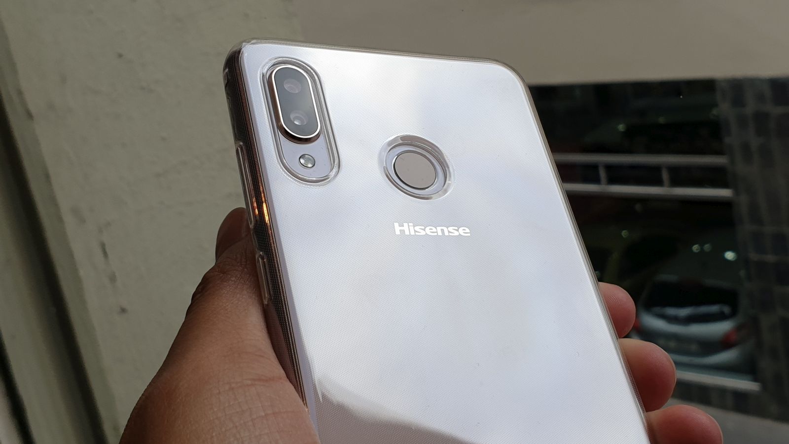
Suited up in its little metal jacket, it’s easily one of the prettiest phones I’ve ever used. The “Blushing Pearl” finish really suits this phone too. It’s a welcome departure from the cloying rose gold that Apple revived a few years ago, and is a subtle yet stylish deviation from the boring black and white phones we’ve seen this year.
Beyond the paint though, the H12 range is stately, elegant and solidly built.
It’s also not too big. At 15.6cm long, it should slip into most jeans’ side pockets. While it’s notably lightweight too at 155 grams.
Quick and accurate fingerprint reader
Budget smartphone fingerprint readers used to be horrible, but the technology’s been refined immensely in recent years. You can feel this on the Hisense H12.
It may take a few milliseconds longer to unlock than some devices, but the slightly raised surface read my prints perfectly each time. Seriously, it worked every single time I unlocked the phone with my finger.
Excellent battery life
Qualcomm’s Snapdragon 450 is a remarkable chip, but not because it’s quick. It definitely isn’t quick.
What it is good at is ramping up when required, while remaining docile in low activity moments to save power.
It can hit clockspeeds of 1.8GHz, which did come in handy while opening apps like Instagram and Netflix.

But when its sprinting legs aren’t needed, saving power is its forte.
Paired with a 3500mAh battery, I could easily go a day and a half before needing to charge the H12. This included heavy Instagram, Reddit, and Firefox Focus usage.
Generous screen size for video binging
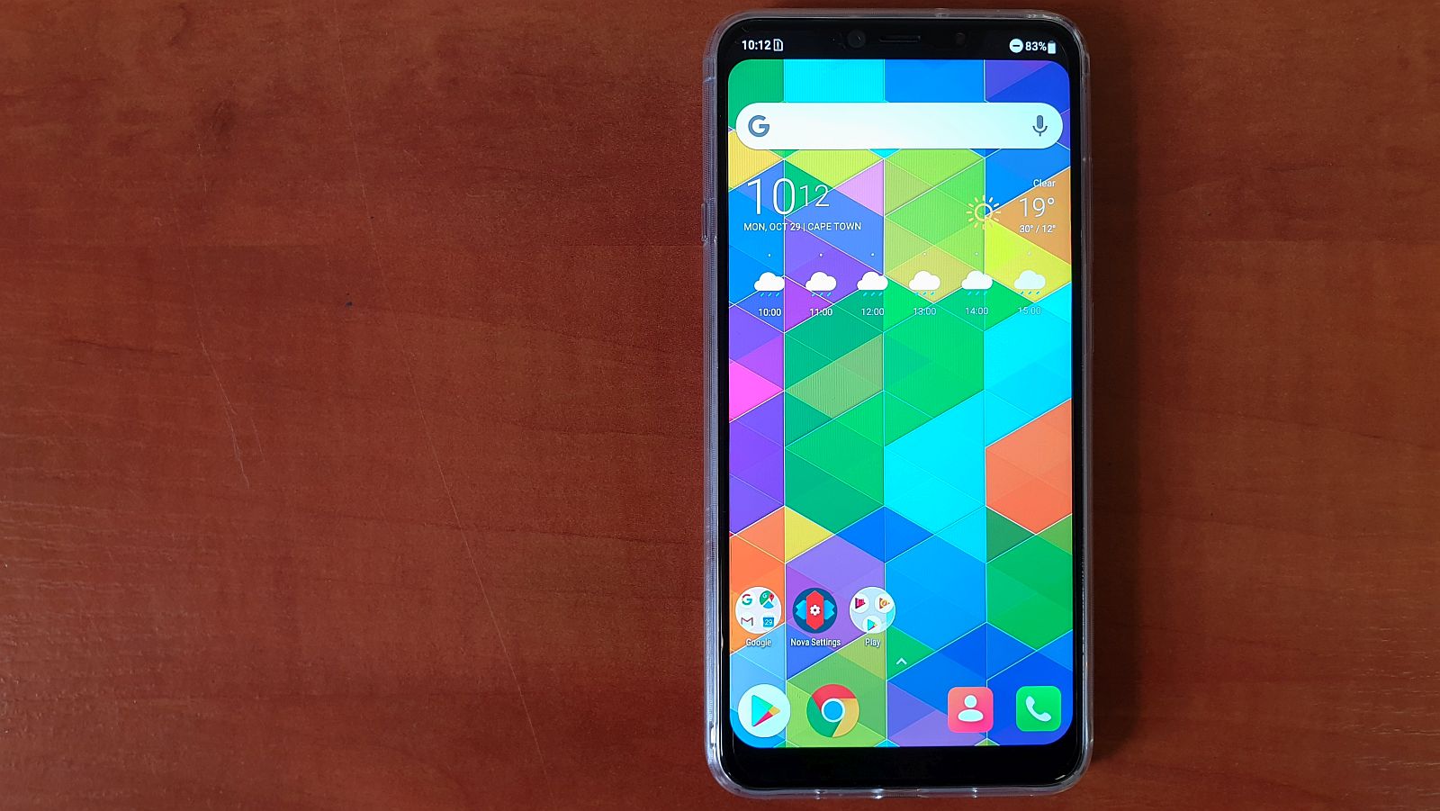
Looking past the notch for a moment, the H12 has a 6.2 inch screen, which makes for a phone that’s a practical size, and gives content bingers enough real estate for video.
Moreover, the phone feels slimmer and less bulky than last year’s Hisense H24, which had a 6.0 inch screen.
The phone’s resolution is a tad low though. At 1500×720, don’t expect high-definition viewing of any kind, but you can at least be comforted by the screen’s decent colour reproduction.
Why you shouldn’t get the Hisense Infinity H12
Sure it’s pretty, but lacks individuality
Some would argue that notches add to available screen real estate, but I’d argue its lazy marketing ruining practical smartphone design.
If screen estate is a factor, why are chins below the smartphone screen so thick? Both the H12 models suffer with this issue. Although the Pro has a smaller notch, it still obfuscates notification icons.
Apps like Google Play Music and Instagram also don’t yet support notches. Is this Hisense’s fault? No, but there’s also no need to blindly follow Apple’s design language.
And while the H12 is a pretty phone, the vertical rear camera array again reminded me of the iPhone X.
Slow, asthmatic user interface
Hisense’s Android UI is pretty damn slow.
During my review, I couldn’t figure out if it was ultimately the Snapdragon 450’s lack of processing grunt, but adjusting the animation scales from 1.0x to 0.5x in developer settings did help somewhat.
What’s weird is that it’s almost stock Android 8.0 Oreo too, with little bloatware — bar a few preinstalled games — to speak of.
No headphone jack
Hisense does bundle a USB-C to 3.5mm dongle in the device pack, but there’s no real excuse to ditch the jack in a budget smartphone.
Let me reiterate this: it’s a budget smartphone. Changes are pretty high that your target market aren’t rocking wireless cans.
Those who do will be met with issues they wouldn’t otherwise face too.
For instance, when I forgot my Bluetooth buds at home and only had my backup wired buds in my bag at the office, I couldn’t use the phone to listen to music on my way home.
Ditching an age-old technology simply because it’s a trend is not a practical move for consumers.
Middling camera performance
I had high hopes for the Hisense H12’s camera. After all, the H24 had a pretty decent snapper all things considered.
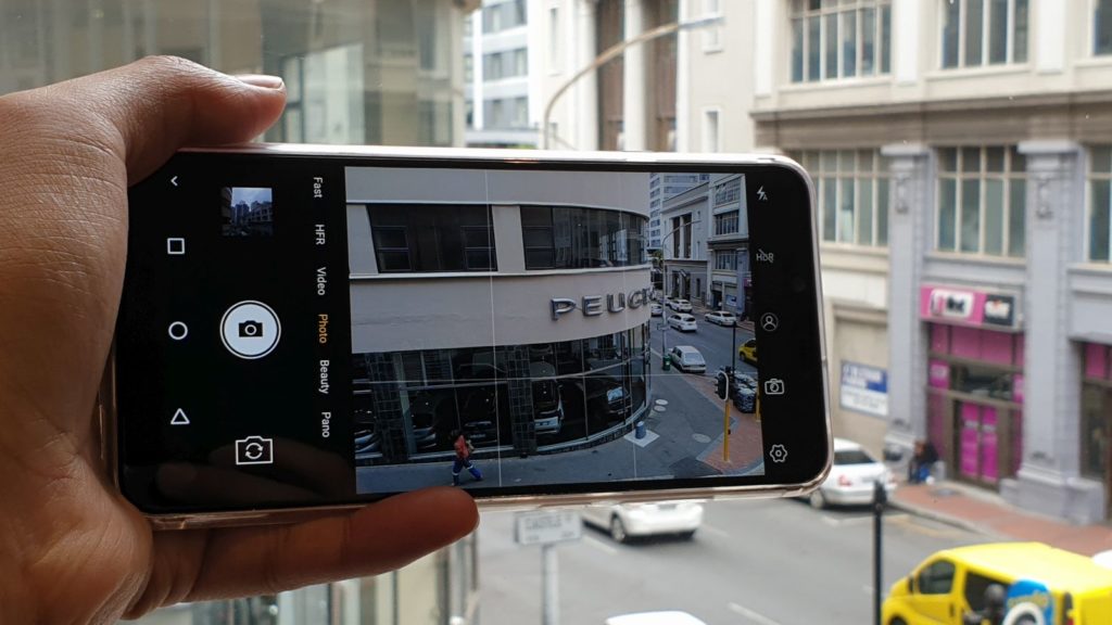
But the dual camera array of 12MP and 5MP did little to inspire.

Autofocus was tardy, the focal length ensured that you couldn’t take any photos within 10cm of your subject, and dynamic range lacked when snapping at any time other than golden hour.
There’s no OIS either, so snapping with a steady hand is a must.
While I thought the camera software may have been an issue, I downloaded Open Camera, gave it a go, and found the same issues.
While the camera’s good enough for snapping pics and sending them to granny via WhatsApp, avoid if you’re a little more serious about your photography.
Better options at the same price
Finally, the biggest problem is that four digit number: the price.
At R5499, Hisense is gambling that this phone’s premium aesthetic will win through. But looking at the phone without it’s pretty attire, you’re left fairly short changed.
The biggest trump card is the excellent battery life, but that’s largely when the phone’s strengths fade in comparison to its rivals.
Devices like the Nokia 6, Huawei P20 Lite, Huawei P Smart, and Xiaomi Redmi 5 look better on paper for a slightly higher, or much lower, price.
And at the end of the day, or the fourth quarter, a budget smartphone’s biggest flaw is its more competitively priced rivals.
Verdict
The Hisense H12 is an admirable little phone. It perks up the budget segment with a heavily iPhone-inspired aesthetic that still somehow pleases me. But it is overpriced for what you get, and what its rivals ultimately offer. If the smartphone landscape was a vacuum, I’d give it a thumbs up. But the budget smartphone market is fiercely competitive, and that’s something Hisense — more than any other firm — should know.
Images: Andy Walker/Gearburn


