South Africa’s retail forex industry is entering a decisive phase as regulation tightens and consolidation accelerates. What does it mean for brokers and traders?
Review: Nokia E6 nips and tucks and botoxes

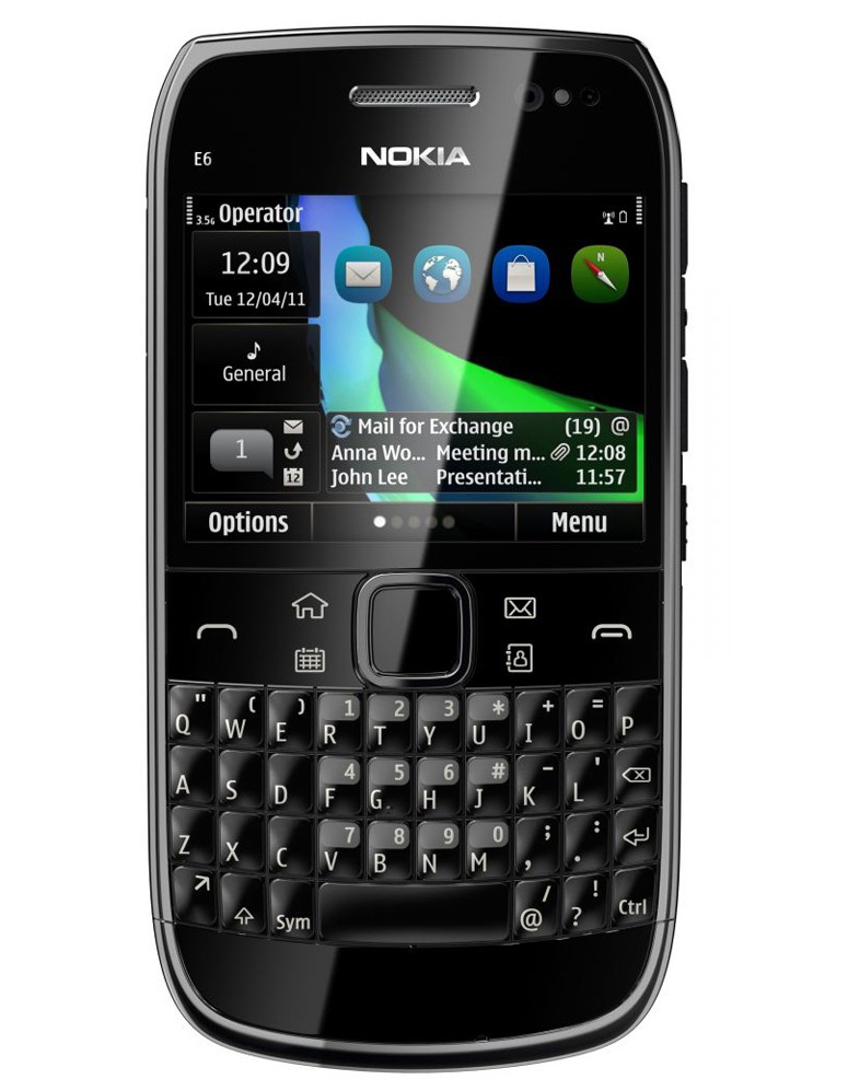
The Nokia E6 business-oriented smartphone sports Symbian Anna, the latest (and probably one of the last) iterations of Nokia’s storied Symbian mobile phone operating system, now turfed out to the gentle ministrations of Accenture’s minions. It’s more or less the same qwerty-keyboarded small-screened messenger-type smartphone that’s been a solid partner to millions, not radically changed since its debut as the E71 way back when.

You’d think by now it would be well nigh perfect. Not ever more flawed.
Let’s start with what Nokia has got right. It is still an incredible piece of mobile phone – flawless fabrication and assembly of durable, tough materials that look executive-smart. The keyboard is still the best around ergonomically, with the keys just rounded enough to give you the haptic happiness of knowing exactly where you are pressing. The display is higher res than previous models, with 640×480 pixels giving you 325ppi with highly accurate capacitive touch. And…
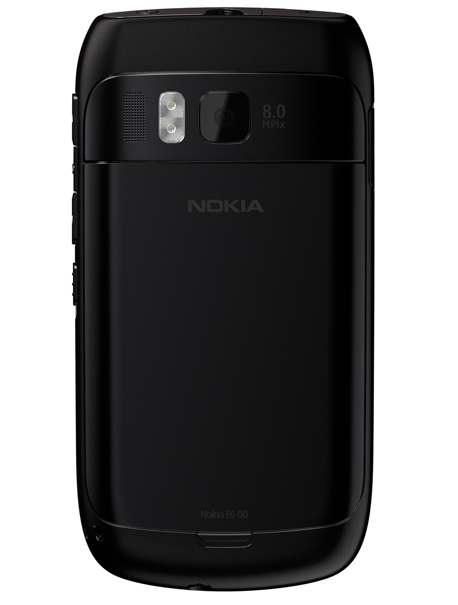
Well, that’s pretty much the sum of it. The rest of the hardware is very competent, but hardly impressive. 680MHz processor soldiers away gamely with the help of a graphics co-pro, but struggles a little to keep up, so the little spinning “hang on, busy” indicator will become your regular companion when using apps. The camera is a decent 8MP that does a credible job, but it’s fixed focus, and far from awe inspiring (samples below – low light it does better than most, but it over does exposure when using the very bright flash). Video will do 720p at 25fps, all very decent.
Too many commitees
 Symbian^3, and Anna in particular, is fundamentally underwhelming. As part of Nokia’s outsourcing of any further Symbian support and development to Accenture until 2016 (yes, Accenture, that company famous the world over for its development of sophisticated mobile phone operating system software), 2,800 developers will be shipped over to a new home.
2,800 developers. A whole big room full of developers, plus a room next to it, and one next to that, and then a couple more floors of them, and another building or two. What have these people been doing?
Not developing software. More likely sitting in endless planning and strategy and quality control and six-sigmas and visoneering sessions. The whole feel of Symbian is bodged together elements born from whiteboard-beset management-smothered design sessions, where nothing hangs together properly, and the user is at best an inconvenience to be worked around.
It works at working
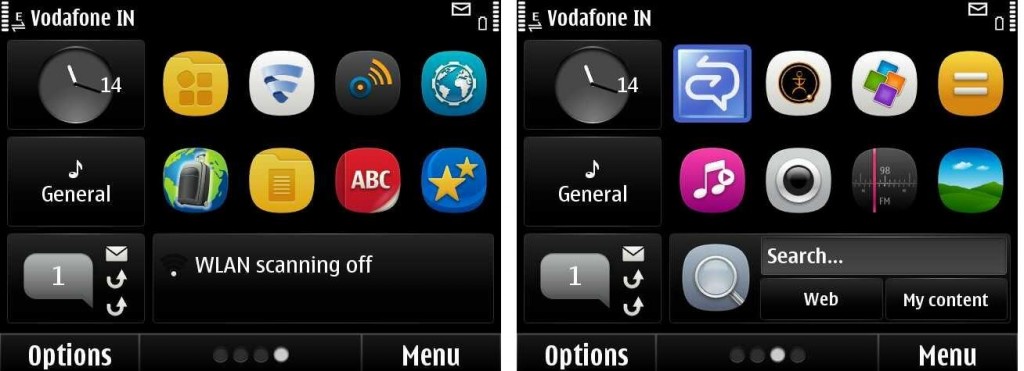
It all works well enough – it’s stable, robust, moderately intuitive (if you’re familiar with Nokias, anyway) but there is no clear single thread in the UI design. Everything feels grafted onto everything else. You get five home screens with various widgets, but half the time you’re still hitting the home button to bring up the old, faithful Symbian menus. The widgets are fixed size, with the left hand third of the screen broken up again into thirds vertically. This area is taken up by two indicators, for ringer mode, and the clock. Yes, you counted two. Inexplicably, the lowest corner can not be populated with anything. And every single home screen has this – every single one of your five defined widget screens has the whole left hand third taken up by a clock, the ringer mode icon, and an empty space. Oh wait, if you get an SMS or missed call, it uses the space for the notication. That’s a really clever use of screen real estate.
 The main home screen updates when you fire up the phone, but the un-displayed screens don’t refresh in the background. A few hours after turning on the phone, when you swipe sideways to the other screens, you have to wait for them to load up and refresh.
It’s certainly not as much of an inconsistent UI mess as the N8 (which once you tweak it and get used to the maddening UI idiosyncrasies is a really good phone), but the E6 is still littered with small stupidities. Every time you want to send a text message, you have to switch text entry mode from numerals, because so many people type in the phone numbers of people they regularly text. WTF? How did the QA people miss this?
Unifying messaging
And not to be snide, but Nokia, 1998 is calling, they recon your messaging apps are pretty hot. Pity that while everyone else is creating unified inboxes that bring together various messaging platforms, Nokia is keeping SMS, email, social media and other message types strictly separate in separate apps.
One could go on and on, but the simple reality is that Symbian was never really the problem, at least from the user’s point of view (app devs may disagree). The increasingly flaky and inconsistent implementation of apps and UI was the problem. The train wreck that was Ovi was the problem (and despite officially killing the Ovi brand, it’s still all over the place on the phones).
The tragedy with Nokia was never its technology, or its developers, it was the stodgy, bureaucratic management chasing focus-group led nonsense and stopping the engineers doing good work through stop-go-stop-go architecture changes (mobile dev Mark Wilcox has some interesting things to say about it all here in the post “What Happened to Nokia?”).
Bottom line – Gear or Burn?
So. Is the E6 a good phone?
Yes, it’s a very good phone. The missed chances and cranky UI are frustrating (although definitely not show-stopping), but the rapid collapse of the third party developer community for Nokia apps is a bigger problem. A rule of thumb for app developers in which order to develop handset flavours nowadays is “Apple, Android, Blackberry, Nokia”. With Nokia a distant last (not going to worry about WinPho here yet).
Case in point: one of the most popular chat apps, WhatsApp, is available on Nokia, but it’s a clumsy quick hack (contacts integration weird, doesn’t support emoticons). And the dev seems uninterested in putting much more work into the platform.
So. Gear it or Burn it.
Tough call. Can’t really do either. I was very relieved to go back to my usual trusty Desire Z (first non-Nokia phone after ten+ years of only using the Finnish marvels). It has a browser that works properly, loads of Android apps, and messaging and social media that suit me, not some management creep.
The E6 is a solid choice for a corporate buyer that wants Mail for Exchange to talk to their office’s MS mail servers, it is reliable, solid, good looking. Is that enough? Sadly, no.
Burn it.
Who it’s for:
- Serious business types that need a serious phone with serious Exchange integration chops
- Dyed in the wool Nokia fans that are happy to tweak it to work around the factory setup
What we liked:
- Great build quality, very sharp looking
- Nokia throws in car charger and windscreen suction mounting bracket for use in-car
- Excellent call quality, pic quality (although fixed focus), sound quality, display quality
- The long press on the keylock button on the side (nice addition!) that turns on the torch is a nice addition
What we didn’t like:
- The klunky interface and bolted-on feel of features
- No dedicated camera button (what’s with the annoying dedicated voice-activated button? Who uses that stuff?)
- Vibrating alert is pretty feeble
- Could only get about two days battery life out of it


