TikTok has not been sold in the United States. Despite headlines suggesting otherwise, the short-video platform remains partially owned by ByteDance. What has changed…
HTC One review: throw out your iPhone
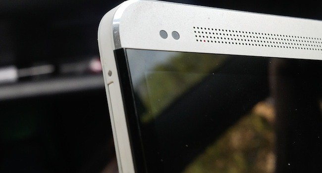

Apple has been out-Appled. The HTC One is a triumph of design and functionality and if you want your next phone to make you happy for a while yet, this is the one you should get. Scrap that, it’s the phone everyone should get.
It’s funny that, at a phase when it’s in financial dire straits, HTC has managed to cook up something so astonishing. The Taiwanese giant is supposed to be dead and buried, one of the more significant casualties in the war between Samsung and Apple. So what is the One then: a last hurrah or the moment we’ll all remember as HTC’s great comeback?
Nostalgia by design
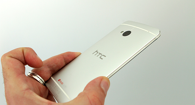
Based on design and looks alone, it should be the latter. The One is exquisite. Its solid lines and metal casing are pleasing to the eye in a way that makes the iPhone 5 look tired, outdated and awkward. The power button, volume rocker and SIM-casing are at once flush and entirely usable.
The front speaker holes meanwhile put me in mind of a portable radio my father had. I used to run my fingers over those speakers every time I went past the radio. I find myself doing the same on the One and every time I do, I’m instantly transported back to my childhood. There are few gadgets that can successfully evoke a past era and look contemporary all at once, the One not only manages it, but does it well.
The only potential negatives are slight. That metal casing isn’t exactly grippy, so if you’re inclined to be clumsy, it might be worthwhile investing in a case, although it would be a massive pity to cover it up like that. The other slight negative is the absence of a dedicated camera button. Now that’s not a problem for most smartphone owners, but my regular phone is an HTC 8X and the ability to access the camera without having to access the screen is a massive plus.
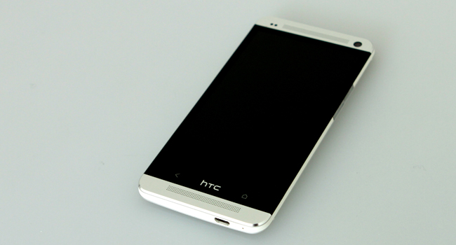
Even the operating system, Android 4.1.1 with HTC Sense overlaid evokes the past. The design is a stark black background with bold white icons on the homescreen, and flat icons in the app menu. It’s a different look and feel, but one that fits in with the “sharp and clean” look of the HTC One.
A camera for the people
Once you open up that camera though, you’re in for a treat. What’s that? You’re sceptical? Oh well, I can understand that: a 4MP camera doesn’t exactly inspire confidence. The thing is, the camera on the One is an ultrapixel. What that means is that the pixels are larger and, according to HTC, are capable of capturing “300% more light than most leading 13 megapixel cameras”.
Ultimately you probably won’t end up with the insanely high-definition ones that you’ll get with Nokia’s Pureview technology but you will get photos that are perfect for sharing with your friends and that come out much better in low light than the competition has to offer.
Audiovisual delight
Once you’ve taken those photos or videos using the camera, you’ll be able to view them on the One’s 1080 x 1920, 469 ppi screen. Putting aside the fact that ppi has pretty much become a phallus-waving contest at this point, everything really does look good on it. It’s buttery smooth to the touch too and is the perfect illustration of just how far we’ve come with touch screen over the past few years.
If you really want to be pleasantly surprised though, play a song. No, don’t bother putting headphones in. Just play the song. I understand why you’re looking at me like I’m mad, songs played on phones suck. They sound tinny, and the singers could be at the bottom of a swimming pool for all the clarity you experience. The One is different. Play a song on it. It sounds like music coming out of an actual audio device, a good one at that. I’m not entirely sure how HTC’s achieved this wizardry (it can’t be Beats technology, my 8X has that and music played through its speakers sounds awful) but it should be awarded a minor humanitarian award for it. At least if someone insists in blasting dubsteb on the One, it won’t sound like it’s coming from a radio cursed with weak signal and existing in the 1950s.
The benefits of power
Among the internals that help keep the One going are a 1.7GHz quad core CPU, 32 or 64GB of internal memory 2GB of RAM and a host of sensors. Powering it all meanwhile is a non-removable Li-Po 2300mAh battery. All do their jobs pretty well. Even with multiple updates installing and a number of resource-heavy apps left open, I had no trouble performing other tasks. That said, the battery isn’t going to break any records and sits solidly in the middle of its contemporaries in most stress tests. With a 48 hour standby time, it’s also a little behind the S4, which will put a few battery nerds off… I guess. The very impressively specced HTC One is detailed here.
A tragic triumph
None of these little quibbles with the One should matter even slightly though. It’s that good. It should be the phone on everyone’s lips right now. If the iFreaks really care about design as much as they say they do then this is what they should be lusting after. If all the Samsung owners out there really wanted awesome tech wizardry without having to worry about their devices spontaneously falling apart, this should be what they’re marking down as their next phone. If HTC abandoned its two marketing strategies — weird and non-existent — for one that actually makes sense, then this could be the phone we all look back on in a few years time and think “man that thing was amazing”. The sad thing is, it probably won’t.
I hope I’m wrong. I hope people start picking up the One. I hope future analysts will pin this as the point that HTC started getting it right again, the point at which it became an exciting contender in the smartphone space again. But I just can’t see that happening and that’s sad.
Verdict: The HTC delivers in spades. Prove me wrong and buy one now.
Score: 9/10
