TikTok has not been sold in the United States. Despite headlines suggesting otherwise, the short-video platform remains partially owned by ByteDance. What has changed…
Nokia X review: plenty noise, zero x-factor
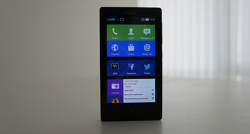

Nokia has released some great smartphones in the past couple of years — at least hardware wise. Devices like Lumia 1020 and Lumia 1520 taught everyone else how to make smartphones with image quality rivalling that of dedicated digital cameras.
When there were rumours of Nokia testing some Android smartphones, heartbeats quickened. But after a couple of leaks, it was evident that Nokia would be releasing an entry-level hardware device with Android.
After being officially revealed during MWC 2014, it has been released at a price matching that one of the Lumia 520. Is it worth enough to spend on a Nokia X?
Design & Build Quality
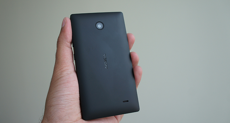
In terms of design, the Nokia X looks very similar to the Nokia Lumia 520 due to its polycarbonate unibody-like design. Nokia loves playing with colours and offers the device in six bright options. There is only a single capacitive button on the front as opposed to three buttons necessary as per Google’s standards. The power button and volume rockers are on the right side. These buttons are comfortable to reach and press. The headphone jack is on the top while the microUSB charging and data transfer port is at the bottom of the device. It feels very comfortable to hold and operate, although a little boxy. Nokia could’ve spent more time on its design to make it feel more natural in the hands. The back is removable, which paves the way for dual SIM cards slots, microSD card slot and a removable battery.
Display Quality & Audio Performance
The Nokia X uses a 4-inch IPS LCD screen with WVGA resolution. Although on paper it is the same screen from the Lumia 520, the main difference is that it uses an inferior 2-point multitouch capacitive touchscreen digitiser versus the 5-point multitouch screen in the Lumia 520. Due to the gap between the display and the protective surface, the screen becomes a bit reflective under sunlight and difficult to read. On the whole, there is nothing interesting to write about regarding the display of the Nokia X. Glance Screen and Double Tap To Wake options are lifted from the Lumia series. Turning on the Glance Screen displays current time and other information such as notification without draining a lot of battery. This is in spite of it not being an AMOLED display. The loudspeaker is clear although not bass-intensive. Voice calls were loud, clear and natural. Music through headphones was average at best.
Camera
There is a 3.15MP fixed-focus camera on the rear of the Nokia X. There is neither an LED flash light on the back nor a front-facing camera. There are three camera modes: image, video and panorama. The image quality is below average. Due to lack of an autofocus lens, clear macro shots are impossible. It even lacks 720p HD video recording, which has become the bare minimum for smartphones in its price range. Videos can be recorded only in 480p resolution which is too low as per today’s standards.

Nokia X 3
Nokia X 2

Nokia X

Nokia X Shot

Nokia X Shot

Nokia X Shot

Nokia X Shot
Internal Hardware & Performance Guts
The Nokia X is powered by a 1GHz dual-core Qualcomm Snapdragon 200 processor. It is the most entry-level mobile SoC from Qualcomm. It combines 2 ARM Cortex A5 cores with an entry-level Adreno 203 GPU, which is good enough only for games such as Angry Birds and Temple Run. 512MB RAM is good for nothing if an Android device isn’t running on the latest v4.4 KitKat. I experienced lags and stutters throughout the testing period. If you are even slightly into graphically rich games, you should stay away from the Nokia X. Accelerometer, ambient light and proximity sensors are present to help you with automatic screen orientation and battery saving.
Operating System & UI
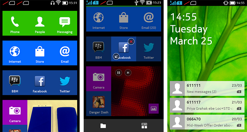
Although it comes with Android underneath, Nokia has done whatever it takes to make it look like a mix of Asha OS and Windows Phone OS. Nokia calls the software as “Nokia Software Platform X 1.0”. There are no multitasking and menu buttons. Long pressing the back buttons takes you to the home screen. The whole UI felt laggy at times. The web browser has a lot of performance issues. It would be better to use the Opera Mobile browser than Nokia’s own, in my opinion and based on hours of use.

Just like with iOS, swiping the notifications on the lock screen takes you straight to the application, while swiping either left or right takes you to the homescreen. There is no dedicated app launcher. The first screen lists all the installed applications, while the adjacent screen, which can be accessed by either swiping right or left, shows the FastLane interface. Apps take time to start and scrolling is stuttery. One really can’t imagine that this UI is based on Android.
Connectivity Options & Battery Endurance
Almost everyone has learnt the secret formula for success when making low-cost smartphones. It needs dual micro SIM card slots — a necessity for all the entry-level and mid-range smartphones. The primary SIM card is compatible with 7.2Mbps HSDPA 3G networks, while the other is compatible with EDGE networks. Apart from this, it is accompanied with Bluetooth v3.0 A2DP, Wi-Fi b/g/n, A-GPS and microUSB v2.0 port. The device can also act as a Wi-Fi Hotspot for other devices. It certainly ticks these boxes.
Wi-Fi and cellular signal strength was commendable throughout the testing period. It comes with a 1500mAh Li-Ion removable battery, which lasted around two days with normal usage. It takes around an hour and a half to charge the battery completely from zero charge.
Nutshell:
The Nokia X price is currently hovering around INR8000 (±US$130) in India, which is one of the first markets where the device was launched. Even though everyone had great expectations with Nokia’s first Android smartphone, it turned out to be a dud, performance-wise as well as UI wise. It lacks access to Google Play Store and its hardware is unimpressive. Based on the price and performance, no one should be buying this.
Score: 4/10
