With powerful hardware working together with an industry-leading camera system and intuitive AI experiences, everyday tasks have never been easier and faster
LG G3 review: third time’s the charm


The G2’s design was a bit too boring. The G Flex’s curved body and display was way too extravagant. Now, LG’s latest flagship, the G3, puts simplicity right in your hands while giving you enough power to back-up whatever you’d want to make it out to be. It’s almost like a chocolate cake. Its outer layer spells style and simplicity, though dig just a little deeper, and you’ll find plenty more surprising treats and nuances. You can’t help but feel that it’s holding back just a little.
Looking good
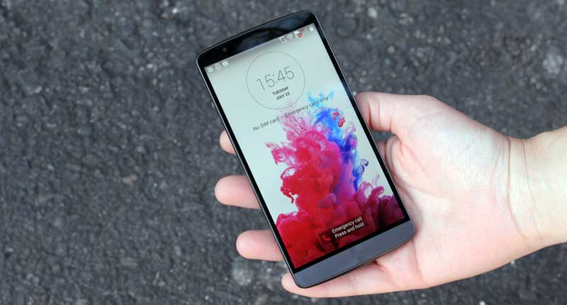
Subtle yet substantial design elements like the curved back, the lack of buttons on the sides, and the incredibly thin bezel make the G3 feel modern and silky-smooth.
It’s biggest competitor has to be the Samsung Galaxy S5, given its phablet 5.5″ size and specs. On the overall physical design front, the G3 beats the S5 out of the water, or most Androids out there for that matter.
Though, you can quickly get the feel of each individual button (and LG added a slight click), the process is still a learning curve that I’m too spoiled to look over, considering the competition. But that’s just me being cynical, really.
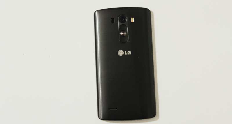
The G3’s signature is of course the power and volume buttons smacked on its back, right under the camera. This means that there’s no bumps on the phones sides which gives it a very sleek, comfortable feel indeed. Like the S5’s leather-like plastic rear, the G3 has a brushed metallic plastic cover instead.

I would have hoped then that LG decided to make the back cover metal as it appears to be. If not, it could have been like the G Flex’s super sci-fi self-healing cover (but that needs a curved material to work).
Its display has more pixels than there are kills in Game of Thrones, and most high-end smartphones on the market for that matter. The S5, for instance, has 432 ppi and the iPhone 5S 326 ppi. The G3 has a 5.5” Quad HD 534 ppi screen.
One of its greatest qualities — the fact that it carries such a fancy big-ass screen — is also one of its flaws. The pixel density is great, and it probably has the best quality I’ve ever seen on a smartphone. Yet because the phone’s so big, I often found myself struggling to navigate using only one hand. It’s simply not intuitive in that sense. Holding it in one hand, and swiping from the top for more information about a notification is extremely awkward.
On that note, the display’s size and quality is supposed to munch through power even though it’s a 3000mAh battery. To my surprise, the battery held its own. Browsing the web using WiFi, playing games and watching videos kept the G3 going for about two days.
The sleek curved back cover is also slippery and I’m too often aware that it might just slip out of my hands when I take it out of my pocket. In this case, a cover is definitely something you should also consider.

‘Simplicity is the new smart’
When LG announced its latest flagship, it emphasised its design direction of sticking to the straightforward. “Simplicity is the new smart”, they said. This means that the South Korean giant leaves enough room for the G3’s owner to add some of their own personality, which is refreshing to say the least.
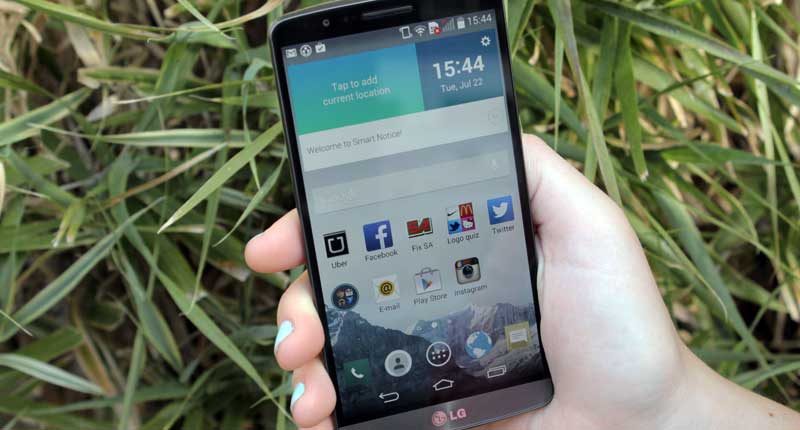
The beauty is in the little things. For instance, you can customise the navigation buttons at the bottom of the screen, moving the home button to the right and the back button to the middle. As is the usual case with Android devices, in order to access Google’s voice search, you hold down the home button and swipe up. With the G3, you can customise this and add the Phone Book if you like. Most if not all of the settings are customisable.
The G3 has Android 4.4 KitKat, bringing with it flat icons, lines and circular buttons when you pull down the notification bar. The general colour scheme, to add to the modern but somewhat timid design, doesn’t flaunt the power of the G3’s display. It’s quite timid in that sense.
It’s only when you fire up HD YouTube videos via LTE or WiFi that you’ll start to see the amount of power you’re actually holding in your hands. Digging into the device, you’ll find a 2.5GHz quad-core CPU complemented with its beefy Adreno 330 GPU and Qualcomm Snapdragon 801 processor. Furthermore, the G3 has 3GB RAM with 32GB internal storage with the option of expanding.
A nice touch
As with the previous two models in the G series, the double tap or knock feature seems little more than a gimmick at first. Though I soon embraced the gimmicks with open hands and ended up thoroughly enjoying it. To wake the G3 up from slumber, tap the screen twice. Tap the wallpaper twice, and it’ll go back to sleep.
I eventually found myself even tapping at other devices’ screens in force of habit.
http://phandroid.s3.amazonaws.com/wp-content/uploads/2014/06/lg-g3-software-screens-640×378.jpg
Another nice touch was the pop notifications when you receive a text message, where a new window opens up over whichever application you’re using. Unlike other Android devices where you have to swipe down, tap, and start typing, you can now just tap reply or close.
Speaking of typing, the G3 has a stunning keyboard. From the fact that you can customise its size easily by dragging it to the size you see fit, to the fine effects that fades the word suggestions in and out. It’s also meant to learn from your tapping (typing?) habits where it tries to fix occurring mistakes.
Apart from the usual Android PIN or slide, there’s another unique lock option where you tap a specific pattern, anywhere over the screen as long as it’s in a unique sequence over four squares — an interesting touch, but one that didn’t wow me and seemed a bit redundant.
As with the 13MP camera, you simply touch on the Camera App, tap on the screen, point and “Snap” — you have yourself a new photo. It’s a simple point and shoot that’s fast and makes your photos look stunning. Blacks seem deep, and the colour saturation natural. Even pictures taken at night don’t disappoint — too much.
The G3’s software features like the LG Health or Smart Notice aren’t too bad but seem unnecessary. Still, it’s refreshing that LG doesn’t try and obtrude the user experience and “sell” you all its features. The apps are there, they’re just not as in-your-face as they are with Samsung’s S5. This means that the smartphone works well for both Android newbies as well as the diehards.
Verdict: For a device that’s meant to take simplicity to heart, the LG G3 is far more complicated than it should be. The screen size is a welcome relief and beautiful to boot, though navigation can sometimes become less than intuitive for one-handed users, but that’s my personal preference. My biggest hope is that the G3’s back cover wasn’t made of plastic. Having said that, the G3’s faults are somewhat minimal compared to the overall package. The G3 is a big, bold, beautiful phone and LG deserves to sell a lot of them.
Score: 8/10

