Donald Trump’s call for Netflix to remove board member Susan Rice has intensified the Paramount saga, pushing the streaming wars into a political confrontation.
Meizu M3 Note review: is this the budget phone for m3?

The Chinese smartphone sector is still booming, with several major companies dominating proceedings. You’ve got Huawei, Xiaomi, Vivo and Oppo all duking it out for supremacy.
Their efforts are being keenly felt in South Africa too, as the likes of Huawei and Xiaomi hit the market, delivering a mix of premium and budget-minded offerings. But another notable player making its way to South Africa is Meizu, in the form of the Pro 6 (review) and the M3 Note.
We’ve already reviewed the Pro 6 though, finding a R7999 handset that, while solid, doesn’t quite compare to other phones in its price range. Nevertheless, we enjoyed the FlymeOS UI and the unique method of navigation, so we’re glad to spend some time with the R3200 M3 Note.
Much like the R7999 Pro 6 and the Xiaomi Mi 5, the M3 Note also has a Xiaomi nemesis in the form of the Redmi Note 3. So how do the two compare — at least on the spec front?
Specs?
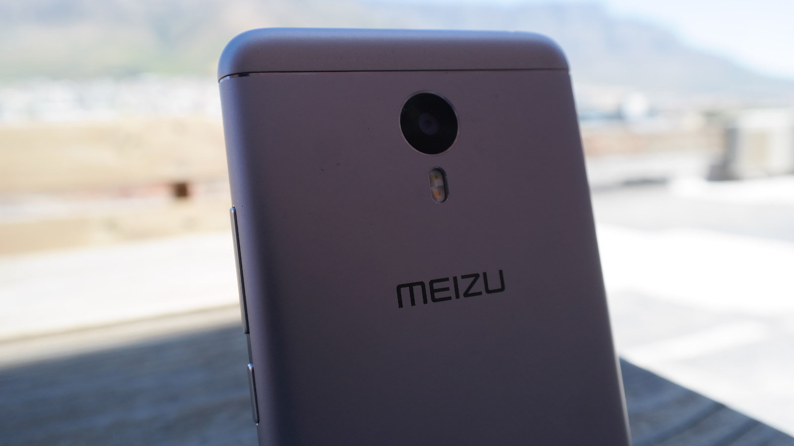
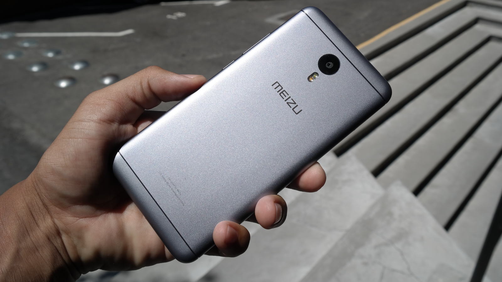
Look at the spec sheet and you’ll notice a phone that actually looks like the Redmi Note 3 (or is it the other way around?). In any case, the Meizu largely features the trimmings of a bog-standard Chinese smartphone in 2016.
Unspectacular but relatively capable MediaTek Helio P10 octacore (eight A53 cores) chip? Yep. 2GB of RAM? Sure. Middling 13-megapixel f/2.2 main camera with a 5MP selfie shooter? Indeed. Expected but welcome hybrid dual-SIM slot? Yay.
The Meizu M3 Note definitely has budget specs, but there are one or two bright spots here
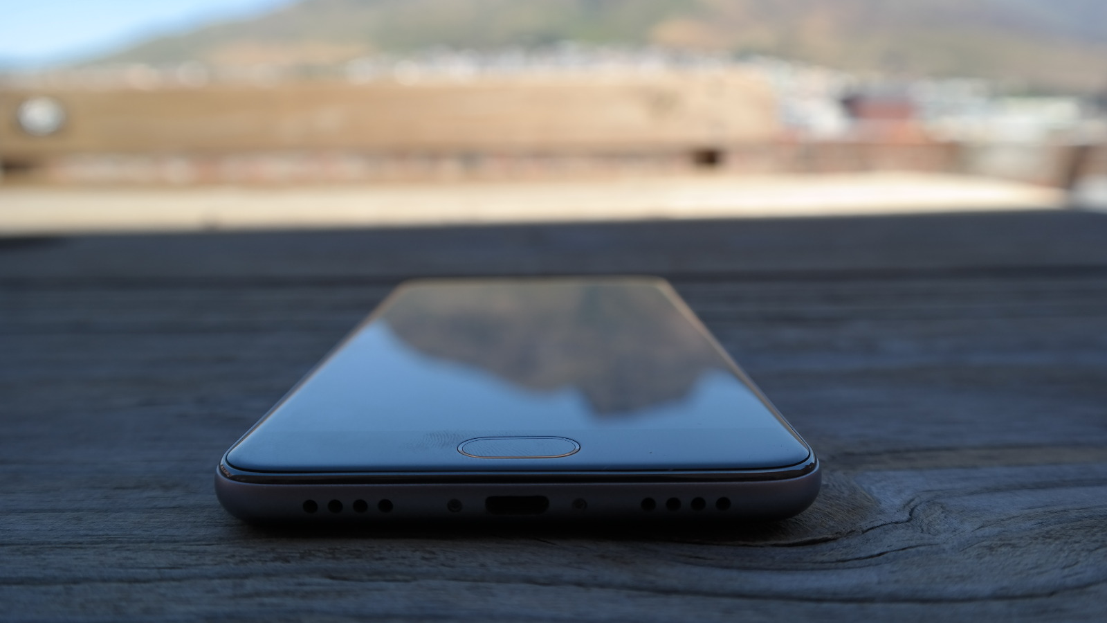
Otherwise, a pleasantly bright and sharp 5.5-inch 1080p LCD screen, microUSB port and earphone jack round out the hardware features.
The Redmi Note 3 packs a few of the same features (1080p LCD screen, 2GB RAM, 16GB expandable storage, hybrid SIM design and 5MP selfie camera), but the Note 3 steps things up with a much more powerful Snapdragon 650 chip and 16-megapixel main camera.
In other words, the ball is in Xiaomi’s court on paper. But there’s more to a decent phone than specs, right?
The actual software experience
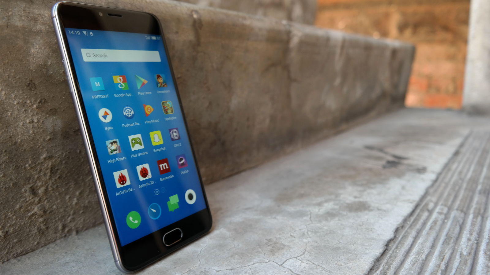
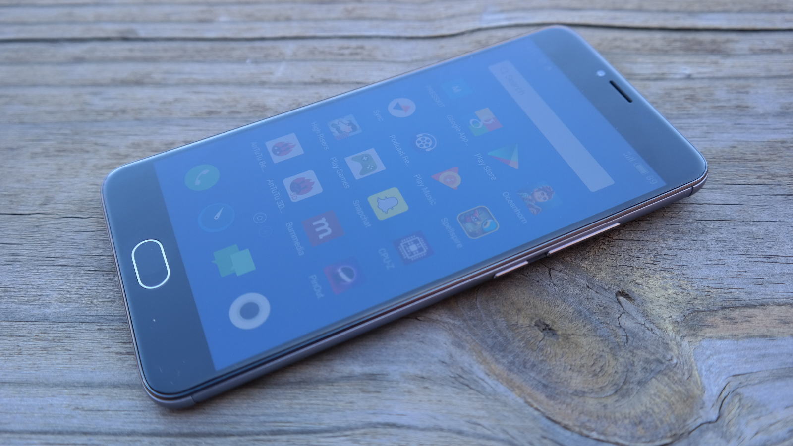
Much like the Pro 6, the Meizu M3 Note offers the same FlymeOS Android skin, delivering the iOS-style opaque overlays, settings menus and toggles. It never feels like a “heavy” skin, so those afraid of a Galaxy S4-like skin needn’t be concerned.
In fact, I really enjoy the one button arrangement used by Meizu for general navigation. You see, there’s only one physical home button (no back or multitasking keys), with a tap being used to go back and a press being used to go home. Swipe up from the bottom bezels and you’ve got the multitasking menu open. It all makes for intuitive navigation and second nature after a few minutes.
What you should worry about is the lack of Google Mobile Services out of the box. Much like the Pro 6, you’ll need to visit the “Hot Apps” store (preinstalled on the phone) to get the GMS prompt. Once you’ve installed this suite, you have access to the Google Play Store and the rest of the Google apps.
The Meizu M3 Note doesn’t have powerful innards at all — but general performance is good enough
It’s not a huge concern for the tech savvy, but newbies will no doubt be feeling a little befuddled with this arrangement — especially when you have to use an app store that sounds like every dodgy popup ad ever.
Lack of Google services aside, the usual list of preinstalled apps/bloatware is here, in the form of music/video players, the now-expected Phone Manager suite and a tools suite.
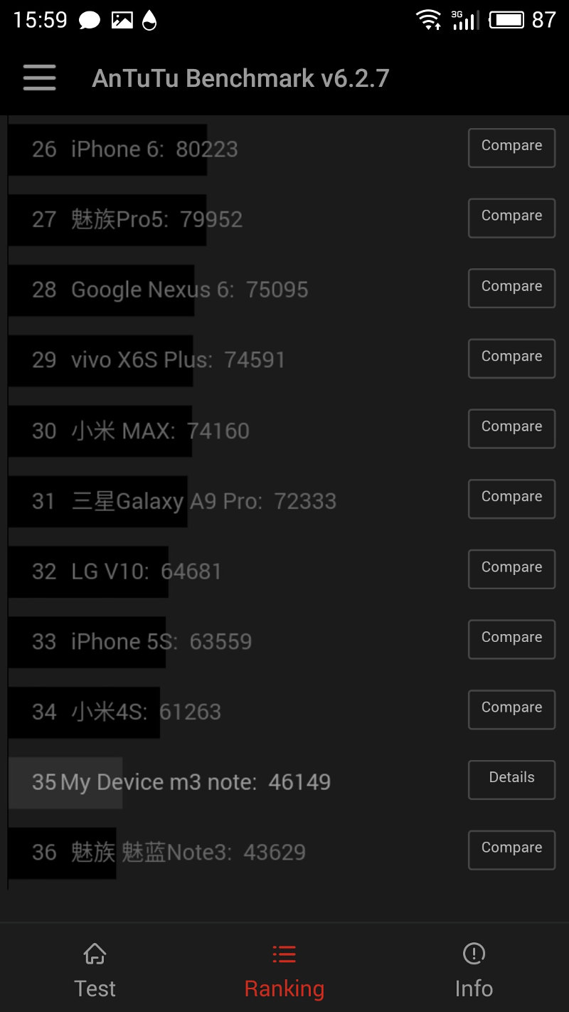
In the power department, the M3 Note is a clear step down from the Pro 6 and Redmi Note 3. In fact, an Antutu test reveals a phone sitting below 2013’s iPhone 5s in the power stakes, just cracking the top 40. But the day-to-day performance holds up well enough.
Whether you’re switching screens, launching apps or heading back to the homescreen, it’s all accomplished relatively quickly. Do expect a wee bit of app reloading now and again when you’ve got a few apps in the multitasking tray, but otherwise, the M3 Note shouldn’t cause any grief during everyday usage.
Gaming is a different test for the device and the Helio P10 processor is firmly in mid-range territory so, while you can play many advanced titles, expect to turn the visuals down for almost all of them. We tried less advanced fare such as High Risers and Spellspire, with both titles running extremely smoothly.
We saw variable results with Oceanhorn, PinOut and Maximum Car though. Oceanhorn immediately defaulted to lower visual settings, but stayed very playable. PinOut also saw a slight graphical downgrade from the looks of things, but ran without a hitch at all. Maximum Car was the toughest test for the hardware, the choppiness making for a borderline unplayable experience at times.
Otherwise, the fingerprint scanner was relatively accurate and fast to unlock, while launching/using the camera was quick enough as well. But if your top priority is getting a device that speeds through everything, the M3 Note isn’t going to be for you.
The camera

Meizu M3 Note

Meizu M3 Note

Meizu M3 Note Antutu

Meizu M3 Note

Meizu M3 Note
Meizu M3 Note

Meizu M3 Note Sample

Not the best shot for the M3 Note in the harsh morning light. Note the halo effect around the white building on the right.
Meizu M3 Note Sample

Note the extremely blurry HDR implementation.
Meizu M3 Note Sample

The colours look great here, but the tree itself is rather splotchy. In fact, detail in general is splotchy here.
Meizu M3 Note Sample

A solid photo here, with a fair amount of detail in the houses. Sunsets are hard to get wrong either.
Meizu M3 Note Sample

There's definitely some colour bleeding here as well as a slightly soft image overall.
Meizu M3 Note Sample

The phone captured more than just the capillaries, capturing the leaf's texture too.
Meizu M3 Note Sample

Ideal conditions for the M3 Note camera, with quite a bit of resolvable detail to be had.
Meizu M3 Note

The M3 Note certainly makes its budget trappings felt here. A 13-megapixel f/2.2 main shooter is definitely average on paper — and in practice.
In terms of pure quality, the phone is pretty capable during the day, offering some saturated colours (but not feeling overly vibrant) and a solid level of detail when you zoom in. Turn on the HDR and, much like the Pro 6, you can expect blurry shots with alarming frequency. It’s something that the likes of Huawei and others struggled with a few years ago, but to see it here again is extremely disappointing.
Low-light photography isn’t going to impress at all either, thanks to copious amounts of noise and a subsequent loss of detail. Sure, a better sensor would’ve helped, but I get the feeling that OIS would’ve gone a long way too.
In the video department, the phone tops out at 1080p, but those expecting 120fps slow-motion or 4K will be disappointed. As for the actual quality, you’re looking at highly compressed, mediocre video quality here. It’ll work for the likes of Snapchat and other social networks, but don’t expect great quality at all.
The 5MP selfie shooter fares much better though, capturing plenty of light and delivering solid selfies in most conditions. But all in all, there are better mobile cameras out there in this price bracket. The Redmi Note 3 and LeEco Le 2 come to mind.
Battery life?
The M3 Note’s best asset is arguably its large 4100mAh battery, easily putting two day life within reach. And no, you don’t have to actively try saving the battery, with the P10 chip generally being economical too.
We also put it through a video playback test, using a 20 second 1080p/60fps clip on a loop via MX Player. This was run with mobile data and WiFi enabled, while the screen brightness was manually turned up to 100%.
The result is a phone that gave up the ghost after ten hours, so it’ll definitely last for three movies or a season of your average TV series. It’s almost double the time of the flagship Pro 6 too, which died after five and a half hours.
In other words, if battery life is the only thing that matters to you, then the Meizu M3 Note warrants consideration without a doubt.
Key numbers
Dimensions: 153.6mm x 75.5mm x 8.2mm
Weight: 163g
SIM Type: dual SIM (nano-SIM, hybrid)
Display: 5.5-inch LCD, 1920×1080, 403ppi
Chipset: MediaTek Helio P10 octacore | quad-core ARM Cortex-A53 1.8Ghz and quad-core ARM-A53 1.0Ghz | Mali-T860 GPU | 2GB RAM
Storage: 16GB expandable
Imaging: (Rear) 13MP, f/2.2 aperture, two-tone flash | (Front) 5MP, F/2.0 aperture
Video: 1080p at 30fps
Battery: 4100mAh fixed
Cool features: USB Type-C, front-mounted fingerprint scanner
OS: Android 5.1 with FlymeOS
One to take Note of?
Even though the M5 Note is already out in some regions, the M3 Note features the same processor (only missing out on more RAM), so those who really want a budget-priced Meizu phone don’t need to wait for the successor. But for everyone else?
The M3 Note would’ve been a recommended purchase 12 or 18 months ago, owing to its huge battery and solid display. But with the Redmi Note 3, Redmi 3, LeEco Le 2 (expect a review soon!) and even the HiSense KO all being great sub-R4000 handsets, it’s a little tougher to recommend.
Verdict: The Meizu M3 Note offers a huge battery, intuitive UI and lush screen, but the subpar processor, lack of preinstalled Google Play Services and disappointing camera means you should look at other budget handsets for now.
Score: 7.5 out of 10

