Anthropic says its AI will not be used to spy on customers, even in government contracts. Here is what that means for AI governance, enterprise trust and defence partnerships.
Google Drive gets a much prettier, refreshed user interface

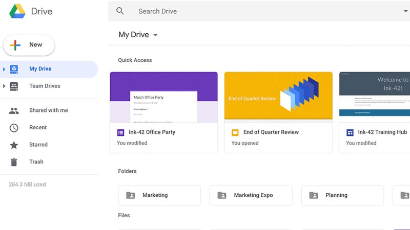
Hot on the heels of Gmail’s redesign, Google Drive is also getting its share of UI updates.
The Mountain View company on Wednesday announced changes that will smooth out the service’s currently clunky layout, and add some material design flair to the visuals.
“There’s no change in functionality, but some icons and buttons have moved, and there’s a range of visual tweaks to align with Google’s latest material design principles,” Google explains in a press release.
With that said, specific design tweaks include changing the position of company logos, a settings icon placed alongside the search bar, a repositioned Help Centre icon also alongside the search bar and a new font.
They’re all minor changes, but the visual result is pleasant.

The changes should be implemented to all users’ accounts within three weeks.
Feature image: Google


