With powerful hardware working together with an industry-leading camera system and intuitive AI experiences, everyday tasks have never been easier and faster
New Microsoft Edge icon looks more like a wave and less like Internet Explorer

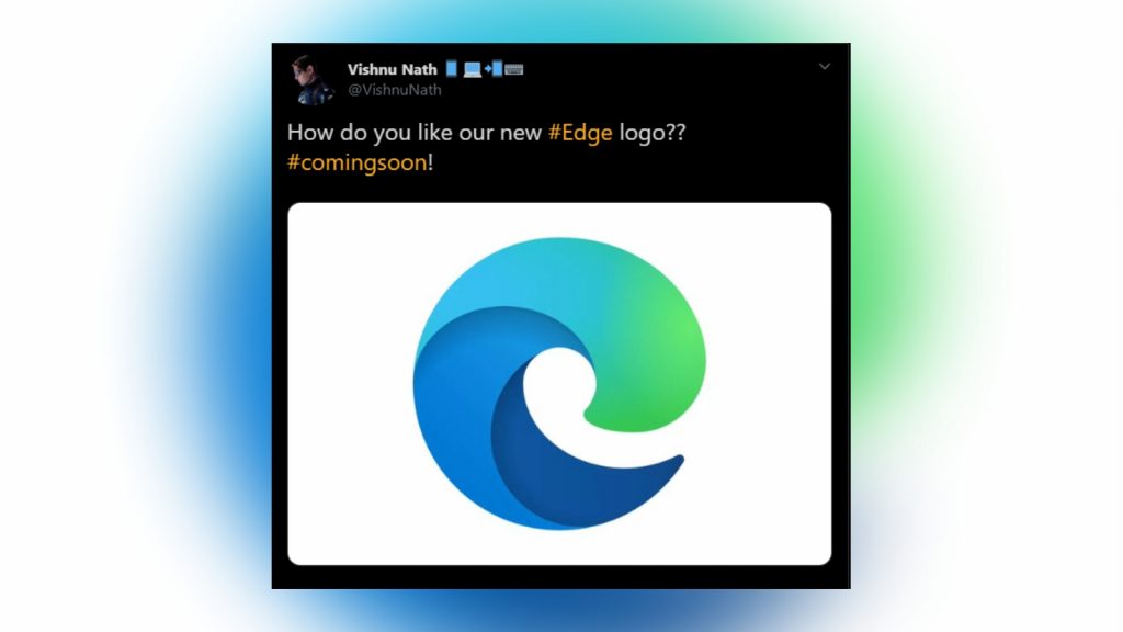
Microsoft Edge is getting a new icon reminiscent of the company’s 2018 Microsoft Office redesign.
Announced by Microsoft’s Vishnu Nath in a tweet and spotted by The Verge, the new icon features a wave-like design in hues of blue and green.
How do you like our new #Edge logo?? #comingsoon! pic.twitter.com/EgL6n5xqRI
— Vishnu Nath 📱💻📲⌨️ (@VishnuNath) November 2, 2019
Like Microsoft Office’s updated icons, the colours reflect simplicity and modernity for the browser, giving it a new look that moves away from its Internet Explorer history.
According to The Verge, the icon was revealed in Canary, an early-testing platform for new features in Edge, and will likely be released with Microsoft’s upcoming Edge Chromium browser.
The new browser is currently available to download in beta.
Feature image: screenshot, @VishnuNath via Twitter