Anthropic says its AI will not be used to spy on customers, even in government contracts. Here is what that means for AI governance, enterprise trust and defence partnerships.
Hands on with the iPad: The Memeburn review
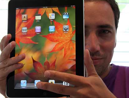
The lingering stares you get while walking around with an iPad tucked under your arm is confirmation that this is no ordinary gadget. In fact, it gives you a small inkling of what it must be like to be a rockstar.
Complete strangers stopped me in my tracks to get a closer look or start a conversation about it. Heads would turn. One guy came up to me, shook my hand and just said “well done”. While in a meeting at Cape Town-based digital agency Gloo, parts of the company came to a standstill when word got out there was an iPad on the premises. A crowd gathered, and I found myself giving a spontaneous demonstration. For the rest of the day I decided to hide it because it was simply taking too long to walk from A to B.
Such is the fanaticism that Apple inspires around its products. I can’t think of too many gadgets from companies that evoke such religious devotion. I’m no Apple fan boy. I’m a happy Windows 7 VAIO user, but I do love my iPhone. I can appreciate a beautiful gadget — and the iPad is indeed a beautiful piece of equipment.
The screen size is luxurious, and despite the extra processor demand, it swipes and pinches with the same smooth ultra-responsiveness of its smaller cousin. It’s fast. The glossy, tactile A4-sized screen makes for dramatic viewing, browsing and gaming. Google maps look simply awesome. Zooming and swiping through the high-resolution detail gives you that Tom Cruise Minority Report feeling.
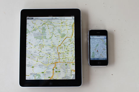
The device feels a bit “precious”. Unlike the lighter, more plastic Kindle you feel the iPad needs to be treated carefully. It’s not a book replacement in the sense that you could comfortably leave it lying on your bed or couch in the lounge. Using one of those large, rubber protectors, like the one on my iPhone, somehow feels silly and clumsy on the iPad. The device is also a little thicker than I would have liked. It also could be lighter.
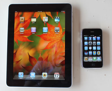
At first glance there’s not too much of a departure from the iPhone. The outside shell is similar, just bigger. With the exception of the icon sizes and the static background image, the desktop user interface experience is almost identical to the iPhone too.

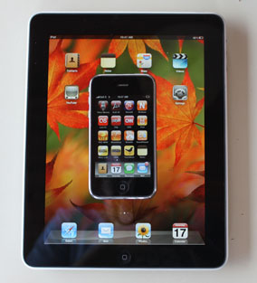
This is both the device’s strength and weakness. There’s no learning curve for iPhone users (and some would argue the interface is so intuitive there’s not much of a learning curve for first time users either). At the same time you can’t help but feel Apple missed an opportunity to do something more than just replicate an iPhone experience on the ample iPad desktop. Perhaps there was an opportunity to marry elements of the Mac OS with that of the beautiful iPhone OS? Perhaps there was an opportunity to go beyond the classic iPhone icons and have an expanded widget presence — a feature other mobile operating systems seem to have mastered particularly well?
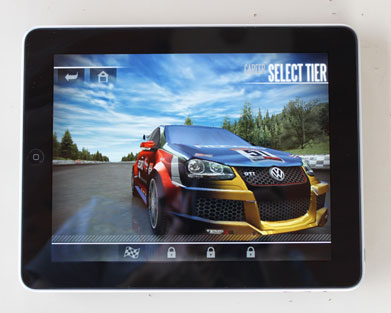
There are differences in some of the iPad’s core apps such as Calendar, Contacts and iPod, which have been modified to suit the larger screen. The games that came with my device — TouchGrind and Need For Speed SHIFT — are stunning on the large, glossy screen. My iPad quickly became an accelerometer-driven steering wheel as I raced my car through the streets of Chicago. It has a strange, futuristic feel –- and you get the feeling that this may be the start of a gaming paradigm shift. Despite some heavy 3D gaming, the battery life just lasted forever (I’ve yet to charge it and it’s still going).
The native iPhone apps we downloaded to the device looked awful. Yeah, awful. We tried the New York Times and Supersport iPhone applications. When they expanded to fit the larger iPad screen, the silky smooth design curves became ugly and pixelated. It was horrible. It looked like a dog’s breakfast. In fact, I’ve seen better dog’s breakfasts.
You of course, have the option of shrinking the iPhone apps to their original iPhone size on the iPad but they just look, well, silly. This must have been quite a dilemma for Apple — and I guess it’s the best they can do. We’ll just have to wait for more dedicated iPad apps to be made.
The leisure device
The iPad is supposed to be our “third device” –- a leisure device we’d use in the lounge or bedroom, reclining on a couch or in bed. We could be reading a book, looking at photos, playing a game or watching a movie. If we’re on the Net, we are reading an online magazine or newspaper away from the distractions that come with our work laptop. Sometimes I’m too tired to open my work laptop -– it’s work, I just don’t want to see it.
A key part of leisure computing, however, is communication. For me, that means Skyping my friends and family. Strangely, a front camera is missing on the device, which I think is a mistake. And before you think I’m one of those gadget fanatics who want everything: I’ve never really desired a front-camera on my iPhone.
The iBook app works well and pages turn intuitively with the flick of your finger. All books are searchable, and the font size and screen brightness are adjustable while reading. One wonders however if the glare of the screen won’t prove too much for intensive reading. This is what the eInk revolution brought us and partly why the Kindle has been such a success as a book replacement.
While almost forgivable on the iPhone, the iPad’s infamous lack of Flash ability is just ludicrous. This is a device that goes as a multimedia experience. A web experience without Flash makes for a dull experience.
These shortcomings won’t bother anyone but the uber geeks. The device is another revolution by Apple –- and it’s amazing what a difference a large screen makes to the experience. But it’s a revolution that’s still in progress.
Prognosis? If you have the money, buy it and you won’t be disappointed. But if you have the self discipline (and you can bear it that you don’t have one), I’d wait for 2.0
The iPad was kindly supplied by wantitall.co.za
