ClawDBot: The AI That’s Quietly Taking Over South African WhatsApp Groups Focus keyphrase: ClawDBot WhatsApp AI Meta description: ClawDBot is the new AI bot…
A (not so) great comeback: The Nokia N9


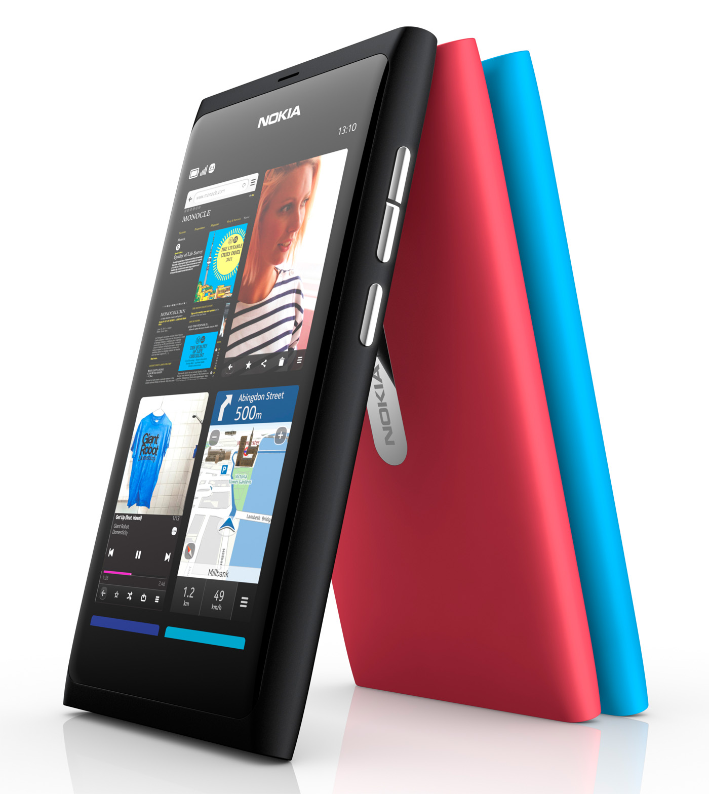
This might be the most polarising review of a gadget I have ever written. The Nokia N9 is a beautiful phone, cool to the touch and deeply gorgeous, akin to the obelisk in 2001: A Space Odyssey. It is also a disgustingly obtuse phone, stuck with both feet in the past and unable to accept its fate. Let me explain.
The Dark Crystal
The screen is deep, richly black and instantly responsive. At the Nokia N9 launch, Marko Ahtisaari (head of Nokia design) said that he wanted “less looking into your screen, and more of interacting off the screen”. With a 3.9″ AMOLED display as beautiful as this, you will have a hard time peeling your eyes off the quartz-like display. Full specs can be found here.
The screen is tough and coated with a layer of anti-glare polarisation. It’s one of the best screens I’ve ever seen, almost beating off the retina display of the iPhone 4. Multi-touch input is the icing on the cake and will be described in detail later on.
A series of patterns
The interface, a simplified Linux mobile OS known as Meego is crap and hey, it still looks like Symbian. There is no excuse for Nokia having to release a phone this beautiful with such a backwards and archaic OS. The genius implementation of the general interface is lost with the sloppy OS. If the N9 was paired with an Android or Windows 7 mobile OS, then the phone would truly shine.
I can see what Nokia has tried to do here though. “Don’t bury your head in the sand, find what you want and carry on with your life”, the interface intones. What it does not realise though is that we have become accustomed to phones that mirror our social interactions. Head down, mute and with the soft glow of a screen running over our face is the way life is. Attempting to change this result delivers an OS like Meego.
The OS has a single redeeming feature though, known as the carousal. There is no “point A to point B”. Instead, there is one single line of consciousness which repeats itself from left to right, up and down, whatever. Swipe off the edge of the glass on an open app and the app pauses, shifts like a playing card on a full deck and remains in a tabbed sheet of apps until it needs to be reactivated. This is remarkably innate and without instruction from the phone, I was able to understand the OS fully from intuition alone.
The home screen is a disgusting page of “squircle” apps which give the candybar form of the N9 a very childish appeal. You cannot create folders meaning that over time your homepage begins to fill up with unwanted apps. How hard was it to create folders Nokia?
Sounds awesome
It really does. This is Dolby sound and delivers a surround sound-like experience with the appropriate and included headphones. Music is downloaded either through the Nokia Ovi Music store or uploaded from a USB connection. With 16/64GB available space, the N9 is winking shyly at you in an attempt to become the new iPod in your life. The music app is exceptionally basic though but like all other apps on the N9, its fast and it works.
It’s all about the apps
This is how Apple turned the iPhone from a handset into magical gateway through which you can realise your wildest dreams. Sadly, the Ovi store is the virtual equivalent of a ghost town, with barely a thousand apps to satisfy your cravings. But dig it, do you really need 500 000 apps in order to have a hit mobile store? It certainly can’t hurt. Too much choice is never a negative.
The Nokia N9 has an included set of apps which will keep you going for a few days before you need to dive into the very dry Ovi Store. Maps, GPS, Facebook, Twitter, Documents, Weather, Youtube, Gaming and Skype — the apps are all functional, speedy and effective. It’s everything you require right out of the box. I need more though, I need an all you can eat buffet and so will everyone else.
The best mobile camera on the market

Nokia has always delivered with its cameras. From the very beginning, its smartphone cameras have managed to impress, mostly thanks to the 8MP, Carl Zeiss optics lens with autofocus, dual LED flash (it’s very bright) and geotagging for that added knock of social relevance.
The camera is fast, insanely fast and snaps high-resolution images at a rate of knots which other phones can barely comprehend. The video is sub-HD and shoots at 720p at 30FPS.
It’s also a phone
Yeah, can you believe it? The N9 makes calls, doesn’t drop them and has a slightly-fiddly contacts list. Outside of this, the aerial is built into the beautiful polycarbonate shell which ultimately leads to crystal clear phone calls.
The N9’s ace in the hole
The battery. It’s fantastic. After using the phone constantly for three days, the battery level is barely on 50% — it is absolutely astonishing how far Nokia has squeezed the power of this phone. Listening to music, watching YouTube, browsing the internet and more means nothing to the N9 and it continues to soldier on and on and on…
Crippled by Meego
At US$750(ZAR5999), this is a premium smartphone and holding it in your hand alone will prove its worth. Sadly, it is let down by Meego and various design-flaws which spit in the face of its beautiful design. I want to love the N9, I want to cradle it in my arms and call it my own. But its chiselled jawbones hide the skeleton of an OS which does it no favours and only assist the N9 in further alienating it from an audience it is so desperately searching for.
Who it’s for:
- The style conscious
What We like:
- Stunningly designed
- Incredible sound
- Brilliant touch interface
What We did not like:
- Instantly outdated Meego OS
- Lack of apps
- Childish interface


