With powerful hardware working together with an industry-leading camera system and intuitive AI experiences, everyday tasks have never been easier and faster
Review: Motorola Razr cuts to the quick


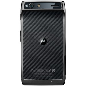
The Motorola dev people have spent a lot of time on the new Razr. It shows. It oozes loving attention. And not in the old Motorola “WTF did they spend all that time on this arb feature for?” No, the new Razr XT910 simply exudes the scent of hard work, clear thinking, clever features and slick hardware crafted from premium materials – Gorilla Glass, kevlar weave and machined aluminium. Is this the phone that returns Motorola to the top of the mobile phone pile?
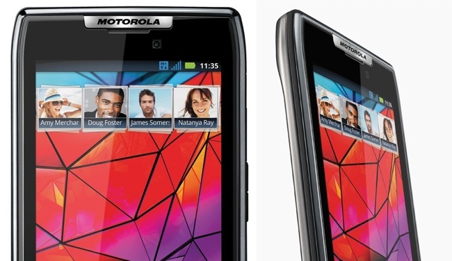
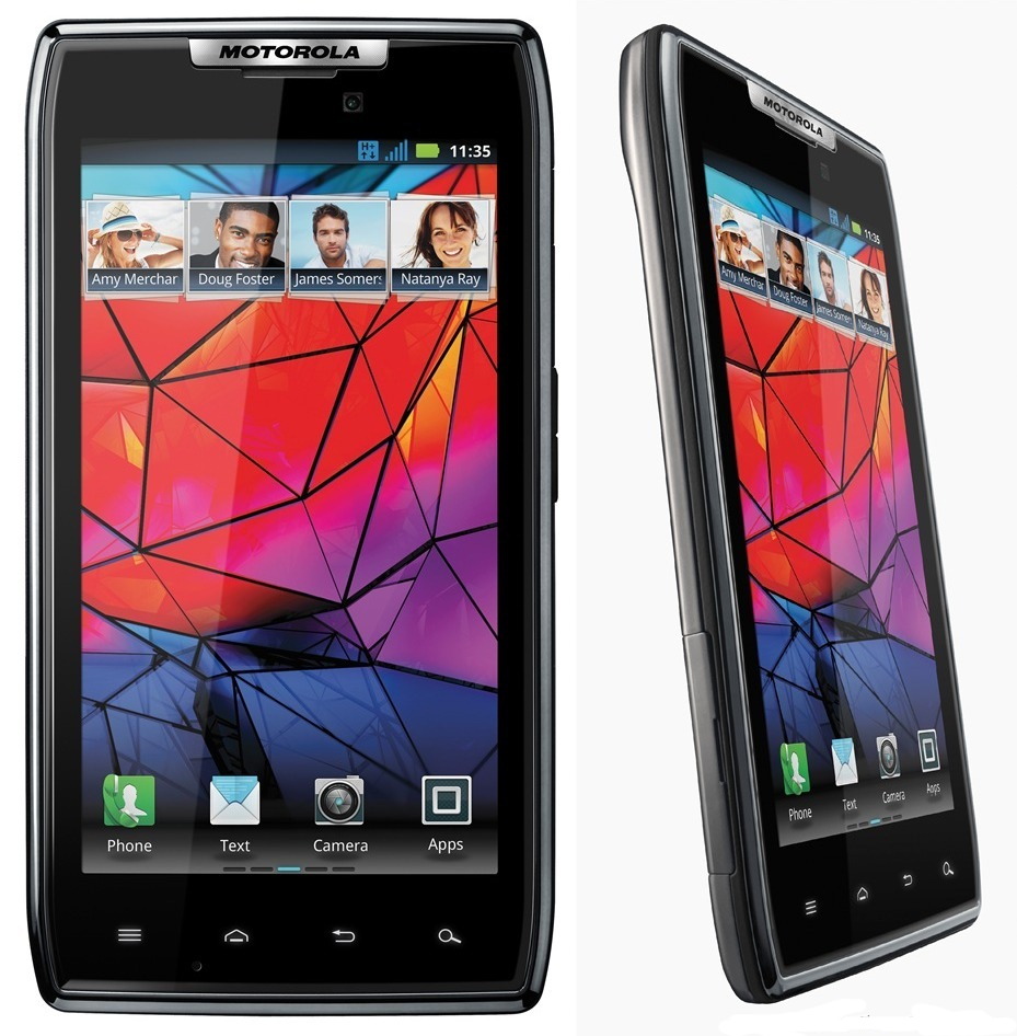
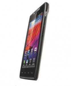
The new Razr is striking. Not beautiful, but the ludicrous thinness (7.1mm apart from the big head-bump) and meticulously crafted lines make is stand out from the glossy black obloid crowd. It has a massive 4.3” Super AMOLED touch screen, which at 540×960 pixels gives you around 256ppi. It’s bright, punchy, fast. It’s got gym-boy innards – a gig of RAM, and 16GB storage (plus microSD) being fed by a dual-core 1.2GHz Cortex A9 processor. 8MP camera, and all the other expected bells and whistles. Oh, and a non-removable battery (not that high-end phone buyers keep them long enough to wear out the original batter). And it uses micro-SIMs, like iPhone. Boo!
We’ve seen this picture before
The floundering mobile behemoth has tried and failed before with “bet the farm” halo phones to kick-start sales. Over the decades it’s had a few massive hits (original Razr, the cheaper Razr V3, the Pebl). More recently it had the heavily hyped Atrix – well received, although not a sales smasheroo. Like the just-not-quite-enough Milestone before it, also well regarded, and also not selling like hotcakes. Essentially Motorola’s problem has been a lack of consistency, and a knee-jerk attention span. For every hit, there’s been a slew of crashing failures (Aura, anyone?). Instead of creating products for actual consumers, it gets lost in the fictional focus group personas, non-existent proto-people that apparently give a good goddam about some absurdly pointless ‘feature’ (the ringtone mixer in the early 2000s… what was it called? MotoMixa? MotoLamo?). The silly, trivial features hoover up development time, and distract from things users want. How long did it take Motorola to introduce a decent predictive text?
Ringing in changes
 Does the new Razr have the chops to win commercially?
It’s a great phone, but Motorola may be trying a bit too hard – outdo everyone else, but forget to reality check. The new Razr is basically too big. The 4’3″ form factor crosses that very fine line between “bit hefty” and “phew, bit of a handful”. An iPhone feels small nowadays, a Galaxy S2 feels sizable, the Razr feels big, even with all its skinniness. I have pretty chunky mitts, and even so the Razr is a handful. And then add to this the extremely tiny buttons of which you get exactly two – an on/lock button and a volume/zoom rocker that protrude the merest fraction of a millimeter (sleek, but you know, pressing them?). No camera button, so yes, you’ll miss all those Kodak moments faffing with touch-screen interfaces.
In the checklist of positives, the new Razr gets mostly full marks – screen is fast and responsive, browsing and watching videos is certainly up with the best, and it comes bundled with a bunch of useful apps, for the office (document editing, GoToMeeting), for navigation, even a task manager that is so often left out of Android builds. No games – this is clearly a phone for serious people. A nice bit of tech is the ‘Smart actions’ tool that lets you create simple rules to automate activities, like turning off ringer after 11pm, sending a text if I’m in a particular neighbourhood (“hi ma, was driving past and though of you, here’s an automated text.”)
Then there’s a usual mish-mash of social networking apps showing your various subscribed timelines — some of which pull in pics from Facebook and other sources, and display them in widgets, and put them in your pic gallery, with not discernible pattern or purpose.
Talk to me. Actually, don’t
Messaging on the Razr is about par with the competitors – functional, but nothing eye-opening. Since it’s a very powerful phone, I thought I’d give the speech-to-text for messaging a crack (it’s usually about useless). And yes, it’s still hilariously wrong. My offer of: “The conversation starts now, let’s see what it thinks I’m saying” returned: “Facebook not if you think I’m saying”. So I tried, “Goodness, that’s hopelessly wrong. Try harder, sport.” It thought I said: “Goodness I hope to see all of the support”.
I tried in French and German as well with similar results, perhaps it’s my accent.
On the up side, Swype works particularly well – possibly the larger keyboard makes jiggly-handed Swypes easier for the software to correctly interpret – but it’s actually faster than just typing, a first for me on any phone.
Like so many of the upper-range phones we’ve tested recently, the camera app on the Razr is poor. This could be a “no one else gives great camera apps, we’ll also do something basic”. There is very little control over the camera, especially over things like compression level (probably because the hardware makers are using on-chip processing to make the camera ‘feel’ faster). A shame when you have so much on-phone horsepower to work with.
 So new, but no Icecream Sarnie
This phone is the first major launch from Motorola since the Google acquisition, and surprisingly to some pundits it comes with Gingerbread, not Icecream Sandwich. That’s because these pundits don’t realise that Motorola’s bureaucracy takes about a year to make even the simplest decision. And also Google insisted that all Android OEMs would be treated the same. And because Icecream Sandwitch is only just hitting the streets (to some ambivalent reviews), jeez guys, give them devs a break.
The Motorola Razr XT910 a browsing, messaging, app’ing beast. If you tend a little more to the phablet than the phone side, it’s for you. Hell, its 131x69mm dimensions are not that much smaller than the Samsung Galaxy Note phablet’s 147×83. And yes, we know the using neologism ‘phablet’ is unacceptable in polite society.
Who it’s for:
- Gear freak that has to have the latest, greatest, biggest, meanest
- Browsing and messaging fiends that want a really big screen
What we liked:
- Beautifully made
- Loads and loads of attention to detail
What we didn’t like:
- A bit over-processed – clever, but not charming.
- We like dedicated camera buttons.
- Some annoying niggles – illumination of the Android nav buttons at the bottom (home/menu/return/search) is hit-or-miss
Do we gear it or burn it?
- It’s too big, but it’s beautiful. Gear.


